Found a total of 10000 related content

HTML Responsive Images Guide
Article Introduction:This guide is about the HTML syntax for responsive images (and a little bit of CSS for good measure). We'll go over srcset and , plus a whole bunch of things to consider to help you get the best performance and design control from your image
2025-04-05
comment 0
313


Building Responsive Web Layouts with HTML
Article Introduction:The core of responsive web layout is to combine HTML and CSS to adapt the website to different devices. 1. Add viewport meta tags to ensure that the mobile device renders the page correctly; 2. Use Flexbox or Grid to create flexible layouts to automatically adjust elements; 3. Use media queries to set breakpoints and apply specific styles according to different devices; 4. Set pictures and containers to responsiveness to prevent content overflow; 5. Follow the mobile priority principle to improve development efficiency. After mastering these key points, responsive layout will be simpler and more efficient.
2025-07-18
comment 0
493
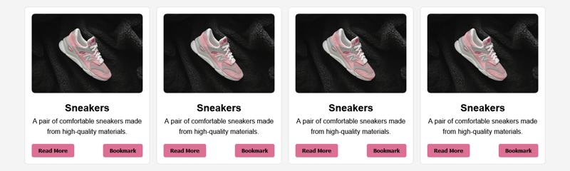
Building Responsive Card Layouts with HTML and CSS Flexbox
Article Introduction:In our previous articles, we’ve explored the importance of structured HTML and how CSS Flexbox simplifies web layouts. This article builds on those concepts by bringing them together to create something practical, a responsive card layout. Think of i
2024-12-31
comment 0
622

How to create a responsive HTML email?
Article Introduction:The following methods are required to create responsive HTML messages: 1. Use inline styles to ensure compatibility; 2. Use table layout to replace Flexbox or Grid; 3. Set viewport tags, fixed-width containers, picture max-width and use table simulation buttons for mobile adaptation; 4. Previews must be tested on multiple clients and real devices. This can improve the display stability and user experience on different devices and email clients.
2025-07-10
comment 0
929

Creating responsive HTML tables using best practices.
Article Introduction:The key to making responsive HTML tables is to ensure that the content on different devices is clear and readable and has a reasonable structure. 1. Use semantic HTML tags and class names, such as, class="name", etc., to facilitate style control and JavaScript operations; 2. Optimize the display method for small screens. Common practice is to place tables into containers with overflow-x:auto to achieve horizontal scrolling, or hide secondary columns or convert them into card-style layouts; 3. You can add fixed table headers, sorting functions, search filtering and other interactions to improve user experience, and pay attention to maintaining good performance.
2025-07-03
comment 0
338

How can you make an HTML layout responsive?
Article Introduction:To realize the responsive design of HTML layout, you must use viewport meta tags, media queries, relative units, elastic layouts, responsive media, mobile-first strategies, and elements hiding or rearrangement. 1. Add viewport meta tags to correctly scale the page; 2. Use media queries to apply styles for different screen sizes; 3. Use relative units such as %, rem, em, vw to replace fixed pixel values; 4. Use Flexbox or CSSGrid to create an adaptable grid layout; 5. Set the maximum width of the picture to 100% and use containers to control the video proportions; 6. Use mobile-first CSS design to expand styles from small screens to large screens; 7. Hide or adjust the display order of elements on small screens to optimize the experience, and finally use real devices or development
2025-08-04
comment 0
497

How to create a responsive HTML video embed
Article Introduction:Use package container and embedded aspect ratio technology to realize the responsive layout of videos in HTML. 1. For iframe embeddings such as YouTube and Vimeo, you need to create a relatively positioned package div, set width:100%, height:0 and padding-bottom:56.25% (16:9 ratio), and absolutely position the iframe to fill the container; 2. For self-hosted elements, just set the package container to width:100% and apply overflow:hidden, and set width:100%, height:auto and display:block to maintain the proportion and eliminate gaps; 3.
2025-08-01
comment 0
881

How to make an HTML page responsive
Article Introduction:The key to making responsive HTML pages is to combine CSS and media queries to automatically adapt to different screen sizes. 1. Use viewport meta tags to control mobile display: 2. Set breakpoints through media queries, such as mobile phone max-width:480px, tablet 481px-768px, desktop 769px or above; 3. Use Flexbox or Grid to achieve elastic layout; 4. Use max-width:100% to prevent overflow of containers; 5. Use mobile-first strategy to write basic styles for small screens first and then gradually enhance them. These steps can effectively improve page adaptability and avoid common problems.
2025-07-09
comment 0
149

How to make your HTML responsive for mobile devices?
Article Introduction:The key to achieving friendly display of web pages on mobile phones is the coordination of HTML and CSS. The following points should be paid attention to: 1. Set the viewportmeta tag to ensure correct rendering on the mobile side; 2. Use media query to apply styles according to different screen sizes; 3. Use flex or grid to achieve elastic layout; 4. Control the image size to adapt to different containers; 5. Use developer tools, real machines or online tools to verify the effect during testing. Every step is crucial, and omissions can affect the overall responsive experience.
2025-07-05
comment 0
668

Implementing Responsive Images with the HTML srcset and sizes Attributes
Article Introduction:srcset and sizes are key properties for HTML implementation of responsive images. srcset provides multiple image sources and their width or pixel density, such as 400w and 800w, and the browser selects the appropriate image accordingly; sizes defines the display width of the image under different screen widths, such as (max-width: 600px)100vw, 50vw, so that the browser can more accurately match the image size. In actual use, you need to prepare multi-size pictures, clearly named, design layout in accordance with media query, and test the performance of the equipment to avoid ignoring sizes or unit errors, thereby saving bandwidth and improving performance.
2025-07-12
comment 0
896

How to make a responsive image in HTML?
Article Introduction:The core method of implementing responsive images in HTML includes the following steps: 1. Use max-width:100% to adapt the image to the container to ensure that the image is scaled to scale and does not overflow; 2. Use srcset and sizes attributes to enable the browser to load pictures of the appropriate size according to the screen width, improving loading efficiency; 3. Pay attention to the original size and format of the image to avoid excessively large images being displayed, and use modern formats such as WebP to optimize loading performance; 4. Solve common problems in layout, such as undefined container size, unadaptive height, and blurred high-resolution screen display, clear sizes should be set and srcset should be used in combination with high-definition pictures. These practices jointly ensure the good display and performance of pictures on various devices.
2025-07-12
comment 0
725

How to create a responsive navigation bar with a hamburger menu using HTML?
Article Introduction:The key to making a responsive navigation bar is to realize the collapse function of the menu on the small screen. The core steps include: 1. Building an HTML structure, including containers, logos, links and hidden hamburger buttons; 2. Using CSS media to query and control styles under different screen sizes, hiding the menu on the mobile terminal and displaying the hamburger buttons; 3. Using JS to realize the interactive logic of click expansion and collapse. Specifically: the navigation items are displayed in HTML.nav-links, and the .hamburger button is hidden by default; the menu is set in CSS to absolutely position and hide the menu, and the hamburger button is displayed; JS controls the menu expansion and collapse by switching the .active class to ensure smooth interaction.
2025-07-05
comment 0
395

Implementing Responsive Images with HTML
Article Introduction:The key to responsive pictures is to load the appropriate size as needed, which is mainly achieved in three ways: First, use tags to set max-width and height attributes with CSS to achieve basic responsiveness; second, use srcset and sizes attributes to select pictures of different sizes according to the device; third, use elements to achieve more refined control, including format and content switching. These three methods are suitable for scenes of different complexity, ensuring that images can be displayed efficiently on various devices.
2025-07-24
comment 0
797


Responsive Web Design Principles in HTML
Article Introduction:Responsive web design is a design concept, with its core lyric layout, media query and scalable elements; 1. Use percentage or vw units to define width to achieve flow layout; 2. Use flexbox or grid to achieve elastic arrangement; 3. Apply different styles according to screen characteristics through media query; 4. Use max-width:100% and elements to achieve adaptation in pictures. These technologies work together to enable the website to be displayed and used normally on different devices.
2025-07-22
comment 0
764

Implementing Responsive Images using HTML Picture Element
Article Introduction:Elements are a native way to implement responsive images in HTML5. It allows the most appropriate image resources to be loaded according to factors such as the screen size, resolution, and direction of the device. Define multiple image sources and their corresponding media query conditions through tags. The browser will match and load pictures that meet the conditions in order, and finally use the tag as the default fallback. For example: when the device width is greater than or equal to 1024px, medium.jpg is loaded between 768 and 1023px, small.jpg is loaded if the device width is greater than or equal to 1024px. Compared with srcset, it provides more refined control capabilities, such as adapting to Retina screens, horizontal and vertical screen switching, completely different picture content, etc. Media checks should be set reasonably when using
2025-07-10
comment 0
459

How to make an HTML responsive?
Article Introduction:The key to achieving a built-in responsive layout is to avoid fixed widths and utilize container scale. The easiest way is to set the iframe width to 100% and use the aspect-ratio attribute to control the aspect ratio, such as iframe{width:100%; aspect-ratio:16/9;}, which is suitable for modern browsers and video embedding scenarios; if IE compatible, you can use the outer div container to match the padding-top technique to achieve responsiveness by setting .iframe-container{position:relative;width:100%;padding-top:56.25%;} and absolute positioning of iframes;
2025-07-09
comment 0
203

HTML `viewport` Meta Tag for Responsive Design
Article Introduction:The viewportmeta tag is the basis for mobile adaptation, and its core function is to control the display of web pages on mobile devices. 1. It sets width=device-width to match the actual width of the device; 2. Initial-scale=1 ensures that the initial scaling ratio of the page is 1, avoiding the browser's automatic scaling resulting in too small text or misplaced layout; 3. If viewport is not set, responsive layout failure, media query cannot take effect, and inaccurate click areas may occur; 4. It is recommended to keep it simple and set basic parameters only to avoid restricting user scaling to improve accessibility; 5. At the same time, media query, relative units, picture adaptation and other means can be combined to achieve the completion.
2025-07-23
comment 0
722

Using srcset and sizes for Responsive HTML Images
Article Introduction:srcset and sizes are key attributes used to optimize the display clarity and loading efficiency of web images on different devices. They improve performance and user experience by letting the browser choose the most appropriate image resources based on screen size, resolution, etc. srcset is used to list image options of different widths or pixel density, such as image-small.jpg480w, image-medium.jpg800w, image-large.jpg1200w; sizes defines the display width of the image under different viewports, such as (max-width: 600px)100vw,800px; when using it, you should pay attention to accurately labeling the image width, covering multiple breakpoints, and adapting to
2025-07-16
comment 0
1002
