Found a total of 10000 related content
Can you animate a CSS gradient?
Article Introduction:Yes, CSS gradients can be animated by background movement. Specific methods include: 1. Use the background-position attribute to achieve linear or radial gradient flow effect with keyframe animation; 2. Set the background-size greater than the container size to provide moving space; 3. Control the animation separately through multiple background layers to achieve more complex effects; 4. Pay attention to optimizing performance, avoiding too fast animations and testing browser compatibility.
2025-07-06
comment 0
152
Inspirational UI Design Ideas for Your Next Website Project
Article Introduction:Design Points
This article discusses how to cleverly use micro-interaction, hover animation, CSS gradient and conversion effects in website design to enhance visual appeal, guide user behavior, and ultimately bring better user experience.
Micro-interaction, hover animation, CSS gradients and transformations: These elements can effectively enhance visual interest and guide users to complete specific operations.
Gradient Background and CSS Transformation: As shown in the Stripe website, gradient background and CSS Transformation can create compelling titles or backgrounds for call-to-action elements.
Interactive Menu: An interactive menu with unique layouts, styling icons, titles, and summary descriptions that transform a normal menu into a engaging display area.
Subtle repeat animation: No user interaction required
2025-02-17
comment 0
727

How to create a CSS-only animated hero section?
Article Introduction:Create an animated hero area that uses only HTML and CSS, first build a semantic HTML structure with titles, descriptions, and buttons; 2. Use Flexbox layout and set gradient background to style hero area; 3. Use @keyframes to add a delayed fade-in slide animation for titles, descriptions, and buttons; 4. Enhance the interactive visuals of the CTA buttons through transition and hover states; 5. Optionally use background-size and animation to achieve background gradient flow effects; 6. Add media queries to ensure responsive display on mobile devices; finally, by streamlining animations and prefers-reduced-motion media
2025-08-04
comment 0
134

Creating complex CSS Gradient backgrounds and effects
Article Introduction:CSS gradient backgrounds enable complex visual effects through cascading, animation and blending modes. 1. Multiple gradients can be separated by commas, and the bottom layer is drawn from the upper layer. It is recommended to use translucent colors and different directions to enhance the levels; 2. Animation can be implemented through background-position or keyframes, pay attention to performance and transition effect control; 3. Mix-clip:text can make gradient text, mask-image combined with gradient can realize image masking, mix-blend-mode is used for element interaction design.
2025-07-12
comment 0
435
Quick Tip: How to Add Gradient Effects and Patterns to Text
Article Introduction:This quick tip demonstrates the simple addition of gradient effects and patterns to webpage text. This is achieved by making the text transparent, applying a background decoration using background-image, and precisely clipping this decoration to the
2025-02-08
comment 0
718
How to create a CSS-only animated social media icons?
Article Introduction:Creating animated social icons using pure CSS can be achieved through HTML structure and CSS animation; 2. Define each social platform icon with class name in HTML and introduce FontAwesome; 3. Use Flexbox to layout and set a unified icon style, including size, rounded corners, shadows and transition effects; 4. Specify brand colors for each platform, and Instagram uses linear gradient background; 5. Add scaling, displacement, rotation and shadows to enhance interaction through:hover pseudo-class; 6. Optionally add luminous or rippling animations to improve visual effects; 7. Ensure accessibility and add aria-label, ensure responsiveness and high performance, and ultimately achieve smooth animation icons without JavaScript.
2025-08-02
comment 0
521

8 Animated Parallax Examples Using jQuery
Article Introduction:jQuery empowerment: 8 amazing parallax animation web page cases
jQuery has greatly improved the level of website animation effects. The parallax effect brings perception and depth to the animation by observing objects in different directions of sight to make them appear in different positions. The following are 8 wonderful cases of using jQuery parallax effects on different websites to inspire you to create your own jQuery parallax animation.
Parallaxbokeh
CSS & jQuery animation parallax bokeh effect created by David Leggett. It uses the animation parallax effect as a website background, and while the effect may slow down the website slightly, this is still a good example.
Come
2025-03-05
comment 0
718
What is a CSS animation defined with @keyframes?
Article Introduction:@keyframes is used in CSS to create keyframe animations, allowing developers to define the styles of elements at different stages of the animation. 1. Specify the style of each stage of the animation through percentage or from/to, such as 0%, 50%, and 100% respectively representing the start, middle and end states respectively; 2. Use the animation attribute to apply the defined keyframe animation to elements, including setting the animation name, duration, speed function, delay and number of playbacks, etc.; 3. Commonly used to implement complex custom animation effects, such as loading indicators, hover effects, UI feedback and background animation; 4. Notes include ensuring that the start and end frames are included, avoiding layout jitter caused by animation, testing browser compatibility, and using animation
2025-06-22
comment 0
655

How to create a CSS-only animated dropdown menu with icons?
Article Introduction:Yes, you can create an icon-free drop-down menu with icons using CSS. 1. Use semantic HTML structure to include nested ul and FontAwesome icons; 2. Set basic styles, transition effects and hide drop-down content through CSS; 3. Use :hover and :focus-within to achieve drop-down display and icon rotation animation without JavaScript, and support keyboard navigation, ultimately implementing a beautiful and accessible pure CSS animation drop-down menu.
2025-08-01
comment 0
968

What are CSS transitions
Article Introduction:CSS transitions enable switching between CSS attribute values ??through smooth animations, which are suitable for user interaction scenarios such as button hovering effects, menu expansion and collapse. Common usages include button closure effect, drop-down menu gradient, background color gradient, image transparency or zoom changes. The basic syntax is a transition: attribute duration time sequence function, which can specify a single or multiple attributes, or all can be used to represent all attributes, but it should be used with caution. Timing functions such as ease, linear, and ease-in-out control the animation speed curve, and can also be customized by cubic-bezier. It is recommended to prioritize opacity and transform for better performance, combined with @media(prefers-
2025-07-01
comment 0
339
jQuery PNG/JPEG/GIF Plugins
Article Introduction:A series of jQuery PNG/JPEG/GIF plug-ins to achieve image animation, cartoon background and other effects, helping you to take the web image design to the next level! Related blog posts:
100 jQuery pictures/content sliders
jQuery PNG repair IE6 background image
jQuery Canimate plugin
A jQuery plug-in that uses high-speed printing of image files to achieve animation effects of non-GIF image files. You can easily change the frame rate; in addition, you can still do everything on elements that contain the image (such as adding borders).
Source Code Demo PNGFix jQuery Plug-in
By applying IE-specific filters to images with alpha channels, I allow
2025-02-27
comment 0
749
10 Magicial jQuery Text Effect Plugins
Article Introduction:10 magical jQuery text special effects plugins to make your website stand out! jQuery is not only used for menus and animation effects. With jQuery, you can also create attractive text effects and cleverly use text to communicate effectively with users. Through this collection, you can create text gradients, text fly-in effects, text glows, and more. Enjoy it!
Codename Rainbows
We use some JavaScript and CSS magic to apply a two-color gradient for any text. Shadows and highlights can also be applied. This is especially effective in large websites or dynamic content, as it is impractical to create images for each instance in these cases.
source
jQuer
2025-03-07
comment 0
1199
Using css blend modes for creative image effects
Article Introduction:CSS hybrid mode realizes creative image effects through mix-blend-mode and background-blend-mode properties. 1. Mix-blend-mode controls the mixing of elements and background, such as using the difference value to allow text to penetrate the picture to display; 2. Background-blend-mode controls the mixing of background layers, such as overlaying gradient tones; 3. Pay attention to browser compatibility when using it. Safari and Chrome support is good, but IE does not support it; 4. Use the isolation attribute to avoid hierarchical interference and ensure that the parent container has content support for the mixing effect.
2025-07-10
comment 0
710
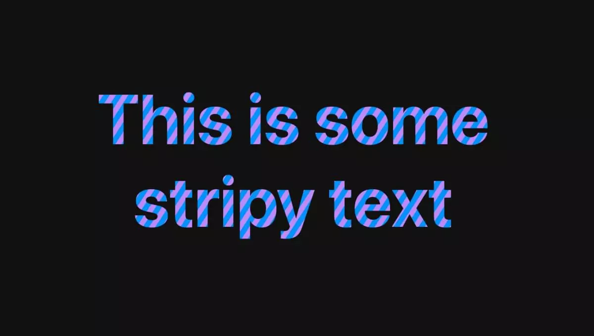
How to create a text gradient with CSS?
Article Introduction:Use background-image and background-clip:text to achieve CSS text gradient effect; 2. You must set -webkit-background-clip:text and -webkit-text-fill-color:transparent to ensure browser compatibility; 3. You can customize linear or radial gradients, and it is recommended to use bold or large text to improve visual effect; 4. It is recommended to set color as an alternative color for unsupported environments; 5. Alternatives can use -webkit-mask-image to achieve more complex effects, but they are mainly suitable for advanced scenarios; this method is simple, has good compatibility and visual
2025-08-01
comment 0
255
Why is Windows 11 consuming more RAM than 10?
Article Introduction:Windows 11 does take up more memory than Windows 10, and the reasons include: 1. More visual and networked interfaces, such as widgets, animation effects and online searches, increasing background data crawling; 2. System architecture changes, such as DirectStorage and web-based components to improve memory requirements; 3. More background services are enabled by default, such as cloud synchronization and preload applications. These designs improve the experience but increase resource consumption, which can be mitigated by closing widgets and background applications.
2025-07-21
comment 0
831
css animation examples
Article Introduction:Hover button zooms in to achieve interactive effects through transform:scale() and transition; 2. Fade in animation using @keyframesfadeIn with animation:forwards to maintain the final state; 3. Infinite rotation icon uses transform:rotate() and border differences to create loading effects; 4. Left and left jitter prompts to move between 25% and 75% keyframes through translateX to generate warning feedback; 5. Slide up and down banners from negative values to 0 to slide into vision; 6. Text typewriter effect simulates verbatim input through width gradient with steps() and adds cursor flash
2025-07-28
comment 0
305
CSS Gradients: A Syntax Crash Course
Article Introduction:CSS Gradient: Crash Gradient Course
In the past, most websites used a lot of pictures to create beautiful UIs. Thanks to various CSS attributes, this trend has changed. This tutorial will help you learn CSS gradients. You can replace various UI elements as well as images in the background using gradients. With a little practice, you can create complex patterns without using any images.
CSS gradients are well supported in the browser, allowing you to create smooth visual transitions between two or more specified colors. Gradients allow you to control many settings such as the size, angle, color stop position of the gradient, etc.
In this article, I will cover linear, radial, and newer repeat gradients.
Key Points
CSS gradients are widely supported in browsers
2025-02-24
comment 0
1007

How to add a preloader or loading screen to an HTML website?
Article Introduction:To add loading animation to a web page, first create an animation structure and set the style with HTML and CSS, and then hide the animation after the page loading is completed through JavaScript. The specific steps are as follows: 1. Create an HTML structure for loading animations, such as a div containing a rotating icon; 2. Use CSS to set animation styles, including centered display, background color and animation effects; 3. Listen to the window.onload event through JavaScript, and hide the animation after the page resource is loaded; 4. You can combine the DOMContentLoaded event or imagesLoaded library to achieve more accurate load control; 5. Pay attention to avoiding animations hindering user interaction, adapt to mobile terminals and optimize page loading
2025-07-13
comment 0
163
How to create a parallax scrolling effect with CSS?
Article Introduction:The parallax scrolling effect can be implemented using CSS. There are three specific methods: First, use the background-attachment attribute, set the background-attachment:fixed; make the background image fixed, forming visual misalignment; second, use transform:translateZ() and perspective to set multiple levels in HTML and give different depths to simulate the 3D scrolling effect; third, combine HTML, CSS and JavaScript, dynamically adjust the style by listening to scroll events to achieve more complex animation effects. These three methods are applicable to basic parallax, full-screen display websites and high-definition
2025-07-25
comment 0
940
