Found a total of 10000 related content

Creating a Dynamic Navbar in Bootstrap: A Step-by-Step Tutorial
Article Introduction:To create a dynamic navigation bar in Bootstrap, follow these steps: 1. Include Bootstrap files, hosted via CDN or locally. 2. Create a basic navigation bar structure and use Bootstrap's navbar component. 3. Use JavaScript to achieve dynamic effects, such as displaying or hiding the navigation bar according to the scroll position. 4. Adjust the responsiveness and use different breakpoint classes such as navbar-expand-lg. 5. Customize the appearance and animation effects of the navigation bar through CSS. 6. Ensure the performance and accessibility of the navigation bar, test different devices and add ARIA tags. Through these steps, you can create a dynamic navigation bar that is both beautiful and enhances the user experience.
2025-07-16
comment 0
209
10 jQuery Cool Menu Effect Plugins
Article Introduction:10 cool jQuery menu special effects plug-ins to improve website user experience! We have shared many jQuery navigation menu plugins, and now we bring you 10 more amazing jQuery menu effects plugins. Enjoy it! Related readings: - 10 dazzling jQuery navigation menus - 15 excellent jQuery navigation menus
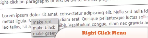
Right-click menu
This plugin is very easy to use and compact, allowing you to create right-click menus.
Source Code Demo 2. jQuery Multi-level Menu – FX CSS Menu with Submenu
100% CSS menu, visual effects provided by jQuery. Only use Javascript to implement special effects. Fully compatible with cross-browser, package
2025-03-01
comment 0
943

How to create a CSS-only animated dropdown menu with icons?
Article Introduction:Yes, you can create an icon-free drop-down menu with icons using CSS. 1. Use semantic HTML structure to include nested ul and FontAwesome icons; 2. Set basic styles, transition effects and hide drop-down content through CSS; 3. Use :hover and :focus-within to achieve drop-down display and icon rotation animation without JavaScript, and support keyboard navigation, ultimately implementing a beautiful and accessible pure CSS animation drop-down menu.
2025-08-01
comment 0
968

How to make a full-screen mobile navbar in Bootstrap?
Article Introduction:Implementing a full-screen mobile navigation bar in Bootstrap requires combining default components and custom styles; 1. Using the Bootstrap default navbar structure as the basis to build a responsive navigation bar; 2. Add a custom CSS style to cover the full screen and center the content when the menu is expanded; 3. You can automatically close the navigation bar after clicking the link through HTML attributes or JavaScript; 4. Pay attention to setting detailed optimizations such as z-index, padding-top, transition animation and scroll control to improve the experience.
2025-07-17
comment 0
427

Mastering Bootstrap Navbars: Customization and Advanced Techniques
Article Introduction:The key to mastering the Bootstrap navigation bar is customization and advanced technology: 1) Customize the color, font and layout of the navigation bar by modifying CSS variables and structures; 2) Enhance the user experience with advanced technologies such as animation drop-down menus and giant menus; 3) Optimizing performance and ensuring accessibility are the keys to improving navigation bar efficiency.
2025-06-27
comment 0
709

How to Create a Navigation Bar in Bootstrap: A Comprehensive Guide
Article Introduction:The steps to create a navigation bar using Bootstrap include: 1. Create an initial navigation bar using the basic navbar component. 2. Customize styles through Bootstrap's utility class and custom CSS. 3. Ensure the navigation bar is responsive on different devices. 4. Add advanced features to the pull-down menu and search bar. 5. Test and optimize the performance and user experience of the navigation bar. With these steps, you can create a powerful and beautiful navigation bar with Bootstrap.
2025-07-08
comment 0
828

Bootstrap 5 Navbar: Create a Responsive and Stylish Navigation
Article Introduction:Using Bootstrap5 to create responsive and stylish navigation bars can be achieved through the following steps: 1) Use Bootstrap5's mobile-first design principles to ensure that the navigation bar can be displayed well on different devices; 2) Adjust the appearance of the navigation bar, such as background color and text color through CSS classes and custom styles; 3) Add drop-down menus to organize navigation projects; 4) Use navbar-expand-* to control the collapse behavior of the navigation bar under different screen sizes; 5) Ensure the accessibility and performance of the navigation bar, by adjusting the size of the toggle buttons and using ARIA properties.
2025-07-15
comment 0
604
css responsive navbar example
Article Introduction:The responsive navigation bar is implemented through pure CSS, and the answer is to use hidden check boxes and media query to control the display behavior of the menu on the mobile side. 1. The desktop side is displayed as a horizontal navigation menu, which is implemented through flex layout; 2. When the mobile side is below 768px, hide the menu and display the hamburger icon, and trigger the hidden checkbox through label; 3. Use the checked status and ~ selector to control the display and hiding of .nav-menu; 4. After clicking the hamburger icon, it can achieve animation effect through CSS transformation; 5. The menu uses absolute positioning to ensure display at the correct level. The entire solution does not require JavaScript, and the interactive logic that relies on CSS is complete and lightweight, suitable for static websites, and finally
2025-07-27
comment 0
527

Inspirational UI Design Ideas for Your Next Website Project
Article Introduction:Design Points
This article discusses how to cleverly use micro-interaction, hover animation, CSS gradient and conversion effects in website design to enhance visual appeal, guide user behavior, and ultimately bring better user experience.
Micro-interaction, hover animation, CSS gradients and transformations: These elements can effectively enhance visual interest and guide users to complete specific operations.
Gradient Background and CSS Transformation: As shown in the Stripe website, gradient background and CSS Transformation can create compelling titles or backgrounds for call-to-action elements.
Interactive Menu: An interactive menu with unique layouts, styling icons, titles, and summary descriptions that transform a normal menu into a engaging display area.
Subtle repeat animation: No user interaction required
2025-02-17
comment 0
727

Vue example of a responsive navigation bar
Article Introduction:How to create a responsive navigation bar in Vue3? Use Vue3's Composition API to build the basic structure and implement responsive layout through CSS. 1. Create a Vue component that includes logo, link and mobile switch buttons; 2. Use ref and toggleMenu functions to control the display status of mobile menus; 3. Use CSSFlex layout to realize desktop horizontal navigation; 4. Use media query and max-height animation to realize mobile sliding menus; 5. Add a window size listener to automatically close the mobile menu.
2025-07-17
comment 0
183

Vanilla Javascript: Creating Animated Sticky Navigation Menu
Article Introduction:Core points
Create an animated sticky navigation menus without the need for a jQuery plugin using pure JavaScript, CSS, and HTML. The menu is designed to slide out of view when scrolling down and slide back into view with a translucent effect when scrolling up.
This process involves setting up the basic HTML structure, applying styles to main elements, and then animateing the menu. The animation is triggered by attaching the event handler to the scroll event and using CSS transformation to adjust the position and appearance of the menu according to the scrolling direction.
This custom solution provides more design flexibility and allows easy customization to be done according to specific needs. The end result is a dynamic interactive navigation menu that enhances the user experience.
Web navigation menu design needs to consider many factors, such as dishes
2025-02-16
comment 0
1163

How to dynamically add items to a Bootstrap navbar with JavaScript?
Article Introduction:To dynamically add Bootstrap navigation bar items, you can use JavaScript to generate HTML elements from the data source and insert them into the .navbar-nav container. The specific steps are as follows: 1. Understand the basic structure of the Bootstrap navigation bar. The key parts are; 2. Create a local array or API data source containing text and links; 3. Iterate through data through JavaScript, create and elements for each item and add to the navigation bar; 4. Optionally handle the activation state or add more complex components to the pull-down menu; 5. Make sure that Bootstrap CSS and JS are loaded to support interactive functions and test responsive behavior.
2025-07-19
comment 0
910

Building Mega Menus with Flexbox
Article Introduction:Core points
Flexbox is a CSS layout model that allows developers to create complex UIs without relying on redundant CSS and JavaScript tricks. It uses a linear layout model, making it easier to layout content horizontally or vertically without spacing calculations.
Flexbox can be used to create websites with giant navigation menus. This layout model allows creating simple navigation bars, single drop-down menu segments, and limiting single drop-down menu segments to three columns. The Flex layout is responsive to elements within the container, reducing the need for media queries.
The final mega menu created in this tutorial is not fully responsive. The main menu bar will be displayed on a smaller screen, but the giant menu will not be available, only the top links are available
2025-02-17
comment 0
647

How to create a responsive navigation bar with a hamburger menu using HTML?
Article Introduction:The key to making a responsive navigation bar is to realize the collapse function of the menu on the small screen. The core steps include: 1. Building an HTML structure, including containers, logos, links and hidden hamburger buttons; 2. Using CSS media to query and control styles under different screen sizes, hiding the menu on the mobile terminal and displaying the hamburger buttons; 3. Using JS to realize the interactive logic of click expansion and collapse. Specifically: the navigation items are displayed in HTML.nav-links, and the .hamburger button is hidden by default; the menu is set in CSS to absolutely position and hide the menu, and the hamburger button is displayed; JS controls the menu expansion and collapse by switching the .active class to ensure smooth interaction.
2025-07-05
comment 0
394

How to center navbar items in Bootstrap?
Article Introduction:To center the Bootstrap navigation bar project horizontally, it is recommended to use the Flexbox method. 1. Add mx-auto class to .navbar-nav to center the navigation bar content horizontally in the container and ensure that the parent element width is sufficient; 2. Or set .navbar-nav to flex layout through custom CSS and use justify-content:center to achieve center; 3. Pay attention to keeping the container width full of one row, avoid multiple .navbar-nav interference, and handle the mobile folding menu style separately to ensure compatibility.
2025-07-23
comment 0
417

Structuring Navigation Menus with the HTML5 Nav Element
Article Introduction:Using HTML5's nav elements to build navigation menus can improve semantic structure and accessibility. nav represents the main navigation area of ??the page, which is often used in conjunction with unordered lists to keep the structure clear. 1. The basic structure is NV wrapped ul, each li is a menu item; 2. The style is controlled through CSS, such as flex layout to achieve horizontal arrangement, media query adaptive design; 3. Precautions include avoiding abuse, adding aria attributes to optimize barrier-free experience, rationally handling nested menus, and paying attention to SEO effects.
2025-07-09
comment 0
284

How to create a multi-level dropdown in Bootstrap navbar?
Article Introduction:To create a multi-level drop-down menu in the Bootstrap navigation bar, 1. You need to build a multi-level menu through a nested <ul> structure; 2. Add a custom CSS to control the submenu position, such as setting the relative positioning of .dropdown-submenu and the left offset of .dropdown-menu; 3. Use data-bs-toggle="dropdown" or custom JS to implement the submenu expansion logic, such as clicking to switch the display status; 4. Optimizing mobile interaction, it is recommended to click to expand, limit the levels, and consider using the folded menu to adapt to touch screen operations.
2025-07-21
comment 0
926

css hamburger menu example
Article Introduction:The hamburger menu implemented in pure CSS expands the right sliding menu when the button is clicked on a small screen and changes the icon to a fork. The hidden buttons on the large screen display horizontal navigation; 1. Use hidden checkbox to trigger interaction with label; 2. Use checked pseudo-class to control menu display and animation; 3. The hamburger icon is composed of three horizontal lines. When selected, the first and third rotations form a fork, and the second transparent disappears; 4. The menu is initially placed outside the right side with fixed positioning, and expands right:0 when selected; 5. Media query switches to horizontal layout and hides the hamburger button when the screen is greater than 768px; this solution does not require JavaScript, supports responsive switching and transition animation, suitable for basic scenes, and can be added by adding AR
2025-08-01
comment 0
458
CSS tutorial for building a navigation menu from scratch
Article Introduction:To create a CSS navigation menu, first build the structure using HTML's nav elements and an unordered list, then implement horizontal layout through Flexbox, and add hover effects and responsive design. 1. Use semantic HTML structures to include nav, ul, li and a tags; 2. Use Flexbox to set display:flex, gap and list-style:none to achieve horizontal arrangement; 3. Add link styles, hover effects, transition animations and focus states; 4. Use media query to adjust the flex-direction under the small screen to column to achieve vertical stacking layout. The whole process is simple and clear, suitable for mastering basic layout techniques.
2025-07-02
comment 0
905
