Found a total of 10000 related content
How to create a CSS-only animated input field with a floating label?
Article Introduction:Use CSS to create an animation input box with floating tags only in pure styles, no JavaScript is required; 2. The HTML structure needs to include label and input and be wrapped in a container, and add required and placeholder attributes to support CSS state detection; 3. The animation is triggered by combining the adjacent brother selectors with the pseudo-class: focus and: not(:placeholder-shown) pseudo-class to trigger the animation, so that the tags float when focused or have values; 4. The basic style includes absolute positioning labels, transition effects, border animation and font smoothing processing; 5. Optional enhancements include underscore animation and multi-input type adaptation; 6. This solution is fully accessible and compatible with modern browsers, and IE11 requires JavaS
2025-08-01
comment 0
881
Unlock CSS Animation Power with @keyframes: A Deep Dive
Article Introduction:The full potential of unlocking CSS animations with @keyframes can be achieved through the following steps: 1) Define the start, end and intermediate state of the animation sequence; 2) Use multi-stage animation to control multiple attributes of the element; 3) Adjust the -timing function to optimize animation effects; 4) Use will-change to improve performance; 5) Choose the appropriate animation duration; 6) Use animations carefully to avoid excessive use; 7) Ensure cross-browser compatibility with vendor prefixes; 8) Dynamically control animations with JavaScript. Through these methods, you can create amazing animations that enhance web design.
2025-06-22
comment 0
190
Can you animate a CSS gradient?
Article Introduction:Yes, CSS gradients can be animated by background movement. Specific methods include: 1. Use the background-position attribute to achieve linear or radial gradient flow effect with keyframe animation; 2. Set the background-size greater than the container size to provide moving space; 3. Control the animation separately through multiple background layers to achieve more complex effects; 4. Pay attention to optimizing performance, avoiding too fast animations and testing browser compatibility.
2025-07-06
comment 0
154
How to create a loading spinner with CSS?
Article Introduction:Creating a CSS loading spinner requires only a div element as the HTML structure. 2. Use CSS to set width, height, border, rounded corners and animation properties, and achieve rotation effect by changing the border color and applying 360-degree rotation animation. 3. You can customize the size, speed, color and border thickness to match design needs. 4. Center the rotator in the container or center of the screen through the flex layout. In the end, a lightweight, modern browser-compatible loading indicator can be achieved with just a small amount of code, which is suitable for AJAX loading, page transition and other scenarios.
2025-07-25
comment 0
814
Simple Animations Using requestAnimationFrame
Article Introduction:Core points
requestAnimationFrame is a helper function that is used to write animations synchronized with the browser's drawing cycle, thus achieving smoother and more CPU-saving animation effects. It is supported by all modern browsers and is compatible with older browsers.
The animate function created with requestAnimationFrame can be designed to accept a series of functions as parameters, which are called in sequence, thereby implementing an animation sequence. This function can track the progress of the animation and calculate the end time of the animation.
requestAnimationFrame is created more efficiently than setTimeout or setInterval
2025-02-24
comment 0
790
How to create a triangle shape using pure CSS?
Article Introduction:To create triangles with pure CSS, the most common method is to use border features. 1. Set the width and height of the element to 0, and only the space is supported through the border; 2. Set the border that does not need to be displayed as transparent; 3. Change the color of a certain border to determine the direction of the triangle, such as border-bottom to control the upward triangle; 4. Use transform to achieve more complex effects, such as rotation or animation. For example, setting border-left to the right triangle is colored, other borders are transparent, while transform is suitable for making icons or arrows with pseudo-elements.
2025-07-31
comment 0
332
10 jQuery Cool Menu Effect Plugins
Article Introduction:10 cool jQuery menu special effects plug-ins to improve website user experience! We have shared many jQuery navigation menu plugins, and now we bring you 10 more amazing jQuery menu effects plugins. Enjoy it! Related readings: - 10 dazzling jQuery navigation menus - 15 excellent jQuery navigation menus
Right-click menu
This plugin is very easy to use and compact, allowing you to create right-click menus.
Source Code Demo 2. jQuery Multi-level Menu – FX CSS Menu with Submenu
100% CSS menu, visual effects provided by jQuery. Only use Javascript to implement special effects. Fully compatible with cross-browser, package
2025-03-01
comment 0
944

Vue Animation and Transition Effects
Article Introduction:In web development, Vue provides a simple and powerful animation system to achieve transition effects. 1. Use wrapping a single element to implement basic animation, define the animation name through the name attribute, and achieve the fade effect with the corresponding CSS class, where v-if control display is the key. 2. Using the combined key attribute, you can add animations to multiple elements, such as the transition effect when the list is added or deleted, and you can set animation styles through CSS. 3. Combining CSS animation libraries such as Animate.css can quickly achieve more complex animation effects. Just specify enter-active-class and leave-active-class in it to complete the integration. After mastering these methods, developers can
2025-07-10
comment 0
611
How to Create a CSS Typewriter Effect for Your Website
Article Introduction:Pure CSS creates engaging typewriter text effects
Core points:
CSS typewriter effects make website content more dynamic and attractive by gradually displaying text, and can be used for login pages, personal websites and code demonstrations.
Typewriter effects can be created by using the CSS steps() function to change the width of the text element from 0% to 100%, and animation simulation of the cursor of "photo" the text.
Typing effects can be adjusted by increasing or decreasing the number of steps and duration of the typing animation to accommodate longer or shorter text.
Typewriter effects can be used in conjunction with flashing cursor animations to enhance the effect, and the cursor can be customized by adjusting its border-right attribute, color, flashing frequency, and more.
This article will
2025-02-08
comment 0
804
css animation examples
Article Introduction:Hover button zooms in to achieve interactive effects through transform:scale() and transition; 2. Fade in animation using @keyframesfadeIn with animation:forwards to maintain the final state; 3. Infinite rotation icon uses transform:rotate() and border differences to create loading effects; 4. Left and left jitter prompts to move between 25% and 75% keyframes through translateX to generate warning feedback; 5. Slide up and down banners from negative values to 0 to slide into vision; 6. Text typewriter effect simulates verbatim input through width gradient with steps() and adds cursor flash
2025-07-28
comment 0
305

Implementing Web Animations API
Article Introduction:WebAnimationsAPI is a browser-native JavaScript animation control interface. 1. It allows developers to define keyframes and animation options through code to achieve dynamic and interactive animation effects; 2. Use the animate() method to create animations, and can achieve fine controls such as playback, pause, and acceleration through the returned Animation object; 3. Advantages include not relying on CSS or third-party libraries, supporting real-time response to user behavior, compatibility with modern browsers, but paying attention to the limitations of IE and Safari; 4. When using it, you should pay attention to performance optimization, avoid animation overlay, and enable animation callbacks through event monitoring.
2025-07-25
comment 0
806
CSS Animations
Article Introduction:CSS animation: The key tool to enhance user experience
Core points:
CSS animation is a key tool to enhance the user experience, adding depth and meaning to interactions, guiding users to browse the interface, and providing user action feedback.
While JavaScript also provides animation features, CSS is the easiest way to get started with animation. JavaScript-based animations can be more complex and resource-intensive, which may slow down page loading times on slower connections or mobile devices.
CSS animations can be launched immediately with just a web browser and text editor, an easy to access and efficient way to bring your design to life. CSS animation has great potential, from smooth transition to using keyframes to creating complex effects.
Animation is becoming a must
2025-02-17
comment 0
1163
How to create CSS animations using `@keyframes`?
Article Introduction:@keyframes is the core tool for CSS animations, used to define animation keyframes. 1. It realizes animation effects by specifying style changes when different percentages, such as @keyframesspin to control rotation; 2. It needs to be bound to elements with animation attributes, set duration, speed function, etc.; 3. Common problems include inconsistent names, no duration or being overwritten by other styles; 4. Multiple keyframes can be added to make the animation more natural, such as bounce bounce effect; 5. You can also use animation-direction, animation-delay and other control directions and delays. It is recommended to simplify animations and use developer tools to debug.
2025-07-28
comment 0
294
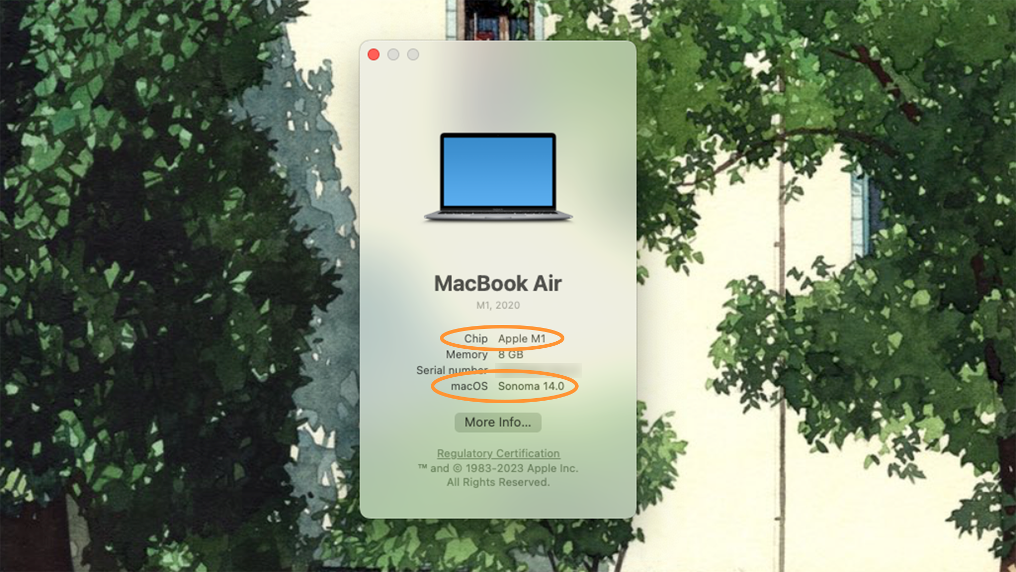
Hand gesture reactions are one of macOS Sonoma's coolest new features
Article Introduction:macOS Sonoma's new gesture response feature makes online interaction more fun! Apple seems to know this well and has added gesture response function to macOS Sonoma. This feature is not only available for FaceTime, but is also compatible with other video calling platforms such as Google Meet, Zoom, and Microsoft Teams.
Users with Mac compatible can now celebrate colleagues with cool fireworks effects or send virtual love to their partner without any clicks or touches.
Compatibility check
To experience the new gesture response function of macOS, you need to meet two system requirements, and you can confirm whether they are all met through a menu.
Animation gesture dependency
2025-02-24
comment 0
717
How to create a CSS-only animated search bar?
Article Introduction:Yes, you can create an animation search bar with CSS only. The key is to use: focus pseudo-class, transition and reasonable layout to achieve interactive effects. The specific steps are as follows: 1. Build the infrastructure with HTML, including input boxes and optional search icons; 2. Use CSS to set the container centering and set the default style of the input box, including rounded borders, inner margins and transition effects; 3. Define the hover and focus states through: hover and: focus pseudo-classes, expand the width, change the border color and add shadows when focusing; 4. Optionally add search icons, and use absolute positioning or adjacent brother selectors ( ) to trigger animation effects when focusing, such as color changes and displacement; 5. Ensure that the transition time is between 0.3s and 0.5s, ensure that the transition time is between 0.3s and 0.5s,
2025-08-04
comment 0
190

What is requestAnimationFrame
Article Introduction:requestAnimationFrame (rAF) is more suitable for animation than setTimeout or setInterval because it is synchronized with the browser refresh mechanism to achieve smoother and more efficient animation effects. ① rAF will call the specified function before the next repaint of the browser, usually execute at a frequency of 60 frames per second to make the animation smoother; ② When the tab page is not in the foreground, it will automatically pause and save resources; ③ When using it, start the animation loop by recursively calling requestAnimationFrame and stop avoiding memory leaks under appropriate conditions; ④ Pay attention to avoid frequent operation of DOM, it is recommended to use high-performance properties such as transform and use the timestamps received by the callback function for precise control; ⑤
2025-07-03
comment 0
206

10 Simple CSS and JavaScript Micro-interactions for Buttons
Article Introduction:Web button micro-interaction design: Ten tips to improve user experience
This article will introduce ten simple ways to add micro-interactions to web buttons to enhance user experience and make the website more attractive.
Core points:
Enhanced user experience: Microinteraction provides instant feedback, improve user participation, and improve overall user experience.
Multiple effects: The tutorial covers a variety of effects such as sound, border animation, 3D transformation, and more complex interactions such as shape and text changes.
Accessibility and Interaction: Sound-based micro-interactions are especially useful for improving accessibility, especially on mobile devices.
Use of CSS and JavaScript: All effects are dynamically interspersed through CSS styles and animations and JavaScript
2025-02-08
comment 0
1044

Is Debian Strings compatible with multiple browsers
Article Introduction:"DebianStrings" is not a standard term, and its specific meaning is still unclear. This article cannot directly comment on its browser compatibility. However, if "DebianStrings" refers to a web application running on a Debian system, its browser compatibility depends on the technical architecture of the application itself. Most modern web applications are committed to cross-browser compatibility. This relies on following web standards and using well-compatible front-end technologies (such as HTML, CSS, JavaScript) and back-end technologies (such as PHP, Python, Node.js, etc.). To ensure that the application is compatible with multiple browsers, developers often need to conduct cross-browser testing and use responsiveness
2025-04-02
comment 0
1119

How to create animations on a canvas using requestAnimationFrame()?
Article Introduction:The key to using requestAnimationFrame() to achieve smooth animation on HTMLCanvas is to understand its operating mechanism and cooperate with Canvas' drawing process. 1. requestAnimationFrame() is an API designed for animation by the browser. It can be synchronized with the screen refresh rate, avoid lag or tear, and is more efficient than setTimeout or setInterval; 2. The animation infrastructure includes preparing canvas elements, obtaining context, and defining the main loop function animate(), where the canvas is cleared and the next frame is requested for continuous redrawing; 3. To achieve dynamic effects, state variables, such as the coordinates of small balls, are updated in each frame, thereby forming
2025-06-22
comment 0
439

Creating complex CSS Gradient backgrounds and effects
Article Introduction:CSS gradient backgrounds enable complex visual effects through cascading, animation and blending modes. 1. Multiple gradients can be separated by commas, and the bottom layer is drawn from the upper layer. It is recommended to use translucent colors and different directions to enhance the levels; 2. Animation can be implemented through background-position or keyframes, pay attention to performance and transition effect control; 3. Mix-clip:text can make gradient text, mask-image combined with gradient can realize image masking, mix-blend-mode is used for element interaction design.
2025-07-12
comment 0
435
