Found a total of 10000 related content

How to make Bootstrap navbar sticky on top?
Article Introduction:Use fixed-top class or position:sticky to implement the navigation bar to fix the top. Bootstrap provides fixed-top class, which can be directly added to the navbar to achieve fixed effects, but you need to add padding-top to the body to avoid content being blocked; if you need more flexible control, you can set position:sticky, top value and z-index by custom CSS; in addition, you need to note that the parent container cannot have overflow:hidden, top value must be set, and z-index is recommended; common problems include style overlay, element overlap, and the incorrect introduction of CSS files. It is recommended to troubleshoot the style application through developer tools and avoid it.
2025-07-20
comment 0
751

How to make a full-screen mobile navbar in Bootstrap?
Article Introduction:Implementing a full-screen mobile navigation bar in Bootstrap requires combining default components and custom styles; 1. Using the Bootstrap default navbar structure as the basis to build a responsive navigation bar; 2. Add a custom CSS style to cover the full screen and center the content when the menu is expanded; 3. You can automatically close the navigation bar after clicking the link through HTML attributes or JavaScript; 4. Pay attention to setting detailed optimizations such as z-index, padding-top, transition animation and scroll control to improve the experience.
2025-07-17
comment 0
426

What is the purpose of the element?
Article Introduction:Tags are used in HTML5 to define page navigation areas, which have semantic effects and can improve accessibility and SEO performance. 1. It clearly tells the browser and auxiliary devices that this area is navigation, which facilitates users to quickly jump. 2. The common usage is to combine the display link group, with clear structure and easy to control style. 3. Not all links need to be wrapped in, only primary navigation is applicable, such as top and bottom navigation. 4. Abuse will reduce the experience of auxiliary equipment. It is recommended to use 1 to 2 on a page. 5. Rational use will help search engines understand the website structure and improve inclusion and ranking.
2025-07-17
comment 0
655

How to create a multi-page website using HTML?
Article Introduction:The steps to create a multi-page website are as follows: 1. Plan the website structure, clarify the page content and list it; 2. Create an independent HTML file and add a unified navigation bar; 3. Set the link path correctly to ensure normal jumps; 4. Introduce public CSS files to maintain consistent style. Follow these steps to achieve a multi-page website with clear structure and complete functions.
2025-07-06
comment 0
165

Should navigation links always be in a tag?
Article Introduction:Use tags more standardized but not required. HTML5 semantic tags can improve the clarity of the page structure, and are designed to wrap main navigation links, such as main navigation bar, side menu, footer link group, etc. 1. The main navigation area such as the main navigation bar on the top or sidebar should be used. 2. Auxiliary navigation such as footer links, paging navigation, etc. are also applicable. 3. Multi-link collections are recommended for navigation. Use improves barrier-free experience, facilitates maintenance and facilitates SEO. However, individual jump links, article embedded links, non-navigation-purpose links, etc. can be omitted and used directly. In actual development, it is recommended to use it reasonably to avoid abuse, and to combine ARIA attributes with better style control, and do not affect structural semantics.
2025-07-17
comment 0
689

okex exchange mobile app download tutorial diagram
Article Introduction:How to download the OKEx exchange application: Visit the official website https://www.okex.com/. Click the Download option in the top navigation bar. Select "Android" or "iOS" according to your mobile device system. Follow the prompts to download and install the application. Sign up or log in to your account to start trading.
2025-02-16
comment 0
841

How to create a double row navbar in Bootstrap?
Article Introduction:The core method of implementing a dual-row navigation bar in Bootstrap is to combine structures and style adjustments. 1. Use nested containers to build a double-row structure, use two independent .navbars or .containers to place the top and bottom navigation content respectively, the first line places secondary information such as language switching and contact information, and the second line is used as the main menu; 2. Use Flex layout to merge into a container, set d-flexflex-column through the outer div to achieve vertical stacking, and manage styles and widths uniformly; 3. Optimization details include controlling spacing, responsive hiding the first line content, style isolation, and color matching coordination. These steps allow for a clear structure and responsive and friendly dual-line navigation bar.
2025-07-22
comment 0
750

How to make a bottom navbar in Bootstrap?
Article Introduction:The key to making the bottom navigation bar at Bootstrap is to have a clear structure and correct style. First, use the nav elements to build the basic structure with the .nav and .nav-pills classes, and fix the navigation at the bottom through fixed-bottom; second, arrange the ul and li elements in HTML and combine the active class to select highlights; then, use mx-auto to center the content, and optimize the visual effects to the mobile terminal adaptation through the FontAwesome icon and responsive class; finally, pay attention to avoid using navbar-nav and deal with content occlusion and compatibility issues caused by fixed positioning, and realize a practical and beautiful bottom navigation bar.
2025-07-24
comment 0
153
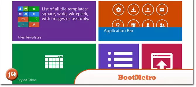
10 Popular Metro Bootstraps
Article Introduction:Explore 12 Exceptional Metro Bootstrap Templates & Themes for Your Next Web Project!
Need to design a website or web app with the sleek Windows 8 Metro style? This curated list of 12 top-notch Metro Bootstrap templates and themes will jumpstart
2025-02-24
comment 0
873

Structuring a webpage with HTML5 section and article tags
Article Introduction:Used to organize logical blocks in the page, such as chapters or functional areas, suitable for classified content; used for content that is independently included, such as blog posts, comments, etc., can exist out of context. For example, it is used for website navigation bar and home page function module, while it is used for articles and user comments in the blog list. When using it, consider whether the content is independent and portable to improve semantics and SEO effects.
2025-07-05
comment 0
202

How to obtain a secure and trusted bitget application software?
Article Introduction:To ensure the security of your Bitget application, be sure to download it from the official website. Click the "Download" button on the top navigation bar of the website and select the corresponding download link based on your device type. Will be redirected to the official app store, such as the Apple App Store or Google Play Store, and follow the instructions to install the app. Note that download only from the official website, check the developer name is "Bitget Global" and read the permissions requested by the application. Update the app regularly and treat suspicious download links with caution for security.
2025-03-04
comment 0
790

Where is Binance's P2P transaction? What is the process for Binance P2P to purchase USDT
Article Introduction:Binance provides a convenient P2P trading platform where users can trade directly with other users. First, users need to log in to Binance's official website or mobile application. On the home page, users can find P2P trading options, usually located in the navigation bar at the top of the page. After clicking on P2P transactions, the user will be directed to the page of P2P transactions, where you can see various advertising and trading options.
2025-05-28
comment 0
253

Sesame gate trading app official website entrance
Article Introduction:After you visit the official website, if you have the need to download the APP, in the navigation bar at the top of the official website page, gently hover the mouse over the "User Center" option. A drop-down menu will pop up, and you will find and click the "Download App" option. The page will jump to the download page of the corresponding Android version of the app. Follow the prompts and guidance on the page to successfully complete the download and installation of the Android version of the app.
2025-03-31
comment 0
579
Watch the entrance video of the domestic blockbuster movies on Bilibili online
Article Introduction:Visit the Bilibili website: Please make sure your device is connected to the network, then enter "www.bilibili.com" in the browser address bar and access the website. Bilibili account login: If you do not have a Bilibili account yet, please register one first. Once you log in, you can use more features such as favorite videos, post comments, and send barrage. Enter the domestic drama area: Find the "Movie and TV" tab in the navigation bar at the top of the homepage of the website, click and select "Domestic Dramas" to browse the rich domestic film resources. Search for videos: Enter the name of the movie you want to watch in the search bar in the upper right corner of the page, then press Enter or click the search icon to start the search. Start playing: After finding the target video, click on its cover or enter the details page, and then click Play
2025-06-04
comment 0
852

How to create a page header with the element in HTML
Article Introduction:When creating a page header with elements, it should be used as a semantic label to wrap the introduction content of the web page or area. 1. Usually, one is placed at the top of the page, including the website title, navigation menu, etc.; 2. It can include the title and navigation elements; 3. Avoid only for style layout, and should be visually beautified in combination with CSS; 4. Pay attention to avoiding multiple tags and neglecting accessibility issues. Correct use can improve SEO and user experience, and ultimately achieve a clear and easy-to-maintain web header.
2025-08-01
comment 0
369

How to make a transparent navbar in Bootstrap?
Article Introduction:The core of implementing a transparent navigation bar in Bootstrap is to clear the default style and adjust the color and layout. First, set the background color to be transparent and remove shadows and borders. Second, deal with the background changes that may be triggered during scrolling, then set the link color and hover effect according to the background. Finally, if you use fixed positioning, you need to add a top margin to the body to avoid the content being blocked. 1. Set the background-color of .navbar to transparent and remove box-shadow and border; 2. If using Bootstrap5, check and remove bg-light or bg-dark classes; 3. Add .navbar.scrolled style to ensure scrolling
2025-07-23
comment 0
132

Bootstrap 5 Mastery: From Zero to Pro in Building Modern Websites
Article Introduction:Bootstrap5 is a front-end framework based on HTML, CSS and JavaScript. It provides a wealth of components and tools to help developers quickly build responsive websites. 1) The grid system is one of its core functions, organizing content through rows and columns to ensure that it can be displayed well on different devices. 2) Provides rich components, such as buttons, forms, navigation bars, etc., to achieve various styles and interactive effects through simple class names. 3) It contains many JavaScript plug-ins, such as modal boxes, carousel pictures, etc., to enhance the interactivity of the website. 4) The basic usage includes creating a navigation bar, and the advanced usage includes using card components to create dynamic product display pages. 5) Common errors and debugging techniques include checking the spelling of class names and using developers
2025-04-03
comment 0
976

AtoZ CSS Screencast: The Hover Pseudo Class
Article Introduction:Core points
:hover pseudo-class is a practical tool for providing visual feedback when the mouse is hovered over links and buttons. It can be styled in a variety of ways, such as changing the color, size, or orientation of an element. However, its reliability on touch devices is not consistent and should not be used to hide critical information.
Other pseudo-classes can be used to style different link states, such as: visited for links in user browser history,:active for links being clicked, and:focus for links currently in focus on the keyboard. These can be combined in a reset style sheet to set default values ??for the project.
The :hover pseudo-class can also be used to create drop-down menus in the main navigation of the website. This involves hovering on top
2025-02-20
comment 0
815

