

Responsive mall web template
All resources on this site are contributed by netizens or reprinted by major download sites. Please check the integrity of the software yourself! All resources on this site are for learning reference only. Please do not use them for commercial purposes. Otherwise, you will be responsible for all consequences! If there is any infringement, please contact us to delete it. Contact information: admin@php.cn
Related Article
 Bootstrap and React: Creating Responsive Web Applications
03 May 2025
How to create responsive web applications using Bootstrap and React? By combining Bootstrap's CSS framework and React's componentized architecture, modern, flexible and easy to maintain can be created. The specific steps include: 1) Importing the CSS file of Bootstrap and using its class to style React components; 2) Using React's componentization to manage state and logic; 3) Loading Bootstrap styles as needed to optimize performance; 4) Creating a dynamic interface using React's Hooks and Bootstrap's JavaScript components.
 Bootstrap: Simplifying Responsive Web Development
09 May 2025
Bootstrap simplifies the development process mainly through its raster system, predefined components and JavaScript plug-ins. 1. The grid system allows for flexible layout, 2. Predefined components such as buttons and navigation bars simplify style design, 3. JavaScript plug-in enhances interactive functions and improves development efficiency.
 Implementing Responsive Web Design with CSS Grid
20 Jul 2025
The key to using CSSGrid for responsive web design is to understand its layout mechanism and adjust it in combination with media query. 1. Use grid-template-columns and grid-template-rows to define the row-column size, and create a flexible layout in conjunction with repeat() and fr units; 2. Use minmax() to realize column width adaptation to reduce media query requirements; 3. Set breakpoints such as mobile phones, tablets, and desktops, and adjust the number of columns respectively; 4. Use grid-column, grid-row and grid-area to rearrange element positions at different breakpoints, enhance responsiveness, and ultimately achieve a flexible and stable layout.
 How Can Bootstrap Media Queries Achieve Scalable Text Modifications for Responsive Web Design?
14 Dec 2024
Scalable Text Modifications with Bootstrap Media QueriesQuestion:For a responsive web layout, how can Bootstrap 3 media queries be utilized to...
 How can JSP Tag Files be used for efficient template inheritance and reusable components in web development?
13 Dec 2024
JSP Tag Files: A Powerful Tool for Template InheritanceFor simple static JSP projects, JSP Tag Files offer an ingenious solution for template...
 Exploring the HTML `` and `` elements for web components.
03 Jul 2025
Define unrendered HTML templates, suitable for component reuse; reserve slots to implement content distribution. Content can be dynamically inserted by JS, but the resources will not be rendered initially or loaded; external incoming content is allowed to replace the default value, and named slots are supported. Both are commonly used in WebComponents, and are combined with CustomElements to create custom elements that can encapsulate structures and styles. Steps: Create a template → Define the class inheritance HTMLElement → attachshadowroot → Clone the template and add shadowDOM → Register custom elements.
 Explain the purpose of the?<template>?and?<slot>?elements in Web Components.
25 Mar 2025
The article discusses the roles of <template> and <slot> in Web Components, focusing on their use for creating modular, reusable UI elements. It argues that these elements enhance performance, reusability, and flexibility
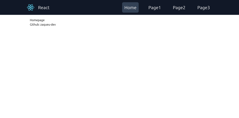 React/Tailwind template with default responsive NavBar.
16 Nov 2024
I was just annoyed with excluding App.test.js and all those default files that I would not use in my React project, and also I've never found a good navbar other than that free version of navbar from Tailwind UI website, which is not the best navbar
 Bootstrap: The Key to Responsive Web Design
08 May 2025
Bootstrap is an open source front-end framework developed by Twitter, providing rich CSS and JavaScript components, simplifying the construction of responsive websites. 1) Its grid system is based on a 12-column layout, and the display of elements under different screen sizes is controlled through class names. 2) The component library includes buttons, navigation bars, etc., which are easy to customize and use. 3) The working principle depends on CSS and JavaScript files, and you need to pay attention to handling dependencies and style conflicts. 4) The usage examples show basic and advanced usage, emphasizing the importance of custom functionality. 5) Common errors include grid system calculation errors and style coverage, which require debugging using developer tools. 6) Performance optimization recommendations only introduce necessary components and customize samples using preprocessors


Hot Tools
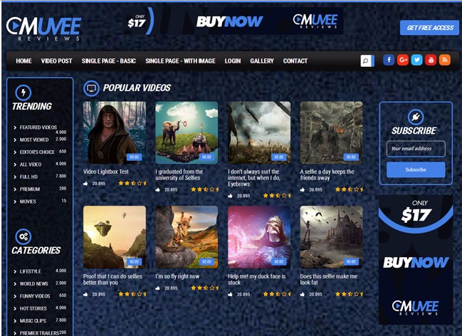
Bootstrap video website template
Bootstrap video website template is a movie website template download based on HTML5+CSS3.
Fashion trend waterfall flow layout responsive website bootstrap template
Fashion trend waterfall flow layout responsive website bootstrap template free download
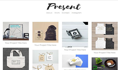
Literary and concise VI design company corporate responsive official website
Literary and simple VI design company corporate responsive official website template free download
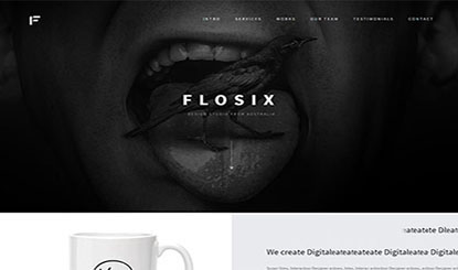
FLOIX Industrial Designer Studio official website template
FLOIX industrial designer studio official website template free download