Found a total of 10000 related content
A jQuery Plugin for Touch Swiping - Part 1 of 2
Article Introduction:This article details building a jQuery plugin for detecting horizontal swipes on touch devices. Part one focuses on creating a responsive image carousel. Part two (not included here) will add swipe detection.
Key Concepts:
This tutorial creates a j
2025-02-24
comment 0
1079

How to Build a Simple jQuery Slider
Article Introduction:This article will guide you to create a simple picture carousel using the jQuery library. We will use the bxSlider library, which is built on jQuery and provides many configuration options to set up the carousel.
Nowadays, picture carousel has become a must-have feature on the website - one picture is better than a thousand words!
After deciding to use the picture carousel, the next question is how to create it. First, you need to collect high-quality, high-resolution pictures.
Next, you need to create a picture carousel using HTML and some JavaScript code. There are many libraries on the web that can help you create carousels in different ways. We will use the open source bxSlider library.
The bxSlider library supports responsive design, so the carousel built with this library can be adapted to any
2025-03-11
comment 0
910
30 jQuery Responsive Layout Plugins
Article Introduction:This article explores 30 helpful jQuery responsive layout plugins for web designers creating adaptive, mobile-friendly websites. These plugins offer various features, including dynamic layouts, image resizing, carousels, and content scrolling, ensur
2025-02-28
comment 0
789
10 jQuery and CSS3 Mobile App Styles
Article Introduction:10 amazing jQuery and CSS3 mobile application styles are worth a try!
Today we show you 10 amazing jQuery and CSS3 mobile app styles, they are so cool and definitely worth your experience!
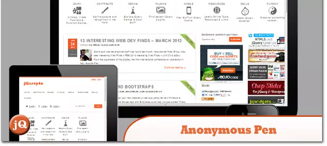
Anonymous pen: Responsive web design detector
Source code and demonstration
Twitter button without iframe
Embedding Tweets or following buttons on responsive websites can be a bit tricky because they can greatly increase page loading time. However, they are a great way to spread a new blog post or article.
Source code and demonstration
Android clock animation
Create animated effects of Android docking clock.
Source code and demonstration
Device switcher
Show responsive
2025-02-23
comment 0
758
12 jQuery Fullscreen Plugins
Article Introduction:12 amazing jQuery full screen plug-ins to create a fascinating website!
Sometimes, full-screen websites are really cool! If a website looks plain, how long do you think visitors will stay? So, we have prepared some good stuff to help you: 12 jQuery full-screen plugins that give your website a stunning full-screen responsive effect! These plugins will add extraordinary visuals to your website. Ready?
Related recommendations:
100 jQuery picture/content slider plug-ins
30 jQuery responsive layout plug-ins
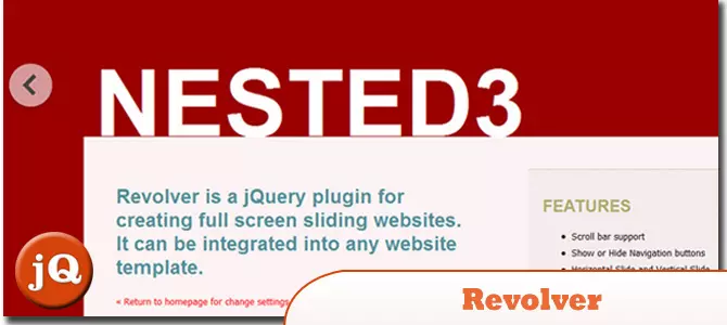
Revolver
A jQuery plugin for creating full-screen sliding websites. It can be integrated into any website template.
Source code
2025-02-25
comment 0
581
10 Premium jQuery Image/Content Sliders Plugins
Article Introduction:Ten powerful jQuery slide plug-ins are recommended to help you create a cool website!
The following are ten excellent jQuery slide plug-ins on Code Canyon. They are powerful and have amazing effects, which will definitely add a lot of color to your website. All pictures are copyrighted by their respective authors.
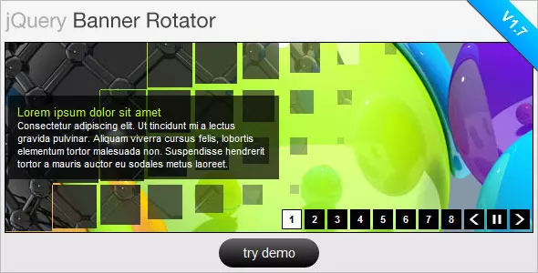
jQuery Banner Rotator / Slideshow
This jQuery banner carousel plug-in has a variety of cool switching effects. Thumbnails and buttons are easy for users to browse banners/ads. It also supports resizing and can be configured via plug-in parameters.
Estro – jQuery Ken Burns & Swipe effect
2025-02-24
comment 0
1009
How to create a responsive website from scratch using CSS?
Article Introduction:Viewport meta tags must be added to ensure that the page is rendered correctly by mobile devices; 2. Adopt a mobile-first strategy, first design the mobile style, and then enhance the layout for tablets and desktops through min-width media query; 3. Use percentage, rem, fr and other relative units to build streaming layouts to avoid fixed pixel values; 4. Use Flexbox or CSSGrid to achieve flexible responsive structures, such as vertical stacking navigation on mobile terminals, large-screen grid layout; 5. Responsive typesetting use rem or clamp() functions to make the fonts scale with the screen; 6. Test the display effect under different screen sizes through browser developer tools and real devices to ensure no overflow or interaction problems, and ultimately achieve pure HTML/C without frameworks
2025-08-01
comment 0
530
10 Premium jQuery Image Gallery Plugins
Article Introduction:Selected 10 best jQuery picture gallery plugins for CodeCanyon
The following are the top ten best jQuery picture library plugins on CodeCanyon for your reference:
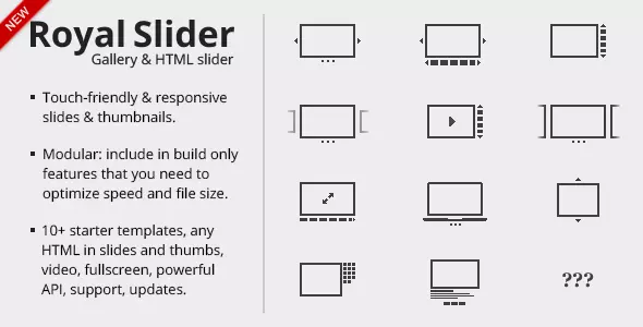
RoyalSlider – jQuery image library that supports touch
RoyalSlider is an easy-to-use jQuery image gallery and content slider plugin with animated subtitles, responsive layouts and touch support for mobile devices.
Megafolio Gallery jQuery plugin
Megafolio is a highly customizable jQuery plugin for displaying your image gallery or portfolio. It takes advantage of the power of jQuery to masonry fabric
2025-02-24
comment 0
1182

Bootstrap Navbar: Common Errors
Article Introduction:Common errors when using BootstrapNavbar include responsive design failures, style not meeting expectations, and JavaScript issues. 1. Make sure to correctly configure the responsive design using the navbar-expand-* class. 2. Overwrite the Bootstrap default style with a custom CSS file to achieve the expected effect. 3. Correctly reference Bootstrap's JS file and use a compatible jQuery version to avoid JavaScript errors. This will help you build a navigation bar that is both beautiful and efficient.
2025-06-03
comment 0
328

10 jQuery Flip Effect Plugins
Article Introduction:Ten excellent jQuery flip effects plugins allow your HTML content and images to achieve 360-degree flip animation effects, using the transform and rotate attributes of jQuery and CSS3. These plugins are perfect for displaying your portfolio, come and try it out!
Related recommendations:
15 amazing jQuery animation design plugins
10 Very Attractive JQuery Widgets
Paid Products – Responsive page turn book based on jQuery
Completely based on HTML and jQuery, no Flash player required. Supports desktop and mobile devices!
Portfolio flip slider based on jQuery and CSS3
Click the paging button to trigger the slider to flip, each time
2025-02-25
comment 0
1261

How to use media queries for responsive design
Article Introduction:Media query is the basic tool for responsive website design, enabling multi-device compatibility by switching styles based on device characteristics (such as screen width). Its basic syntax is @media media type and (condition){CSS rules}, for example, using @mediascreenand(max-width:767px) to adjust the style of the small screen. It is recommended to adopt a mobile priority strategy, first define the mobile phone style and then gradually adapt to a larger screen. Pay attention to when using: ① Select a general breakpoint instead of a specific device size; ② Set the viewport meta tag to ensure that the mobile terminal takes effect; ③ Avoid relying solely on browser zoom tests; ④ Only modify the styles that need to be adjusted in media queries. Mastering media queries helps build a responsive layout with clear structure and easy to maintain.
2025-06-30
comment 0
506

How to make your HTML responsive for mobile devices?
Article Introduction:The key to achieving friendly display of web pages on mobile phones is the coordination of HTML and CSS. The following points should be paid attention to: 1. Set the viewportmeta tag to ensure correct rendering on the mobile side; 2. Use media query to apply styles according to different screen sizes; 3. Use flex or grid to achieve elastic layout; 4. Control the image size to adapt to different containers; 5. Use developer tools, real machines or online tools to verify the effect during testing. Every step is crucial, and omissions can affect the overall responsive experience.
2025-07-05
comment 0
667
How to create a responsive blog layout with CSS?
Article Introduction:To create a responsive blog layout, the following steps must be followed: 1. Adopt a mobile-first design method, first write basic styles for the small screen, and then adapt to the large screen through media query; 2. Use CSSGrid or Flexbox to build a flexible page structure, such as using Grid to implement responsive grid layout of the main content and sidebar; 3. Add breakpoints to optimize the display effect of different devices, use two column layouts above 768px, and further improve the layout and font size above 1024px; 4. Use clamp() function to implement responsive fonts to ensure that the text has good readability on various devices; 5. Set max-width:100% to zoom the picture with the container to avoid overflow. Finally, through reasonable HTML structure and
2025-08-02
comment 0
517

What are meta tags in HTML and what are they for?
Article Introduction:Meta tags are text snippets in HTML that describe the content of web pages. They are not displayed on the page, but are used by browsers and search engines to correctly display and understand the website. They are located in the HTML document, and common types include: 1. Charsetmeta tags (set character encoding); 2. Viewportmeta tags (influence mobile device responsive design); 3. Descriptionmeta tags (influence page summary in search engine results); 4. OpenGraph/TwitterCards (control web page sharing display on social media). Meta tags have an auxiliary effect on SEO, such as improving click-through rate and improving mobile display, but some tags are like k
2025-07-14
comment 0
600

How to create a sidebar navbar with Bootstrap 5?
Article Introduction:To add a side navigation bar to a web page, use Bootstrap5 to implement it in the following steps: 1. Use the grid system to build a two-column layout, with the sidebar on the left and the main content area on the right; 2. Use the nav component to build a vertical navigation menu, and realize vertical arrangement through the flex-column class; 3. If you need a mobile folding effect, you can combine the Collapse plug-in to achieve responsive switching; 4. Add custom CSS styles to optimize scrolling, hovering and activation status and other details. The structure is clear and the class name is correct to quickly build the responsive sidebar.
2025-08-03
comment 0
899

How do media queries enable responsive web design for different screen sizes and devices?
Article Introduction:Media query is a CSS feature that allows different styles to be applied according to the screen size, resolution, or direction of the device, thereby enabling responsive web design. Its core function is to optimize the layout display effect on different devices through condition judgment. For example, hide the menu to fit the mobile device when the screen width is less than 768px. It helps developers adjust layout structure, font size, element visibility and image switching without modifying HTML. Typical application scenarios include adaptation of mobile phones (480px), tablets (768px), and desktop devices (1024px or 1200px). It is recommended to adopt a mobile-first strategy and flexibly set breakpoints in combination with content needs. When using it, you need to pay attention to testing the actual screen width and reasonably matching min-widt
2025-06-17
comment 0
281

What is the purpose of the element?
Article Introduction:The function is to display structured two-dimensional data, such as score sheets, timetables, etc.; it is not used for page layout. The correct way to use it includes: 1. wrap the entire table with it; 2. define the table header; 3. contain the main content; 4. represent a row; 5. or define a cell. Auxiliary tags include: add title; define column attributes; display the bottom summary information. Notes: Avoid complex structures, reduce the number of columns to improve the mobile experience, and use a responsive framework to optimize the display effect.
2025-07-01
comment 0
550

How does the viewport meta tag work in HTML?
Article Introduction:The viewport meta tag must be added to ensure that the web page is displayed correctly on mobile devices. 1.width=device-width sets the viewport width to the device screen width to avoid the browser being rendered by default by the desktop width. 2.initial-scale=1 sets the initial scaling ratio to 100%, ensuring that the page is loaded in a natural size and preventing text from being automatically adjusted. Other optional settings such as user-scalable=no or maximum-scale=1 may damage accessibility, so it is not recommended. This tag is crucial to responsive design, ensuring that media queries and layout breakpoints take effect normally, improving mobile user experience, and it should always be placed in the head of HTML.
2025-08-02
comment 0
557

HTML `viewport` Meta Tag for Responsive Design
Article Introduction:The viewportmeta tag is the basis for mobile adaptation, and its core function is to control the display of web pages on mobile devices. 1. It sets width=device-width to match the actual width of the device; 2. Initial-scale=1 ensures that the initial scaling ratio of the page is 1, avoiding the browser's automatic scaling resulting in too small text or misplaced layout; 3. If viewport is not set, responsive layout failure, media query cannot take effect, and inaccurate click areas may occur; 4. It is recommended to keep it simple and set basic parameters only to avoid restricting user scaling to improve accessibility; 5. At the same time, media query, relative units, picture adaptation and other means can be combined to achieve the completion.
2025-07-23
comment 0
721
How to create a responsive image carousel with CSS scroll-snap?
Article Introduction:Create a container containing multiple pictures as a carousel diagram structure; 2. Use flex layout and scroll-snap-type:xmandatory to achieve horizontal scrolling and ensure that each picture is aligned and docked; 3. Set the picture style to flex:00100% and cooperate with scroll-snap-align:start to accurately stop each scroll at the starting position of each picture; 4. Adjust the image width under different screen sizes through media query to achieve responsive effects of single images on mobile, large images on tablets with preview, and double images on desktops on side by side; 5. Optionally add visual prompts or navigation buttons to improve user experience, but the basic functions can achieve smooth scrolling without JavaScript, and finally get a lightweight
2025-08-02
comment 0
721
