Found a total of 10000 related content
Embracing Tailwind CSS: A New Era of Styling for Web Developers
Article Introduction:Let's start to get rid of that forever long CSS file and start enhancing your styling experience with Tailwind CSS! It makes styling your code directly in your html or React component easy to do and easy to organize.
What is Tailwind CSS?
Tailwind C
2024-10-21
comment 0
419
What are CSS preprocessors and why use them?
Article Introduction:CSS preprocessor is a tool that enhances CSS development. 1. It reduces duplicate code and manages styles uniformly through variable definitions (such as $primary-color); 2. It supports nested structures (such as .navbar directly writes ul and li) to make the code logic clearer; 3. It provides mixin function to achieve style reuse (such as btn-style); 4. It can automatically add browser prefixes in combination with PostCSS to improve compatibility. Suitable for long-term maintenance projects, team collaboration and component development scenarios, but small projects or novices can directly use native CSS.
2025-07-21
comment 0
472

How to disable a form input or button?
Article Introduction:To disable the input box or button in an HTML form, use the disabled property. 1. Just add the disabled attribute directly to HTML: or Submit. Both writing methods are valid, but HTML5 recommends using a valueless abbreviation. 2. Dynamic control can be used through JavaScript: set the disabled attribute of the element to true or false, such as document.getElementById("myInput").disabled=true;. 3. Optionally use CSS to beautify the disabled state: select by input: disabled, button: disabled
2025-08-01
comment 0
543

What is BEM (Block, Element, Modifier) methodology, and how does it help in writing scalable CSS?
Article Introduction:BEM is a CSS naming specification that creates reusable components and maintains extensible stylesheets. 1. Block is an independent component, such as a button or a menu; 2. Element is a child element attached to a Block, such as a menu item; 3. Modifier is a sign that changes appearance or behavior, such as the disabled state of a button. Through the naming method of block-name__element-name--modifier-name, improve code predictability, avoid conflicts, facilitate collaboration and component reuse. For example, use .btn and .btn--secondary to implement basic buttons and variants. When applying, you need to pay attention to identifying blocks, use double underscores and double hyphens correctly, and avoid oversight.
2025-06-06
comment 0
456
What is BEM (Block, Element, Modifier) methodology?
Article Introduction:BEM is a naming specification for writing maintainable HTML and CSS. 1. Block is an independent and reusable component, such as .menu or .button, which should be named semantically; 2. Element is an integral part of Block, named such as .menu__item, which should not exist alone and should not be nested too deeply; 3. Modifier represents state or variant, such as .button--primary, which should only define different styles and avoid complex combinations; BEM improves naming clarity, reduces conflicts, facilitates maintenance and unifies team structure.
2025-06-24
comment 0
857

How to implement Bootstrap ordered lists?
Article Introduction:Bootstrap does not have a dedicated ordered list component, it implements ordered lists through CSS classes using native HTML <ol> and <li> tags. The easiest way is to use <ol> and <li> directly, and then use Bootstrap's classes (such as .list-group and .list-group-item). More flexible style control can be implemented through custom CSS or Less/Sass, with attention to responsive design and browser compatibility.
2025-04-07
comment 0
652

JavaScript CSS-in-JS Libraries (Styled Components, Emotion)
Article Introduction:CSS-in-JS improves maintainability by combining styles with component logic. 1. Its core advantage is scope isolation and avoid style conflicts; 2. It supports dynamic styles and directly modify styles based on props; 3. It integrates well with React and is suitable for component development. StyledComponents is easier to use and has a mature ecosystem; Emotion is more flexible, supports object syntax and has good performance optimization. When using it, you need to pay attention to the style loading order, debugging complexity and performance considerations, but it is still practical in modern React projects.
2025-07-22
comment 0
908

Explain how styling is handled in React components (CSS-in-JS, Modules, etc.).
Article Introduction:There are three common style processing methods in React: CSS-in-JS, CSSModules and global CSS. CSS-in-JS directly writes component styles through JavaScript files, supporting variables, conditions and dynamic styles, such as styled-components; CSSModules implements modular CSS through .module.css file to avoid class name conflicts; global CSS is suitable for small projects or legacy systems, but naming conflicts should be paid attention to. The selection should be based on project size and team preferences: select CSS-in-JS when dynamic style is needed, and select CSSModules when using normal CSS and module scope is needed. Small projects or old systems can
2025-07-15
comment 0
500

How to implement a dark mode theme switcher in Vue
Article Introduction:Create a theme switching component, use the checkbox to bind the isDarkMode state and call the toggleTheme function; 2. Check localStorage and system preferences in onMounted to initialize the theme; 3. Define the applyTheme function to apply the dark-mode class to the html element to switch styles; 4. Use CSS custom properties to define bright and dark variables, and overwrite the default styles through the dark-mode class; 5. Introduce the ThemeSwitcher component into the main application template to display the toggle button; 6. Optionally listen to prefers-color-scheme changes to synchronize the system theme. This solution uses Vue
2025-08-02
comment 0
653
What is the :root pseudo-class and how does it differ from html?
Article Introduction::root is used in CSS to select document root elements, usually equivalent to tags in HTML, but with higher specificity. 1.:root is suitable for defining global CSS variables, such as --main-color; 2. It provides higher priority to avoid style conflicts; 3. Still applicable in elementless documents (such as XML); 4. It is easier to maintain and dynamically modify topics when combined with component frameworks. Compared to using the html selector directly, :root improves code maintainability and consistency, and is especially suitable for complex projects.
2025-06-25
comment 0
221

How to insert pictures on bootstrap
Article Introduction:There are several ways to insert images in Bootstrap: insert images directly, using the HTML img tag. With the Bootstrap image component, you can provide responsive images and more styles. Set the image size, use the img-fluid class to make the image adaptable. Set the border, using the img-bordered class. Set the rounded corners and use the img-rounded class. Set the shadow, use the shadow class. Resize and position the image, using CSS style. Using the background image, use the background-image CSS property.
2025-04-07
comment 0
1045

What is CSS-in-JS?
Article Introduction:CSS-in-JS is a method of writing CSS styles directly in JavaScript or TypeScript code. 1. It avoids global conflicts by defining styles within components; 2. Use libraries such as styled-components or Emotion to support dynamic styles, pseudo-classes and media queries; 3. Provide scope styles, dynamic customization, code co-location and theme support; 4. However, there is runtime overhead, package size increase, SSR complexity and learning costs; 5. Applicable to complex and dynamic React applications, but traditional CSS or Tailwind may be better in simple projects. Therefore, CSS-in-JS provides a powerful component style solution, but requires trade-offs on performance and complexity
2025-07-31
comment 0
310

How to use utility-first CSS frameworks like Tailwind with Vue?
Article Introduction:The key to using Tailwind in Vue projects is to configure correctly and divide the labor properly. First, install Tailwind and its dependencies; second, configure the content paths of PostCSS and Tailwind; then introduce the basic style of Tailwind in global CSS; finally, use the Tailwind style directly through class in component templates, and optimize the development experience through: class dynamic binding, abstract commonly used combinations as components, and rational use of @apply, etc.
2025-07-01
comment 0
216

Using Bootstrap Components in React: A Step-by-Step Tutorial
Article Introduction:There are two ways to use Bootstrap components in React projects: 1) CSS and JavaScript of the original Bootstrap; 2) Use libraries designed specifically for React such as react-bootstrap or reactstrap. 1) Install Bootstrap through npm and introduce its CSS file in the entry file, and then use the Bootstrap class name in the React component. 2) After installing react-bootstrap or reactstrap, directly use the React components it provides. Use these methods to quickly build a responsive UI, but pay attention to style loading and JavaScript
2025-05-05
comment 0
976
What is CSS-in-JS and what are its pros and cons?
Article Introduction:CSS-in-JS is a method of directly managing component styles through JavaScript. Its core advantages include 1. Scope styles avoid conflicts, 2. Dynamic styles are more flexible, and 3. Rich tool support. It improves maintainability by binding styles to components, and achieves efficient development with libraries such as styled-components, emotion, etc., but it also has disadvantages such as runtime performance overhead and increased build time. It is suitable for project scenarios that require highly dynamic or componentization.
2025-06-27
comment 0
469

How to add icons to Bootstrap list?
Article Introduction:How to add icons to the Bootstrap list: directly stuff the icon into the list item <li>, using the class name provided by the icon library (such as Font Awesome). Use the Bootstrap class to align icons and text (for example, d-flex, justify-content-between, align-items-center). Use the Bootstrap tag component (badge) to display numbers or status. Adjust the icon position (flex-direction: row-reverse;), control the style (CSS style). Common error: The icon does not display (not
2025-04-07
comment 0
787

Setting Custom Mouse Pointer Icons Using CSS cursor Property
Article Introduction:Replacing the mouse pointer style with CSS can be achieved with built-in cursor and custom pictures. 1. Built-in cursor styles include auto, default, pointer, text, wait, help, and directly set such as button{cursor:pointer;}; 2. Custom images need to use url() to specify .cur or .png files, and provide fallback solutions, such as .custom-cursor{cursor:url('icon.cur'),auto;}; 3. You can set hot spots such as cursor:url('pointer.cur')1010,pointer; 4. Apply to games, creative websites or special
2025-07-07
comment 0
803
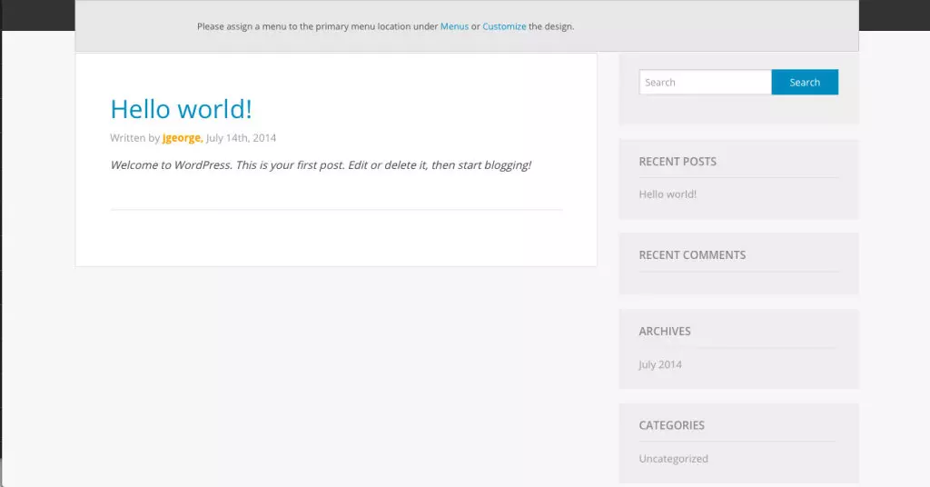
Reverie: A Foundation Based WordPress Starter Theme
Article Introduction:Reverie: A WordPress Introduction Theme Based on Foundation Framework
Reverie is a WordPress introductory theme based on the ZURB Foundation framework, which provides a solid foundation for theme development, including responsive mesh, typography, button styles, and other components. Its lightweight and minimalist design can improve website performance.
Custom Reverie
You can modify CSS and PHP files directly or use WordPress customizer to make simpler changes. This theme supports sub-themes, allowing you to make changes without affecting the original theme file, making it easier to update the theme without losing custom settings.
Reverie to developers
2025-02-17
comment 0
726
Controlling CSS Variable scope and fallbacks
Article Introduction:Controlling the scope of CSS variables can avoid naming conflicts and improve maintenance. 1. Define the variable in a specific parent element rather than in root, such as .button{--btn-bg:#007bff;}, restrict the variable to only act on the component and its child elements; 2. Use fallback value to ensure that there is a default substitution when the variable is not defined, such as color:var(--text-color,#333); 3. Use nesting priority to achieve style override, such as .card.dark internal redefinition --bg and combine naming specifications to reduce the possibility of conflict, thereby improving the flexibility and stability of the style.
2025-07-07
comment 0
304
