Found a total of 10000 related content

Create circular progress bar animation effect using CSS3 and SVG
Article Introduction:You can use CSS3 and SVG to create a circular progress bar animation effect. The steps are as follows: Create an SVG element and define a circular path; set a dotted line style for the circular path; use CSS3 animation to control the offset of the dashed line; set a progress percentage by adjusting the initial offset of the dashed line.
2025-04-04
comment 0
753


8 Cool jQuery Animation Effects Tutorials
Article Introduction:jQuery animation effect tutorial: Say goodbye to Flash animation and embrace the era of jQuery animation!
In the past, animation effects on websites usually rely on Flash. But now, with jQuery, you can easily create various animation effects. The following are some jQuery animation effects tutorials to help you start your journey of painting! Related readings:
10 CSS3 and jQuery loading animation solutions
3D JavaScript animation—three.js
JQuery animation feed display imitating Foursquare
This tutorial will show you how to easily create an RSS scrolling subtitle effect using jQuery.
Source Code Demo
jQue
2025-02-26
comment 0
495

HTML5 page transition effects
Article Introduction:The page switching effect can be achieved through the combination of CSS3 and JavaScript. The specific steps are: 1. Use CSS to define transition styles, such as transition or animation attributes to control page entry and exit animation; 2. Dynamically add or remove class names during page switching through JavaScript to achieve animation triggering and content updates; 3. Pay attention to optimization of performance, avoid layout jitter, and reasonably use hardware acceleration and resource preloading. In addition, you can also use global containers to manage transitions uniformly, use CSS variables to improve flexibility, and set diversified animations for different pages, so as to achieve rich and smooth page switching effects while ensuring user experience.
2025-07-23
comment 0
543

How to create a 3D cube with CSS transforms?
Article Introduction:To create a 3D cube, you need to set up a scene and cube structure containing perspective effects; 2. Use perspective and transform-style:preserve-3d to enable 3D space; 3. Position six faces through rotateX, rotateY and translateZ; 4. Optionally add animation to achieve automatic rotation; 5. Pay attention to the consistency of the size of the face, the hiding of the back face and the adjustment of the center point, and finally use pure CSS to present the 3D cube effect in modern browsers.
2025-08-01
comment 0
402

css modal popup example
Article Introduction:Use pure CSS to implement modal pop-up windows to control the visible and hidden checkbox. 1. Use input[type="checkbox"] as the status switch; 2. Use: checked .modal to control the display of modal boxes; 3. Use label[for] to trigger checking to achieve opening and closing; 4. Add @keyframes animation to achieve fade-in pop-up effect; 5. The close button or mask click area in the modal box can be bound to label control hidden. The entire process does not require JavaScript, is very compatible and has strong accessibility, and is suitable for static pages or lightweight interactive scenarios.
2025-07-28
comment 0
915

How to Create a CSS Typewriter Effect for Your Website
Article Introduction:Pure CSS creates engaging typewriter text effects
Core points:
CSS typewriter effects make website content more dynamic and attractive by gradually displaying text, and can be used for login pages, personal websites and code demonstrations.
Typewriter effects can be created by using the CSS steps() function to change the width of the text element from 0% to 100%, and animation simulation of the cursor of "photo" the text.
Typing effects can be adjusted by increasing or decreasing the number of steps and duration of the typing animation to accommodate longer or shorter text.
Typewriter effects can be used in conjunction with flashing cursor animations to enhance the effect, and the cursor can be customized by adjusting its border-right attribute, color, flashing frequency, and more.
This article will
2025-02-08
comment 0
803

css tooltip example
Article Introduction:The CSSTooltip effect is implemented through pure CSS without JavaScript; 2. Use :hover to trigger visibility and opacity changes to achieve display and fade in animation; 3. The prompt box is positioned by position:absolute, and left:50% plus transform:translateX (-50%) to achieve horizontal centering; 4. Use ::after pseudo-element to create a small arrow pointing down; 5.z-index:1 to ensure that the prompt box is at the top level; 6. You can adjust the attributes such as top, bottom and border-color to achieve prompt boxes in different directions up, down, left and right directions; 7. It is recommended to use vi
2025-07-28
comment 0
733

Creating tooltips with pure CSS
Article Introduction:The method of implementing tooltip with pure CSS is: 1. Use nested HTML structure to wrap the trigger area and prompt content; 2. Control the display and hide of child elements through:hover; 3. Use absolute positioning to set the prompt box position; 4. Add animation to improve the experience; 5. Pay attention to z-index and multi-directional adaptation. The specific implementation includes setting .tooltip as relative positioning, .tooltiptext is hidden by default, becomes visible when hover, and can add transition to achieve fading and delay effects. At the same time, positioning in different directions is controlled through class names, but it should be noted that the effect of hover on the mobile side may be limited.
2025-07-07
comment 0
230

How to create a CSS-only tooltip?
Article Introduction:To create a pure CSS prompt box, you must first set up an HTML structure and use a container containing trigger elements and prompt text; 2. Hidden the prompt text by default through CSS, and use the :hover pseudo-class to achieve hover display; 3. Add position, visibility, opacity and transition attributes to achieve smooth display effect; 4. Optionally add pseudo-elements::after to create a pointing arrow and adjust the position to achieve different directions of up, down, left and right; 5. Key points include using visibility instead of display to support transition animation, ensuring that the parent container is positioned as a relative child element and absolute, and using z-index to ensure complete hierarchical display.
2025-07-28
comment 0
613

Vanilla Javascript: Creating Animated Sticky Navigation Menu
Article Introduction:Core points
Create an animated sticky navigation menus without the need for a jQuery plugin using pure JavaScript, CSS, and HTML. The menu is designed to slide out of view when scrolling down and slide back into view with a translucent effect when scrolling up.
This process involves setting up the basic HTML structure, applying styles to main elements, and then animateing the menu. The animation is triggered by attaching the event handler to the scroll event and using CSS transformation to adjust the position and appearance of the menu according to the scrolling direction.
This custom solution provides more design flexibility and allows easy customization to be done according to specific needs. The end result is a dynamic interactive navigation menu that enhances the user experience.
Web navigation menu design needs to consider many factors, such as dishes
2025-02-16
comment 0
1164

css responsive navbar example
Article Introduction:The responsive navigation bar is implemented through pure CSS, and the answer is to use hidden check boxes and media query to control the display behavior of the menu on the mobile side. 1. The desktop side is displayed as a horizontal navigation menu, which is implemented through flex layout; 2. When the mobile side is below 768px, hide the menu and display the hamburger icon, and trigger the hidden checkbox through label; 3. Use the checked status and ~ selector to control the display and hiding of .nav-menu; 4. After clicking the hamburger icon, it can achieve animation effect through CSS transformation; 5. The menu uses absolute positioning to ensure display at the correct level. The entire solution does not require JavaScript, and the interactive logic that relies on CSS is complete and lightweight, suitable for static websites, and finally
2025-07-27
comment 0
527


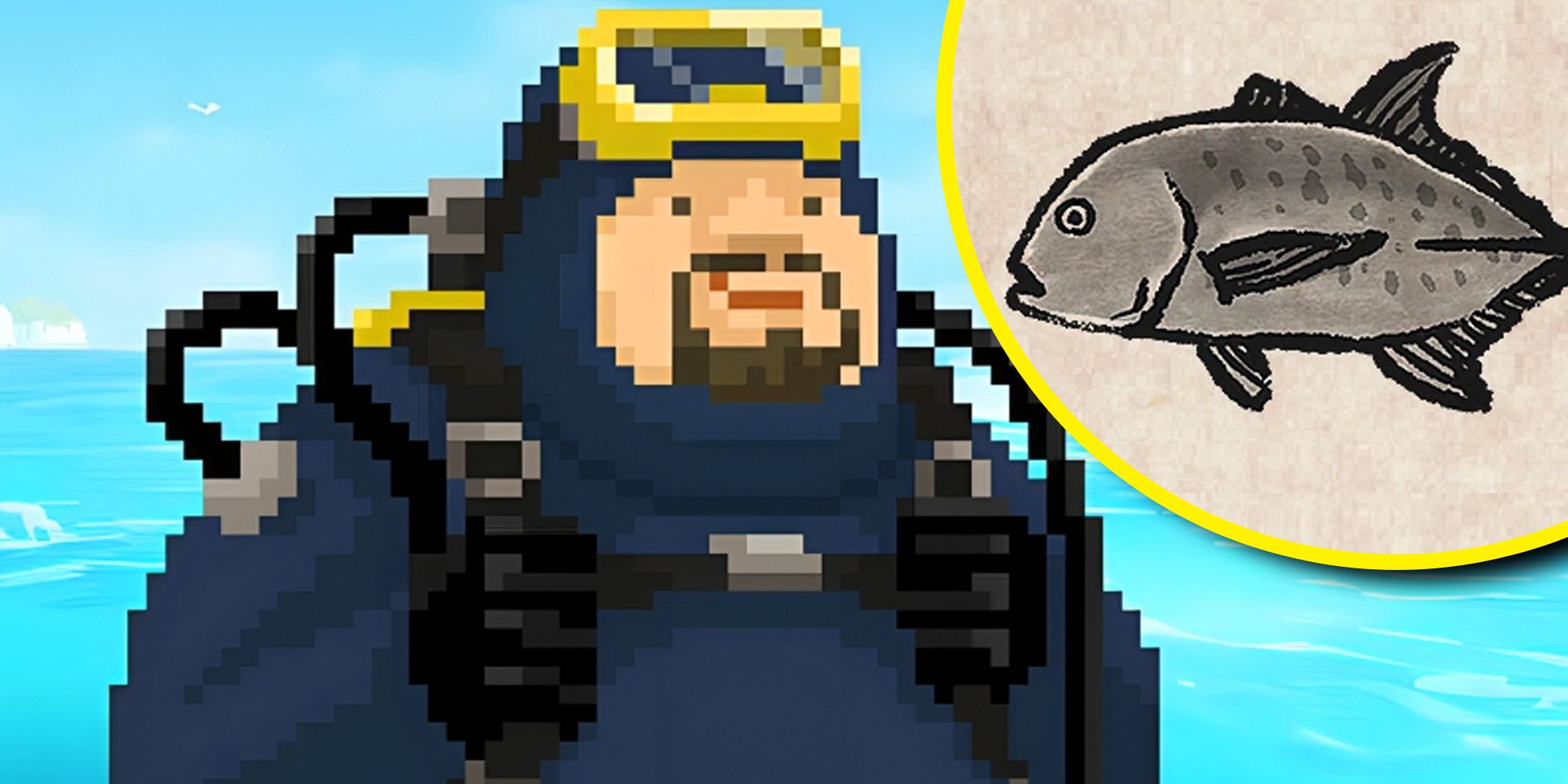
Dave The Diver: How To Catch Spider Crabs
Article Introduction:In Dave The Diver, there are some creatures that are not easy to catch. Or, catch alive that is. The spider crab is one of those very species, making it seem like the only way to bring these crustaceans back up to land is to viciously crack them up w
2025-01-10
comment 0
864

Prepare for Interview Like a Pro with Interview Questions CLI
Article Introduction:Prepare for Interview Like a Pro with Interview Questions CLI
What is the Interview Questions CLI?
The Interview Questions CLI is a command-line tool designed for JavaScript learners and developers who want to enhance their interview
2025-01-10
comment 0
1491
