Found a total of 10000 related content
How to Achieve Inner Text Shadow with CSS?
Article Introduction:Achieving Inner Text Shadow with CSSCreating a text shadow effect inside the text can be a challenging task in CSS. While the box-shadow property...
2024-11-04
comment 0
1039
How Can I Create an Inner Text Shadow with CSS?
Article Introduction:Inner Text Shadow with CSSCreating a text shadow that appears within the text itself has been a challenge in CSS. While box-shadow can render...
2024-11-09
comment 0
1147
How to create a 3D text effect with CSS?
Article Introduction:Use text-shadow to overlay multiple shadows to create a 3D effect, each layer of shadow simulates depth through incremental horizontal and vertical offsets; 2. Use sharp contrasting solid colors or gradient backgrounds to enhance the three-dimensional sense, such as dark gradients to set off light text; 3. Optionally add hover animations to make the text "pop up" by increasing shadow offset and slight displacement; 4. Fine-tune the color gradient, blur and direction, use different dark grays and slight blurs to enhance the realism, and ultimately achieve a pure CSS three-dimensional text effect without 3D transformation.
2025-07-31
comment 0
940

Creating Playful Effects With CSS Text Shadows
Article Introduction:Let’s have a look at how we can use the CSS text-shadow property to create truly 3D-looking text. You might think of text-shadow as being able to apply
2025-04-07
comment 0
882

How to Create 3D Text With CSS3
Article Introduction:This tutorial demonstrates creating a 3D text effect using only CSS3's text-shadow property, avoiding images, plugins, or canvas. The illusion of depth is achieved by layering multiple text shadows with subtle color and offset variations.
This imag
2025-03-02
comment 0
1072
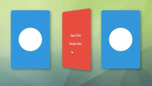
Building a 3D Card Flip Animation with CSS Houdini
Article Introduction:This article demonstrates Houdini's capabilities by creating a 3D card flip animation. It guides you through the core concepts and practical implementation, showing how to enhance your workflow and achieve advanced CSS animations.
Traditional CSS an
2025-02-08
comment 0
731
How Can I Create an Inner Text Shadow Using CSS?
Article Introduction:Inner Text Shadow with CSS: A Comprehensive GuideThe pursuit of stunning visual effects in web design often leads to experimentation with CSS...
2024-11-04
comment 0
1164

Vue realizes marquee/text scrolling effect
Article Introduction:Implement marquee/text scrolling effects in Vue, using CSS animations or third-party libraries. This article introduces how to use CSS animation: create scroll text and wrap text with <div>. Define CSS animations and set overflow: hidden, width, and animation. Define keyframes, set transform: translateX() at the beginning and end of the animation. Adjust animation properties such as duration, scroll speed, and direction.
2025-04-07
comment 0
471
How to Resolve the Flipping Issue in CSS 3D Card Flips?
Article Introduction:This article addresses the snapping issue in CSS-based 3D card flipping animations, caused by the initial "none" transform property of the back face. By initializing the back face with a 180deg rotation, the animation can smoothly transitio
2024-10-23
comment 0
665
Create a 3D CSS Printer that Actually Prints!
Article Introduction:This article showcases the creation of a fun, interactive 3D printer model using CSS, with a touch of JavaScript for animation. The author details the process, highlighting key techniques and offering several CodePen demos for readers to explore.
T
2025-02-09
comment 0
827
How to create a flip card effect with CSS?
Article Introduction:To create a flipped card effect using CSS, the key is to utilize 3D conversion and cascade control. The specific steps are as follows: 1. Build an HTML structure, set the outer container card-container and the internal front and back faces; 2. Set the style, open the 3D space through perspective, use transform-style:preserve-3d to maintain the 3D effect of child elements, and hide the back content through backface-visibility:hidden; 3. Use:hover pseudo-class or JavaScript to trigger the rotateY transformation to achieve flip animation; 4. Adjust the card size, shadow and other details to enhance the visual effect and intersect
2025-07-31
comment 0
724
CSS Animations
Article Introduction:CSS animation: The key tool to enhance user experience
Core points:
CSS animation is a key tool to enhance the user experience, adding depth and meaning to interactions, guiding users to browse the interface, and providing user action feedback.
While JavaScript also provides animation features, CSS is the easiest way to get started with animation. JavaScript-based animations can be more complex and resource-intensive, which may slow down page loading times on slower connections or mobile devices.
CSS animations can be launched immediately with just a web browser and text editor, an easy to access and efficient way to bring your design to life. CSS animation has great potential, from smooth transition to using keyframes to creating complex effects.
Animation is becoming a must
2025-02-17
comment 0
1161

Creating complex CSS Gradient backgrounds and effects
Article Introduction:CSS gradient backgrounds enable complex visual effects through cascading, animation and blending modes. 1. Multiple gradients can be separated by commas, and the bottom layer is drawn from the upper layer. It is recommended to use translucent colors and different directions to enhance the levels; 2. Animation can be implemented through background-position or keyframes, pay attention to performance and transition effect control; 3. Mix-clip:text can make gradient text, mask-image combined with gradient can realize image masking, mix-blend-mode is used for element interaction design.
2025-07-12
comment 0
435
css loader or spinner example
Article Introduction:This is a lightweight loading animation implemented in pure CSS. 1. Create a div container using HTML; 2. Set a circular border through CSS and color only the top; 3. Use @keyframes animation to continuously rotate elements; 4. Customize size, speed and color; 5. Center display through Flex layout; 6. Dynamically control display and hiding in combination with JavaScript, suitable for form submission, data loading and other scenarios, complete and no external dependencies are required.
2025-07-27
comment 0
445

How to Create a CSS3 Blurred Text Link Effect
Article Introduction:Detailed explanation of the effects of fuzzy text in CSS3 and FAQs
Key Points
CSS3 can create blur text effects with transparent text colors and text shadows, but not all browsers support the text-shadow property. In this case, you can use Modernizr or write custom text shadow detection code as a workaround.
A pleasant effect can be achieved for the navigation menu by smoothly blurring the links in and out while hovering or focusing. This involves defining a "blur" class that can be applied to any link and then using a CSS style that can be applied in all browsers.
When creating blurred text effects, be sure to pay attention to accessibility and visibility issues. In addition, the third text shadow can be adjusted by adjusting
2025-03-04
comment 0
475
