

CSS Positions layout method to implement responsive image layout
Sep 26, 2023 pm 01:37 PM
CSS Positions layout method to implement responsive image layout
In modern web development, responsive design has become an essential skill. In responsive design, image layout is one of the important considerations. This article will introduce how to use CSS Positions layout to implement responsive image layout and provide specific code examples.
CSS Positions is a layout method of CSS, which allows us to position elements arbitrarily in the web page as needed. In responsive image layout, we can use CSS Positions to achieve adaptive size and position of images.
First, we need to insert an image tag into HTML. Suppose we have a container div for an image, which can be implemented with the following code:
<div class="image-container">
  <img src="image.jpg" alt="圖片">
</div>
Next, we need to use CSS Positions to set the width and height of the image and adapt it to the size of the container. You can use the following CSS code:
.image-container {
  position: relative; /* 設(shè)置容器為相對定位 */
  width: 100%; /* 設(shè)置容器寬度為100% */
  height: 0; /* 設(shè)置容器高度為0 */
  padding-bottom: 60%; /* 設(shè)置容器的padding-bottom為圖片高度的百分比,可以根據(jù)需要調(diào)整 */
}

.image-container img {
  position: absolute; /* 設(shè)置圖片為絕對定位 */
  top: 0;
  left: 0;
  width: 100%; /* 設(shè)置圖片寬度為100% */
  height: 100%; /* 設(shè)置圖片高度為100% */
  object-fit: cover; /* 圖片自適應(yīng)容器大小 */
}
In the above code, we set the image container to relative positioning and set its width to 100%. Then, set the container's height to 0 and use padding-bottom to determine the percentage of the container's height. The 60% set here is an example value and can be adjusted according to the actual situation.
Next, we set the positioning of the image to absolute positioning, and set its width and height to 100%. Finally, use the object-fit attribute to make the image adapt to the size of the container, so that the image will be scaled and cropped according to the size of the container to adapt to different screen sizes.
Through the above code settings, we can achieve a responsive image layout. When the size of the browser window changes, the image will be adaptively adjusted according to the size of the container to ensure the display effect of the image.
It should be noted that the above method is suitable for responsive image layout in most cases. However, if there are special needs, such as maintaining the aspect ratio of the image or performing special scaling effects, further adjustments and modifications may be required.
To sum up, by using CSS Positions layout, we can easily implement responsive image layout. By setting the width and height of the container and image, and using the object-fit attribute to adaptively adjust the size, we can present better image layout effects on different devices.
The above is the detailed content of CSS Positions layout method to implement responsive image layout. For more information, please follow other related articles on the PHP Chinese website!

Hot AI Tools

Undress AI Tool
Undress images for free

Undresser.AI Undress
AI-powered app for creating realistic nude photos

AI Clothes Remover
Online AI tool for removing clothes from photos.

Clothoff.io
AI clothes remover

Video Face Swap
Swap faces in any video effortlessly with our completely free AI face swap tool!

Hot Article
Hot Tools

Notepad++7.3.1
Easy-to-use and free code editor

SublimeText3 Chinese version
Chinese version, very easy to use

Zend Studio 13.0.1
Powerful PHP integrated development environment

Dreamweaver CS6
Visual web development tools

SublimeText3 Mac version
God-level code editing software (SublimeText3)


 What are the operating skills for excel typesetting?
Mar 20, 2024 pm 05:01 PM
What are the operating skills for excel typesetting?
Mar 20, 2024 pm 05:01 PM
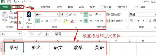
In order to achieve the visual effect of the entire document, both word and excel files need to be typed. However, many novice friends do not know how to perform excel typesetting. Below, we will share some typesetting operation skills, hoping to give you some Inspiration on operational skills! 1. First, we create and open an excel form and enter some simple content to facilitate demonstration operations. 2. We find the print preview function menu in the menu bar above the file. 3. Click the print preview function, and we find that the table is asymmetrical when it is not typeset. We need to find the page setup function in the menu bar above the document. 4. Click Page Settings and find the margin function in the function menu that opens. 5. Click
 Analysis and solutions to the causes of misaligned typography in WordPress
Mar 05, 2024 am 11:45 AM
Analysis and solutions to the causes of misaligned typography in WordPress
Mar 05, 2024 am 11:45 AM
Analysis of causes and solutions to misaligned typography in WordPress When building a website using WordPress, you may encounter misaligned typography, which will affect the overall beauty and user experience of the website. There are many reasons for typography misalignment, which may be caused by theme compatibility issues, plug-in conflicts, CSS style conflicts, etc. This article will analyze common causes of misaligned typography in WordPress and provide some solutions, including specific code examples. 1. Reason Analysis Theme Compatibility Issues: Some WordPress
 Questions frequently asked by front-end interviewers
Mar 19, 2024 pm 02:24 PM
Questions frequently asked by front-end interviewers
Mar 19, 2024 pm 02:24 PM
In front-end development interviews, common questions cover a wide range of topics, including HTML/CSS basics, JavaScript basics, frameworks and libraries, project experience, algorithms and data structures, performance optimization, cross-domain requests, front-end engineering, design patterns, and new technologies and trends. . Interviewer questions are designed to assess the candidate's technical skills, project experience, and understanding of industry trends. Therefore, candidates should be fully prepared in these areas to demonstrate their abilities and expertise.
 Discuz Editor: an efficient post layout tool
Mar 10, 2024 am 09:42 AM
Discuz Editor: an efficient post layout tool
Mar 10, 2024 am 09:42 AM
Discuz Editor: An efficient post layout tool. With the development of the Internet, online forums have become an important platform for people to communicate and share information. In the forum, users can not only express their opinions and ideas, but also discuss and interact with others. When publishing a post, a clear and beautiful format can often attract more readers and convey more accurate information. In order to facilitate users to quickly type and edit posts, the Discuz editor came into being and became an efficient post typesetting tool. Discu
 CSS Layout Tips: Best Practices for Implementing the Stacked Card Effect
Oct 22, 2023 am 08:19 AM
CSS Layout Tips: Best Practices for Implementing the Stacked Card Effect
Oct 22, 2023 am 08:19 AM
CSS Layout Tips: Best Practices for Achieving Stacked Card Effects In modern web design, card layout has become a very popular design trend. Card layout can effectively display information, provide a good user experience, and facilitate responsive design. In this article, we’ll share some of the best CSS layout techniques for achieving a stacked card effect, along with specific code examples. Layout using Flexbox Flexbox is a powerful layout model introduced in CSS3. It can easily achieve the effect of stacking cards
 CSS Positions layout method to implement responsive image layout
Sep 26, 2023 pm 01:37 PM
CSS Positions layout method to implement responsive image layout
Sep 26, 2023 pm 01:37 PM
CSSPositions layout method to implement responsive image layout In modern web development, responsive design has become an essential skill. In responsive design, image layout is one of the important considerations. This article will introduce how to use CSSPositions layout to implement responsive image layout and provide specific code examples. CSSPositions is a layout method of CSS that allows us to position elements arbitrarily in the web page as needed. In responsive image layout,
 Basic operations of excel table layout
Mar 20, 2024 pm 03:50 PM
Basic operations of excel table layout
Mar 20, 2024 pm 03:50 PM
When everyone uses Excel for data processing, it is indispensable to format and beautify the data, so that it will be more beautiful when shown to others or printed out. Today I will introduce to you the basic operations of excel table formatting. I hope it will be helpful to those who have just started learning. Help for those new to Excel. 1. First select the text - click Start - typesetting the table text: Generally, the title font size is set to 14~16, black Song font, bold, and centered; the main text is generally set to 12 size, Song font, centered. Tips: If the content is small, you can set a larger font. 2. Set the appropriate row height and column width: Select the entire table - drag to uniformly adjust the row height and column width. You can also click Start - Format - Set the row height and column width - For the title row or
 CSS layout tutorial: The best way to implement a two-column responsive layout
Oct 18, 2023 am 11:04 AM
CSS layout tutorial: The best way to implement a two-column responsive layout
Oct 18, 2023 am 11:04 AM
CSS Layout Tutorial: The Best Way to Implement Two-Column Responsive Layout Introduction: In web design, responsive layout is a very important technology that allows web pages to automatically adjust their layout according to the screen size and resolution of the user's device, providing Better user experience. In this tutorial, we'll show you how to use CSS to implement a simple two-column responsive layout, and provide specific code examples. 1. HTML structure: First, we need to create a basic HTML structure, as shown below: <!DOCTYPEht
