jQuery responsive navigation drop-down menu effects
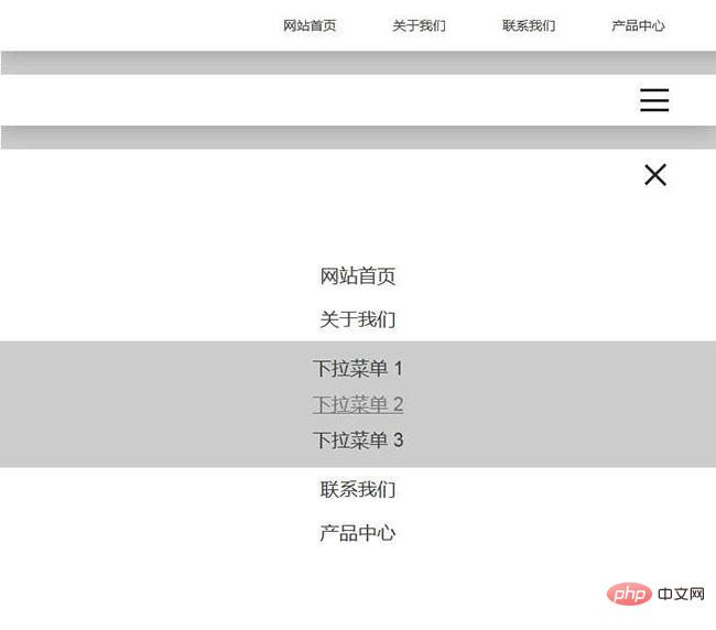
The jQuery responsive navigation drop-down menu effect is a responsive navigation bar that displays a drop-down menu when the mouse is hovering.
All resources on this site are contributed by netizens or reprinted by major download sites. Please check the integrity of the software yourself! All resources on this site are for learning reference only. Please do not use them for commercial purposes. Otherwise, you will be responsible for all consequences! If there is any infringement, please contact us to delete it. Contact information: admin@php.cn
Related Article
 Solve the problem of clicking on the responsive navigation bar drop-down menu failure
26 Sep 2025
This article aims to resolve the problem that the drop-down menu does not appear or disappears when clicking on it when using the responsive navigation bar code provided by W3Schools. We will detail the possible causes of the problem and provide clear steps and code examples to help you fix the drop-down menu feature of the navigation bar to ensure it works properly on all devices.
 Responsive navigation bar drop-down menu positioning techniques and analysis of FAQs
05 Oct 2025
This article explores in-depth common problems in implementing precise positioning of drop-down menus in the CSS navigation bar, especially keeping them aligned with the trigger buttons at different screen widths. The article analyzes the key roles of position and overflow properties in detail, and provides a set of solutions combining relative positioning, absolute positioning and media query to ensure that the drop-down menu can adapt to various devices and provide an excellent user experience.
 Accurately positioning the navigation bar drop-down menu: Responsive design and analysis of common pitfalls
09 Oct 2025
This article explains in detail how to achieve precise and responsive drop-down menu positioning in the navigation bar. The core is to correctly configure the CSS position properties of parent elements and child elements to avoid the impact of overflow: hidden on absolutely positioned elements, and use media queries to optimize the display of the drop-down menu for different screen sizes, ensuring that it is always located below the trigger button and maintaining a good user experience.
 Responsive positioning tutorial for the navigation bar drop-down menu
05 Oct 2025
This tutorial discusses in detail the common challenges and solutions for implementing responsive positioning of drop-down menus in the web navigation bar. The article deeply analyzes the problems that can occur when combined with position: absolute and provides professional methods to optimize CSS position properties, remove unnecessary overflow: hidden, and utilize media queries to enable adaptive positioning across devices, ensuring that the drop-down menus are always displayed correctly under their trigger buttons at different screen sizes.
 CSS drop-down menu positioning guide: Avoid submenu squeezing main navigation
12 Sep 2025
This tutorial is designed to solve the problem of CSS navigation submenu squeezing or moving the main navigation layout when hovering. By digging into position properties, we will demonstrate how to remove the submenu from the document stream using position: absolute, so that it does not affect the layout of the parent element when it expands. The article will provide detailed CSS code examples and key considerations to help developers build a stable and user-friendly multi-level navigation menu.
 Solve the problem that the Bootstrap 5 responsive navigation bar drop-down menu cannot be displayed on the mobile side
29 Sep 2025
This article aims to solve the problem that the drop-down menu cannot be displayed normally in the mobile responsive layout of the Bootstrap 5 navigation bar. The main reasons are usually the lack of necessary JavaScript dependencies or the error in the HTML structure. This article will provide detailed troubleshooting steps and sample code to help developers quickly solve this problem and ensure that the navigation bar works properly on various devices.
 CSS drop-down menu precise positioning: Solve the problem of misalignment of drop-down menus in the navigation bar
06 Oct 2025
This article aims to solve the problem of inaccurate positioning of drop-down menus in the navigation bar, especially when position: absolute cannot be responsively adjusted, and position: relative in turn causes the menu to disappear. The core solution is to correctly manage the overflow properties of the parent element and set position: relative for the drop-down menu container to create a positioning context, while optimizing the mobile display through media queries to ensure that the drop-down menu can be positioned accurately and responsively under its trigger button at any screen size.
 Guide to precise positioning and responsive layout of navigation bar drop-down menus
05 Oct 2025
This tutorial aims to solve the problem that the navigation bar drop-down menu cannot accurately align its trigger buttons at different screen widths. The article deeply analyzes the impact of CSS position attributes and overflow attributes on the positioning of drop-down menus, and provides an accurate alignment scheme based on position: relative and position: absolute. At the same time, it combines media query to realize a cross-device responsive layout to ensure that the drop-down menu can be displayed and positioned correctly at any screen resolution.
 How to Create a Drop-Down Nav Menu With HTML5, CSS3, and JQuery
04 Mar 2025
This tutorial demonstrates building a responsive dropdown navigation menu using HTML5, CSS3, and jQuery. We'll cover the HTML structure, CSS styling, and jQuery functionality to create a smooth and user-friendly experience. Project Setup: Create a


Hot Tools

Black left navigation management panel ui special effects
Native js css3 is used to create a black and practical left-hand category navigation management panel with icon text vertical navigation menu ui layout. Suitable for: functional and backend management UI website templates.
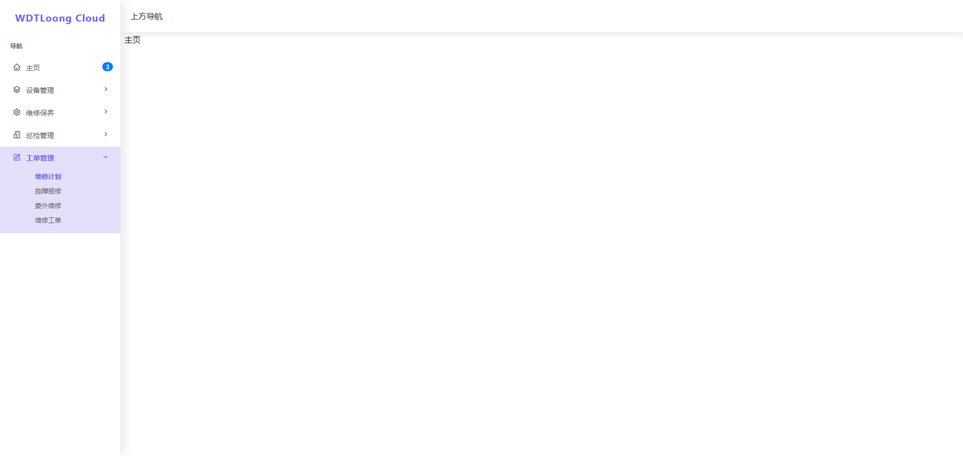
jQuery left drop-down navigation menu background frame template
jQuery creates a vertical drop-down navigation bar on the left and an embedded iframe navigation menu background page template.
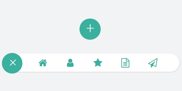
js-realize expandable hidden navigation menu button special effects
Simple and practical expandable hidden navigation menu button js special effects code download. The feature of this menu is that the menu can be expanded when the button is clicked. When expanded, it has flexible animation effects, which is quite cool. Menu items are small icons. Of course, you can also use icons combined with text. Since the hidden/expanded method is relatively space-saving, this menu can be applied to mobile devices.

Interactive liquid navigation tab bar
A super popular HTML+CSS interactive liquid navigation tab bar with a very beautiful and concise design


