Found a total of 10000 related content
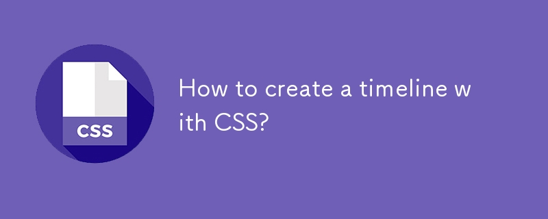
How to create a timeline with CSS?
Article Introduction:Creating a CSS timeline requires only HTML and CSS, no JavaScript required; 2. Use structured HTML containing time points and content; 3. Draw the central vertical line on the container through the ::before pseudo-element; 4. Use flexbox layout and positioning to control the arrangement of content on the left and right; 5. Add circular marking points for each time point; 6. Implement responsive design through media query, arrange the content on the left side and adjust the timeline position on the small screen; finally realize a beautiful and responsive vertical timeline, and is displayed with multiple devices.
2025-08-01
comment 0
956
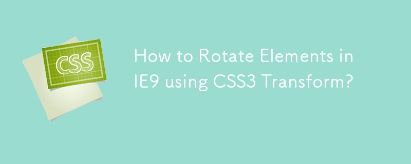
How to Rotate Elements in IE9 using CSS3 Transform?
Article Introduction:CSS3 Transforms in IE9: Rotation This article aims to solve the problem of rotating elements in IE9. The problem is in the design, we need a vertical element. Although...
2024-11-03
comment 0
1065

how to crop video in Premiere Pro
Article Introduction:When cropping videos in PremierePro, you should use the "Crop" function in "Motion". The specific steps are as follows: 1. Select the video clip on the timeline and open the "EffectControls" panel; 2. Expand the "Motion" option, click "Crop" and drag the four-direction slider to crop; 3. If the picture becomes smaller after cropping, adjust the screen to enlarge the screen; 4. You can adjust the screen position with "Position" to optimize the composition; 5. When cropping in batches, you can achieve unified settings by copying and pasting properties. Cropping will not change the resolution and scale, but excessive cropping may lead to black edges, so you need to pay attention to symmetrical operations or appropriate scaling. Practical applications include adapting horizontal and vertical screen ratios
2025-07-03
comment 0
860

Implementing Effective Responsive Design with CSS Media Queries
Article Introduction:Media queries are CSS3 features that are used to dynamically adjust styles according to device attributes to ensure responsive design. It realizes different screen adaptation through @media rules combined with breakpoints (such as max-width, min-width). Common breakpoints include: 1. Mobile phone vertical screen: max-width: 480px; 2. Mobile phone horizontal screen or small tablet: 481px-768px; 3. Tablet and above: ≥769px. There are two ways to organize structure: centralized management by breakpoint is suitable for small projects, and decentralized management by components is conducive to maintenance of large projects. When using it, you should follow the mobile priority principle, adopt relative units, avoid excessive breakpoints, and consider high resolution and printing style adaptation, and cooperate with real machine testing to optimize the experience.
2025-07-05
comment 0
665


Dave The Diver: How To Catch Spider Crabs
Article Introduction:In Dave The Diver, there are some creatures that are not easy to catch. Or, catch alive that is. The spider crab is one of those very species, making it seem like the only way to bring these crustaceans back up to land is to viciously crack them up w
2025-01-10
comment 0
855

Prepare for Interview Like a Pro with Interview Questions CLI
Article Introduction:Prepare for Interview Like a Pro with Interview Questions CLI
What is the Interview Questions CLI?
The Interview Questions CLI is a command-line tool designed for JavaScript learners and developers who want to enhance their interview
2025-01-10
comment 0
1485

Soft Deletes in Databases: To Use or Not to Use?
Article Introduction:Soft Deletes: A Question of DesignThe topic of soft deletes, a mechanism that "flags" records as deleted instead of physically removing them, has...
2025-01-10
comment 0
1083
Terraria: How To Make A Loom
Article Introduction:There are a lot of crafting stations that you can make in Terraria. This ranges from simple anvils to unique stations meant for one specific type of resource. Early into the game, you'll be able to make your own Loom, which is primarily used to make
2025-01-10
comment 0
1365


