
 Web Front-end
PS Tutorial
What is the purpose of guides, grids, and rulers in achieving precise layouts?
Web Front-end
PS Tutorial
What is the purpose of guides, grids, and rulers in achieving precise layouts?
What is the purpose of guides, grids, and rulers in achieving precise layouts?
Jul 15, 2025 am 12:38 AM
Rulers provide positioning references, Guides implement element alignment, and Grids builds a systematic layout. 1. Rulers display position coordinates, and can drag out reference lines to check element deviations and judge distance specifications; 2. Guides are virtual lines dragged out from rulers, accurately align elements and divide areas, and support locking and color settings; 3. Grids consist of rows and columns to control the overall layout rhythm, and adapt to responsive design, which are common, such as 12-column web page grids and 8px mobile grids. The combination of the three improves layout efficiency and professionalism.
In design or layout related work, guides, grids, and rulers are the three basic tools for achieving accurate layout. Their core role is to help you align elements, control spacing, and maintain consistency, thereby improving overall visual effects and user experience.
1. Rulers: The basis of positioning
Rulers usually appear on the upper and lower and left edges of the design software interface to display the position of pixels or units. It is the starting point for all precise positioning operations.
- effect :
- Provide coordinate references to let you know the location of each element.
- You can drag and drop out guides and use them as auxiliary lines.
- Practical Tips :
- If you find that the text is not aligned when typing, you can open the ruler to see if the element position is biased.
- In web page or APP design, rulers can help you determine whether the distance between a button from the edge of the screen complies with the specification.
2. Guides: Flexible auxiliary lines
A reference line is a virtual line you drag from the ruler and can be placed anywhere on the canvas to align or divide areas.
- Why use it?
- Helps you accurately align elements such as text, pictures, buttons, etc.
- You can set different blocks such as margins, title areas, and content areas.
- Common usage :
- Drag out four reference lines to set the page's safe margins.
- When aligning multiple objects, the reference lines are much more accurate than the naked eye to judge.
- When multiple people collaborate, unified reference lines help to unify styles.
Tips: Most design software supports "locking the reference line" to prevent mismoving; it can also set the color of the reference line for easy identification.
3. Grids: A powerful tool for systematic layout
The grid is a set of horizontal and vertical lines, forming small grids, like a "skeleton" of design. It is more suitable for design tasks with complex structures, such as web pages, APP interfaces or magazine typesetting.
- Key role :
- Implement modular layout to make the elements arranged neatly and orderly.
- Control column width, row height, margin, etc. to ensure the consistent visual rhythm.
- Supports responsive design and adapts to different screen sizes.
- How to use it to be effective?
- When designing web pages, you can use 12-column grids to flexibly deal with different content combinations.
- The mobile interface often uses 8px or 4px grid systems to facilitate correspondence with margin/padding in the code.
- Beginners can start their practice with a simple 2-column or 3-column grid.
For example: If you are doing a card-style layout, using a grid can ensure that each card is consistent in size, uniform in spacing, and looks more professional.
Let's summarize
- The ruler tells you "what is this"
- The reference line helps you "align this"
- Grids allow you to "coordinate overall"
Use these three together can greatly reduce the time for manual adjustment and avoid problems such as loose layout and misalignment. Many details in the design look inconspicuous, but it is these tools that make the work appear professional and tidy.
Basically all that is, not difficult but very practical.
The above is the detailed content of What is the purpose of guides, grids, and rulers in achieving precise layouts?. For more information, please follow other related articles on the PHP Chinese website!

Hot AI Tools

Undress AI Tool
Undress images for free

Undresser.AI Undress
AI-powered app for creating realistic nude photos

AI Clothes Remover
Online AI tool for removing clothes from photos.

Clothoff.io
AI clothes remover

Video Face Swap
Swap faces in any video effortlessly with our completely free AI face swap tool!

Hot Article
Hot Tools

Notepad++7.3.1
Easy-to-use and free code editor

SublimeText3 Chinese version
Chinese version, very easy to use

Zend Studio 13.0.1
Powerful PHP integrated development environment

Dreamweaver CS6
Visual web development tools

SublimeText3 Mac version
God-level code editing software (SublimeText3)
Hot Topics


 Windows 11: The easy way to import and export start layouts
Aug 22, 2023 am 10:13 AM
Windows 11: The easy way to import and export start layouts
Aug 22, 2023 am 10:13 AM
In Windows 11, the Start menu has been redesigned and features a simplified set of apps arranged in a grid of pages, unlike its predecessor, which had folders, apps, and apps on the Start menu. Group. You can customize the Start menu layout and import and export it to other Windows devices to personalize it to your liking. In this guide, we’ll discuss step-by-step instructions for importing Start Layout to customize the default layout on Windows 11. What is Import-StartLayout in Windows 11? Import Start Layout is a cmdlet used in Windows 10 and earlier versions to import customizations for the Start menu into
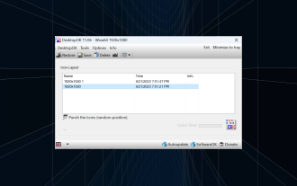 How to save desktop icon position layout in Windows 11
Aug 23, 2023 pm 09:53 PM
How to save desktop icon position layout in Windows 11
Aug 23, 2023 pm 09:53 PM
Windows 11 brings a lot to the table in terms of user experience, but the iteration isn't entirely error-proof. Users run into issues from time to time, and changes to icon positioning are common. So how to save desktop layout in Windows 11? There are built-in and third-party solutions for this task, whether it's saving the screen resolution of the current window or the arrangement of desktop icons. This becomes even more important for users who have a bunch of icons on their desktop. Read on to learn how to save desktop icon locations in Windows 11. Why doesn't Windows 11 save icon layout positions? Here are the main reasons why Windows 11 does not save desktop icon layout: Changes to display settings: Typically, when you modify display settings, the configured customizations
 Guide to solving misalignment of WordPress web pages
Mar 05, 2024 pm 01:12 PM
Guide to solving misalignment of WordPress web pages
Mar 05, 2024 pm 01:12 PM
Guide to solving misaligned WordPress web pages In WordPress website development, sometimes we encounter web page elements that are misaligned. This may be due to screen sizes on different devices, browser compatibility, or improper CSS style settings. To solve this misalignment, we need to carefully analyze the problem, find possible causes, and debug and repair it step by step. This article will share some common WordPress web page misalignment problems and corresponding solutions, and provide specific code examples to help develop
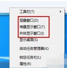 Introducing the window arrangement method in win7
Dec 26, 2023 pm 04:37 PM
Introducing the window arrangement method in win7
Dec 26, 2023 pm 04:37 PM
When we open multiple windows at the same time, win7 has the function of arranging multiple windows in different ways and then displaying them at the same time, which allows us to view the contents of each window more clearly. So how many window arrangements are there in win7? What do they look like? Let’s take a look with the editor. There are several ways to arrange Windows 7 windows: three, namely cascading windows, stacked display windows and side-by-side display windows. When we open multiple windows, we can right-click on an empty space on the taskbar. You can see three window arrangements. 1. Cascading windows: 2. Stacked display windows: 3. Display windows side by side:
 Flexible application skills of position attribute in H5
Dec 27, 2023 pm 01:05 PM
Flexible application skills of position attribute in H5
Dec 27, 2023 pm 01:05 PM
How to flexibly use the position attribute in H5. In H5 development, the positioning and layout of elements are often involved. At this time, the CSS position property will come into play. The position attribute can control the positioning of elements on the page, including relative positioning, absolute positioning, fixed positioning and sticky positioning. This article will introduce in detail how to flexibly use the position attribute in H5 development.
 How to create a responsive carousel layout using HTML and CSS
Oct 20, 2023 pm 04:24 PM
How to create a responsive carousel layout using HTML and CSS
Oct 20, 2023 pm 04:24 PM
How to create a responsive carousel layout using HTML and CSS Carousels are a common element in modern web design. It can attract the user's attention, display multiple contents or images, and switch automatically. In this article, we will introduce how to create a responsive carousel layout using HTML and CSS. First, we need to create a basic HTML structure and add the required CSS styles. The following is a simple HTML structure: <!DOCTYPEhtml&g
 Syntax usage scenarios of contain in CSS
Feb 21, 2024 pm 02:00 PM
Syntax usage scenarios of contain in CSS
Feb 21, 2024 pm 02:00 PM
Syntax usage scenarios of contain in CSS In CSS, contain is a useful attribute that specifies whether the content of an element is independent of its external style and layout. It helps developers better control page layout and optimize performance. This article will introduce the syntax usage scenarios of the contain attribute and provide specific code examples. The syntax of the contain attribute is as follows: contain:layout|paint|size|style|'none'|'stric
 How to create a responsive image gallery display layout using HTML and CSS
Oct 18, 2023 am 09:40 AM
How to create a responsive image gallery display layout using HTML and CSS
Oct 18, 2023 am 09:40 AM
How to use HTML and CSS to create a responsive picture gallery display layout. In today's Internet era, picture gallery display is a common layout in web design, which can display various pictures and image works. In order to allow users to have a good browsing experience on different devices, responsive design is becoming more and more important. This article will introduce how to use HTML and CSS to create a responsive image gallery display layout, and provide specific code examples. Step 1: Create a basic HTML structure First, we need to create a basic HTM
