
 Hardware Tutorial
Hardware News
iOS 26 Liquid Glass Design Drama: Beta 2 vs. Beta 3 Changes in Every App
Hardware Tutorial
Hardware News
iOS 26 Liquid Glass Design Drama: Beta 2 vs. Beta 3 Changes in Every App
iOS 26 Liquid Glass Design Drama: Beta 2 vs. Beta 3 Changes in Every App
Jul 09, 2025 am 09:02 AM
Apple has been refining Liquid Glass during the developer beta testing process, and both beta two and beta three have introduced some major tweaks. There was little outcry over the updates that Apple made in the second beta, but the third beta's design updates have frustrated some users who feel that Apple is removing too much of the Liquid Glass aesthetic.

For context, Apple made navigation bars more opaque across many apps in iOS 26 beta 3, and we've got a series of side-by-side comparisons that demonstrate what's different. In all of the comparison images, beta 2 is on the left and beta 3 is on the right.
Apple Music
Apple Music's bottom navigation bar is more opaque, and it has the frosted glass look that Apple is now favoring. The change is most noticeable when scrolling over a background that has color. In beta 2, the navigation bar was almost translucent, allowing much of the background color to shine through. That effect is significantly reduced in beta 3.

Safari
The changes in Safari vary depending on what you're doing, the background color of the website, and which Tab View design you're using. In general, the URL bar is more opaque and less prone to notable shifts in color. Less of the background comes through.

The URL bar will still change from light to dark if the content you're scrolling over is predominantly dark, but there's a higher threshold for that to kick on.

It's easiest to see the difference with the Compact View, because it was the most translucent view to begin with.
App Store
The App Store's navigation bar has one of the most noticeable changes, and it's almost entirely opaque now.


Podcasts
As with Apple Music, translucency has been almost entirely eliminated in the Podcasts navigation bar. The change is easiest to see with backgrounds that have color.

Apple TV
The Apple TV app has a darker background and the change is more subtle. The overlaying navigation bar is a darker glass color, but transparency appears to be similar.

Photos
For the Photos app, Apple tweaked the design in a similar way to the Apple TV app. The navigation bar is darker, but there's been little change to transparency.

Calendar
Calendar's navigation buttons are more opaque, both in Light Mode and Dark Mode.

Keyboard
The Spotlight Search keyboard is both more and less translucent. The keyboard itself has slightly more background visible, but the search bar is darker.

Dark Mode
Dark Mode has retained more transparency than Light Mode for the most part, so you may see less of a difference if you have Dark Mode enabled permanently. Some menu bar elements are darker than before, but white text on a dark background is more readable so Apple had to increase the opaqueness less.

This isn't true for all apps, though, and there are areas with dark navigation bars that also have less translucency.
Color Dependency
The difference that you see between beta 2 and beta 3 can vary quite a bit depending on the color in the background. With some white backgrounds, it's hard to tell that the Liquid Glass has a more frosted appearance, and the updates are mostly noticeable with light colors.

Over content that is are darker, navigation bars will often transition to their Dark Mode view that appears more translucent, as can be seen in the Safari screenshot below. This is the same effect you'll see with Dark Mode enabled.

Notifications, Lock Screen, and Home Screen
On the Lock Screen, the time is ever so slightly more opaque than it was before. With some background colors, notifications also have a darker background than before, but this isn't always noticeable. Home Screen and Control Center haven't changed much if at all.

Other App Changes
Most of Apple's built-in apps have tweaked buttons and navigation bars in iOS 26 beta 3, with repeats of the design changes listed above.
- Weather - The buttons at the bottom of the app are much darker than before, and the search button is no longer translucent.
- Camera - No noticeable change.
- FaceTime - No noticeable change.
- Messages - The search bar isn't as translucent, nor is the message compose bar. Popover buttons haven't changed.
- Maps - Maps is actually more translucent, because it's using Liquid Glass for the turn-by-turn directions that are shown at the top of the app.
- Mail - Buttons have less translucency.
- Notes - The buttons and navigation bar in the Notes app already had little translucency, but it's been reduced further and is almost non-existent.
- Reminders - When you're composing a Reminder, the toolbar has less translucency. The search bar and popover menus are the same.
- Clock - No change.
- Health - The Health app's navigation bar and search bar are a little less transparent, but it was already fairly opaque.
- Wallet - Buttons aren't as transparent, so if you scroll over something with bright colors, it's no longer visible behind the button.
- Settings - The Search bar is more opaque.
- Find My - No change.
- Stocks - The translucency of Top Stories is unchanged, but the search bar has increased opacity.
- Home - Less opacity overall for navigation bar and home control buttons.
- Books - Navigation menus and search have less translucency.
- Fitness - Little change because the app uses a darker background, but the buttons are a touch darker than before.
- Contacts - Less translucency for search.
- Files - Less translucency for navigation bar and search.
- Translate - No change.
- Shortcuts - Less translucency for navigation bar. Keyboard translucency remains the same.
- Calculator - History interface is more opaque.
- Voice Memos - No change.
- Compass - No change.
- Passwords - Navigation bar and search interface lost translucency.
- Games - Navigation bar is darker and less translucent.
- Preview - No change.
What do you think of the changes that Apple made in iOS 26 beta 3? Are you hoping for some of the Liquid Glass design to be reimplemented, or do you prefer the more opaque look? Let us know in the comments below.
The above is the detailed content of iOS 26 Liquid Glass Design Drama: Beta 2 vs. Beta 3 Changes in Every App. For more information, please follow other related articles on the PHP Chinese website!

Hot AI Tools

Undress AI Tool
Undress images for free

Undresser.AI Undress
AI-powered app for creating realistic nude photos

AI Clothes Remover
Online AI tool for removing clothes from photos.

Clothoff.io
AI clothes remover

Video Face Swap
Swap faces in any video effortlessly with our completely free AI face swap tool!

Hot Article
Hot Tools

Notepad++7.3.1
Easy-to-use and free code editor

SublimeText3 Chinese version
Chinese version, very easy to use

Zend Studio 13.0.1
Powerful PHP integrated development environment

Dreamweaver CS6
Visual web development tools

SublimeText3 Mac version
God-level code editing software (SublimeText3)


 The best SD cards for Switch in 2025: the perfect way to expand your Nintendo game collection
Jul 06, 2025 am 01:39 AM
The best SD cards for Switch in 2025: the perfect way to expand your Nintendo game collection
Jul 06, 2025 am 01:39 AM
The best SD cards for Switch are worth keeping an eye on, even now that the Nintendo Switch 2 has arrived.If you're still playing on the Nintendo Switch, Switch Lite, or Switch OLED, then you'll likely need to get your hands on a compatible SD card i
 The Last of Us Part 2 will now let you play the game's emotional story in chronological order thanks to a new update, but I'd rather stick to the original format
Jul 12, 2025 am 09:06 AM
The Last of Us Part 2 will now let you play the game's emotional story in chronological order thanks to a new update, but I'd rather stick to the original format
Jul 12, 2025 am 09:06 AM
A new update for The Last of Us Part 2 lets you play the game's story in chronological orderNaughty Dog says Chronogical mode will allow players to "will gain even deeper insight into Part 2’s narrative"New trophies and Uncharted 4-themed s
 Apple's Low-Cost MacBook: Everything We Know So Far
Jul 11, 2025 am 09:01 AM
Apple's Low-Cost MacBook: Everything We Know So Far
Jul 11, 2025 am 09:01 AM
Apple is working on a more affordable version of the MacBook that's powered by an A-series iPhone chip rather than an M-series Apple silicon chip. We've rounded up all of the rumors about the new machine, which is expected next year.DesignThe upcomin
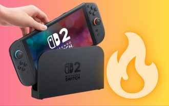 Nintendo Switch 2 users are reporting a worrisome problem – here's what we know
Jul 05, 2025 am 01:33 AM
Nintendo Switch 2 users are reporting a worrisome problem – here's what we know
Jul 05, 2025 am 01:33 AM
Nintendo Switch 2 users are reporting overheating issues in handheld and docked modesIt comes amid Nintendo's recent controversies surrounding its new Switch 2 deviceIt reportedly occurs even when playing less demanding gamesIt's no secret that Ninte
 Apple Smart Glasses: Everything We Know About Apple's Answer to Meta Ray-Bans
Jul 12, 2025 am 09:01 AM
Apple Smart Glasses: Everything We Know About Apple's Answer to Meta Ray-Bans
Jul 12, 2025 am 09:01 AM
Apple is working on a set of smart glasses that will rival Meta's popular AI-equipped Ray-Bans, offering many of the same features. Rumors about Apple's work on the glasses have been picking up, and we've gathered all of the information we've heard i
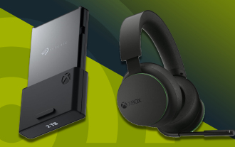 The best Xbox Series X and Series S accessories in 2025: essential gear for your Xbox console
Jul 05, 2025 am 01:37 AM
The best Xbox Series X and Series S accessories in 2025: essential gear for your Xbox console
Jul 05, 2025 am 01:37 AM
The best Xbox Series X and Series S accessories can make for game-changing additions to your setup, especially if you've recently picked up either of Microsoft's current-generation consoles and you're looking to get the most out of them. From interna
 iOS 26: Every Change to the Messages App
Jul 12, 2025 am 06:01 AM
iOS 26: Every Change to the Messages App
Jul 12, 2025 am 06:01 AM
The Messages app has the Liquid Glass redesign that's been introduced throughout iOS 26, but Apple also added several long-desired features that make for a better experience in both one-to-one and group chats, such as custom backgrounds and group typ
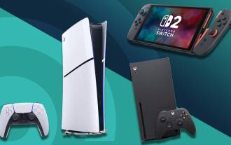 Best gaming console in 2025: every major system tested and ranked
Jul 05, 2025 am 01:34 AM
Best gaming console in 2025: every major system tested and ranked
Jul 05, 2025 am 01:34 AM
The best gaming console space has just been shaken up by the arrival of the Nintendo Switch 2, which has now usurped the older Nintendo Switch OLED as my pick for the number one handheld option right now. I've been testing it for weeks, and can say t
