


Harnessing the Power of Data Visualization with Microsoft Power BI Charts
In today's data-driven world, effectively communicating complex information to non-technical audiences is crucial. Data visualization bridges this gap, transforming raw data into readily understandable insights. Microsoft Power BI excels at this, offering a diverse range of charts for impactful business analytics. This article explores the most frequently used Power BI chart types.
Key Advantages of Power BI Charts:
- Clear Data Presentation: Power BI charts transform complex datasets into easily digestible visual formats.
- Trend & Pattern Identification: Quickly identify trends, patterns, and anomalies within your data.
- Comparative Analysis: Facilitate comparisons across different categories, time periods, or data series.
- Informed Decision-Making: Support data-driven decision-making based on clear, visual insights.
- Interactive Exploration: Engage with your data through interactive features like filtering and drill-downs.
- Effective Communication: Communicate complex findings clearly and concisely to stakeholders.
Popular Power BI Chart Types:
Let's delve into the most commonly employed Power BI charts:
1. Bar and Column Charts: These fundamental charts compare values across categories. Bar charts use horizontal bars, while column charts utilize vertical bars. Variations include stacked, clustered, and 100% stacked versions for enhanced analysis.
- Strengths: Simple, effective for comparisons, shows trends.
- Limitations: Can become cluttered with many categories, may not highlight minor variations.


2. Line Charts: Ideal for visualizing trends over time, line charts connect data points to reveal changes and patterns across continuous periods.
- Strengths: Excellent for showing trends, easily displays multiple series.
- Limitations: Overlapping lines can be confusing, dense data can clutter the chart.

3. Pie and Donut Charts: These charts represent parts of a whole. Pie charts show proportions in a single series, while donut charts allow for multiple series.
- Strengths: Simple, intuitive for showing proportions.
- Limitations: Not suitable for many categories, difficult to compare small slices precisely.

4. Area Charts: Similar to line charts but with filled areas under the lines, highlighting cumulative totals and comparisons.
- Strengths: Shows cumulative totals, emphasizes magnitude of change.
- Limitations: Overlapping areas can obscure data, less effective for precise values.

5. Scatter and Bubble Charts: These charts illustrate relationships between variables. Scatter plots show data points, while bubble charts add a third dimension using bubble size.
- Strengths: Identify correlations, detect outliers, handle multi-dimensional data.
- Limitations: Can be complex with many points, overlapping points can obscure information.


6. TreeMap: TreeMaps visualize hierarchical data as nested rectangles, with size representing data value.
- Strengths: Effective for hierarchical data, shows proportions clearly.
- Limitations: Can be cluttered with large datasets, small rectangles may be hard to read.

7. Waterfall Charts: These charts display the cumulative effect of sequential positive and negative values, useful for financial analysis.
- Strengths: Shows cumulative impact, highlights increases and decreases.
- Limitations: Best suited for specific use cases, can be complex with many steps.

8. Funnel Charts: Funnel charts illustrate stages in a process, revealing bottlenecks and drop-off points.
- Strengths: Visualizes process stages, identifies bottlenecks.
- Limitations: Limited detail on individual stages, fixed shape may not suit all processes.

9. Gauge Charts: Gauge charts (speedometer charts) display a single value within a range, ideal for KPIs.
- Strengths: Quick performance overview, shows progress towards a target.
- Limitations: Only shows a single value, can oversimplify complex data.

10. Maps: Power BI offers various map visualizations (filled, bubble, shape) for geographically displaying data.
- Strengths: Shows geographical patterns and trends.
- Limitations: Requires accurate geographic data, can be complex with large datasets.

Choosing the Right Chart:
Selecting the appropriate chart depends on your data type, analytical goals, and audience. Consider:
- Data Type: Categorical, time-series, hierarchical, geographical.
- Purpose: Comparison, trend analysis, distribution, proportion, relationship, hierarchy.
- Audience: Technical expertise and preferred visualization styles.
- Chart Features: Interactivity, scalability, customization options.
Conclusion:
Mastering Power BI's diverse chart options empowers you to transform raw data into compelling visual narratives. By selecting the right chart for your specific needs, you can effectively communicate insights, facilitate data-driven decisions, and unlock the full potential of your data.
The above is the detailed content of Most Used 10 Power BI Charts - Analytics Vidhya. For more information, please follow other related articles on the PHP Chinese website!

Hot AI Tools

Undress AI Tool
Undress images for free

Undresser.AI Undress
AI-powered app for creating realistic nude photos

AI Clothes Remover
Online AI tool for removing clothes from photos.

Clothoff.io
AI clothes remover

Video Face Swap
Swap faces in any video effortlessly with our completely free AI face swap tool!

Hot Article
Hot Tools

Notepad++7.3.1
Easy-to-use and free code editor

SublimeText3 Chinese version
Chinese version, very easy to use

Zend Studio 13.0.1
Powerful PHP integrated development environment

Dreamweaver CS6
Visual web development tools

SublimeText3 Mac version
God-level code editing software (SublimeText3)
Hot Topics


 AGI And AI Superintelligence Are Going To Sharply Hit The Human Ceiling Assumption Barrier
Jul 04, 2025 am 11:10 AM
AGI And AI Superintelligence Are Going To Sharply Hit The Human Ceiling Assumption Barrier
Jul 04, 2025 am 11:10 AM
Let’s talk about it. This analysis of an innovative AI breakthrough is part of my ongoing Forbes column coverage on the latest in AI, including identifying and explaining various impactful AI complexities (see the link here). Heading Toward AGI And
 Kimi K2: The Most Powerful Open-Source Agentic Model
Jul 12, 2025 am 09:16 AM
Kimi K2: The Most Powerful Open-Source Agentic Model
Jul 12, 2025 am 09:16 AM
Remember the flood of open-source Chinese models that disrupted the GenAI industry earlier this year? While DeepSeek took most of the headlines, Kimi K1.5 was one of the prominent names in the list. And the model was quite cool.
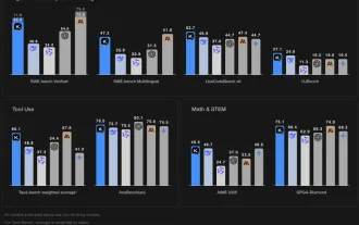
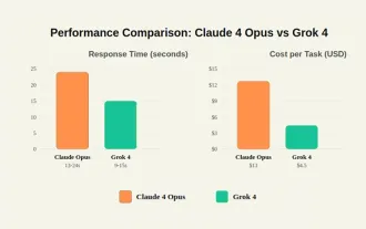 Grok 4 vs Claude 4: Which is Better?
Jul 12, 2025 am 09:37 AM
Grok 4 vs Claude 4: Which is Better?
Jul 12, 2025 am 09:37 AM
By mid-2025, the AI “arms race” is heating up, and xAI and Anthropic have both released their flagship models, Grok 4 and Claude 4. These two models are at opposite ends of the design philosophy and deployment platform, yet they
 In-depth discussion on how artificial intelligence can help and harm all walks of life
Jul 04, 2025 am 11:11 AM
In-depth discussion on how artificial intelligence can help and harm all walks of life
Jul 04, 2025 am 11:11 AM
We will discuss: companies begin delegating job functions for AI, and how AI reshapes industries and jobs, and how businesses and workers work.
 Premier League Makes An AI Play To Enhance The Fan Experience
Jul 03, 2025 am 11:16 AM
Premier League Makes An AI Play To Enhance The Fan Experience
Jul 03, 2025 am 11:16 AM
On July 1, England’s top football league revealed a five-year collaboration with a major tech company to create something far more advanced than simple highlight reels: a live AI-powered tool that delivers personalized updates and interactions for ev
 10 Amazing Humanoid Robots Already Walking Among Us Today
Jul 16, 2025 am 11:12 AM
10 Amazing Humanoid Robots Already Walking Among Us Today
Jul 16, 2025 am 11:12 AM
But we probably won’t have to wait even 10 years to see one. In fact, what could be considered the first wave of truly useful, human-like machines is already here. Recent years have seen a number of prototypes and production models stepping out of t
 Context Engineering is the 'New' Prompt Engineering
Jul 12, 2025 am 09:33 AM
Context Engineering is the 'New' Prompt Engineering
Jul 12, 2025 am 09:33 AM
Until the previous year, prompt engineering was regarded a crucial skill for interacting with large language models (LLMs). Recently, however, LLMs have significantly advanced in their reasoning and comprehension abilities. Naturally, our expectation
 Chip Ganassi Racing Announces OpenAI As Mid-Ohio IndyCar Sponsor
Jul 03, 2025 am 11:17 AM
Chip Ganassi Racing Announces OpenAI As Mid-Ohio IndyCar Sponsor
Jul 03, 2025 am 11:17 AM
OpenAI, one of the world’s most prominent artificial intelligence organizations, will serve as the primary partner on the No. 10 Chip Ganassi Racing (CGR) Honda driven by three-time NTT IndyCar Series champion and 2025 Indianapolis 500 winner Alex Pa
