


HTML <fieldset></fieldset> Detailed explanation of elements: a powerful tool for organizing form elements
<fieldset></fieldset> Elements are practical tools for organizing and grouping related projects in forms and have long been widely used by desktop applications. When it is used in conjunction with the <legend></legend> element (which is contained within <fieldset></fieldset> and is required if <fieldset></fieldset> is used), a box is created around the grouped items and the description is displayed to the right of each item, As shown below:
You can also nest <fieldset></fieldset> elements to subgroup items as follows:

Example:
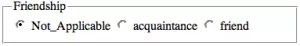
The following example groups three related XFN attributes using the <fieldset></fieldset> element (see the Microformats section for XFN):
<fieldset>
  <legend>Friendship</legend>
  <label for="radFriendNot_Applicable">Not_Applicable</label>
  <label for="radFriendaquaintence">acquaintance</label>
  <label for="radFriendfriend">friend</label>
  ?
</fieldset>
Purpose:
<fieldset> Attributes are used to logically group data items with certain common characteristics. For example, when capturing visitor information in an application form, you can use <fieldset> to wrap personal details in one group and work details in another.
HTML <fieldset> Element FAQ:
Q: HTML <fieldset> What are the main functions of elements?
A: HTML <fieldset> Elements are used to group relevant elements in a form. It draws a box around the relevant elements, which is very useful for intuitively organizing complex forms. The <fieldset> element is usually used with the <legend> element, which provides a title for <fieldset>.
Q: How to use HTML <fieldset> elements in code?
A: To use HTML <fieldset> elements, just wrap the relevant form elements using the <fieldset> tag. Here is a basic example:
<fieldset>
  <legend>Personal Information</legend>
  <label for="name">Name:</label>
  <input type="text" id="name">
  <label for="email">Email:</label>
  <input type="email" id="email">
</fieldset>
In this example, the <fieldset></fieldset> element combines the name and email input fields together, while the <legend></legend> element provides the group with a title.
Q: Can the <fieldset></fieldset> elements be nested with each other?
A: The <fieldset></fieldset> elements can be nested with each other. This is very useful for creating more complex form layouts. However, remember that each nested <fieldset></fieldset> creates another box around its content, so use this feature with caution so that the form is not cluttered.
Q: <fieldset></fieldset> Does the element have any specific attributes?
A:<fieldset></fieldset> Element supports global properties in HTML. It also supports the form attribute (specifying one or more forms to which <fieldset></fieldset> belongs) and the disabled attribute (disable all form controls within <fieldset></fieldset>).
Q: How does the attribute work with the disabled element? <fieldset></fieldset>
attribute to the <fieldset></fieldset> element, all form controls within disabled will be disabled. This means that the user cannot interact with these controls and their value is not submitted with the form. <fieldset></fieldset>
Q: How does an element affect accessibility? <fieldset></fieldset>
and <fieldset></fieldset> elements can greatly improve the accessibility of forms. The <legend></legend> element combines relevant form controls, which can help screen reader users understand the relationship between controls. The <fieldset></fieldset> element provides the title for the group, which can provide more context information for screen reader users. <legend></legend>
Q: Can CSS be used to style the element? <fieldset></fieldset>
element. You can change borders, fills, margins, and other properties. However, remember that some browsers apply default styles to <fieldset></fieldset> elements that may be difficult to override. <fieldset></fieldset>
Q: How do elements behave in different browsers? <fieldset></fieldset>
element. However, each browser applies its own default style to the <fieldset></fieldset> element, which may result in a slight difference in appearance. <fieldset></fieldset>
Q: Can the element be used outside the form? <fieldset></fieldset>
element is usually used within a form to group relevant form controls, it can technically be used outside the form. However, this is not a common practice and may not be supported by all browsers. <fieldset></fieldset>
Q: What are some common use cases for elements? <fieldset></fieldset>
A:
to group personal information fields, another <fieldset></fieldset> for account information fields, and another for preferences. <fieldset></fieldset>
The above is the detailed content of fieldset (HTML element). For more information, please follow other related articles on the PHP Chinese website!

Hot AI Tools

Undress AI Tool
Undress images for free

Undresser.AI Undress
AI-powered app for creating realistic nude photos

AI Clothes Remover
Online AI tool for removing clothes from photos.

Clothoff.io
AI clothes remover

Video Face Swap
Swap faces in any video effortlessly with our completely free AI face swap tool!

Hot Article
Hot Tools

Notepad++7.3.1
Easy-to-use and free code editor

SublimeText3 Chinese version
Chinese version, very easy to use

Zend Studio 13.0.1
Powerful PHP integrated development environment

Dreamweaver CS6
Visual web development tools

SublimeText3 Mac version
God-level code editing software (SublimeText3)


 CSS tutorial for creating loading spinners and animations
Jul 07, 2025 am 12:07 AM
CSS tutorial for creating loading spinners and animations
Jul 07, 2025 am 12:07 AM
There are three ways to create a CSS loading rotator: 1. Use the basic rotator of borders to achieve simple animation through HTML and CSS; 2. Use a custom rotator of multiple points to achieve the jump effect through different delay times; 3. Add a rotator in the button and switch classes through JavaScript to display the loading status. Each approach emphasizes the importance of design details such as color, size, accessibility and performance optimization to enhance the user experience.
 Addressing CSS Browser Compatibility issues and prefixes
Jul 07, 2025 am 01:44 AM
Addressing CSS Browser Compatibility issues and prefixes
Jul 07, 2025 am 01:44 AM
To deal with CSS browser compatibility and prefix issues, you need to understand the differences in browser support and use vendor prefixes reasonably. 1. Understand common problems such as Flexbox and Grid support, position:sticky invalid, and animation performance is different; 2. Check CanIuse confirmation feature support status; 3. Correctly use -webkit-, -moz-, -ms-, -o- and other manufacturer prefixes; 4. It is recommended to use Autoprefixer to automatically add prefixes; 5. Install PostCSS and configure browserslist to specify the target browser; 6. Automatically handle compatibility during construction; 7. Modernizr detection features can be used for old projects; 8. No need to pursue consistency of all browsers,
 What is the difference between display: inline, display: block, and display: inline-block?
Jul 11, 2025 am 03:25 AM
What is the difference between display: inline, display: block, and display: inline-block?
Jul 11, 2025 am 03:25 AM
Themaindifferencesbetweendisplay:inline,block,andinline-blockinHTML/CSSarelayoutbehavior,spaceusage,andstylingcontrol.1.Inlineelementsflowwithtext,don’tstartonnewlines,ignorewidth/height,andonlyapplyhorizontalpadding/margins—idealforinlinetextstyling
 Creating custom shapes with css clip-path
Jul 09, 2025 am 01:29 AM
Creating custom shapes with css clip-path
Jul 09, 2025 am 01:29 AM
Use the clip-path attribute of CSS to crop elements into custom shapes, such as triangles, circular notches, polygons, etc., without relying on pictures or SVGs. Its advantages include: 1. Supports a variety of basic shapes such as circle, ellipse, polygon, etc.; 2. Responsive adjustment and adaptable to mobile terminals; 3. Easy to animation, and can be combined with hover or JavaScript to achieve dynamic effects; 4. It does not affect the layout flow, and only crops the display area. Common usages are such as circular clip-path:circle (50pxatcenter) and triangle clip-path:polygon (50%0%, 100 0%, 0 0%). Notice
 Styling visited links differently with CSS
Jul 11, 2025 am 03:26 AM
Styling visited links differently with CSS
Jul 11, 2025 am 03:26 AM
Setting the style of links you have visited can improve the user experience, especially in content-intensive websites to help users navigate better. 1. Use CSS's: visited pseudo-class to define the style of the visited link, such as color changes; 2. Note that the browser only allows modification of some attributes due to privacy restrictions; 3. The color selection should be coordinated with the overall style to avoid abruptness; 4. The mobile terminal may not display this effect, and it is recommended to combine it with other visual prompts such as icon auxiliary logos.
 How to create responsive images using CSS?
Jul 15, 2025 am 01:10 AM
How to create responsive images using CSS?
Jul 15, 2025 am 01:10 AM
To create responsive images using CSS, it can be mainly achieved through the following methods: 1. Use max-width:100% and height:auto to allow the image to adapt to the container width while maintaining the proportion; 2. Use HTML's srcset and sizes attributes to intelligently load the image sources adapted to different screens; 3. Use object-fit and object-position to control image cropping and focus display. Together, these methods ensure that the images are presented clearly and beautifully on different devices.
 Demystifying CSS Units: px, em, rem, vw, vh comparisons
Jul 08, 2025 am 02:16 AM
Demystifying CSS Units: px, em, rem, vw, vh comparisons
Jul 08, 2025 am 02:16 AM
The choice of CSS units depends on design requirements and responsive requirements. 1.px is used for fixed size, suitable for precise control but lack of elasticity; 2.em is a relative unit, which is easily caused by the influence of the parent element, while rem is more stable based on the root element and is suitable for global scaling; 3.vw/vh is based on the viewport size, suitable for responsive design, but attention should be paid to the performance under extreme screens; 4. When choosing, it should be determined based on whether responsive adjustments, element hierarchy relationships and viewport dependence. Reasonable use can improve layout flexibility and maintenance.
 What are common CSS browser inconsistencies?
Jul 26, 2025 am 07:04 AM
What are common CSS browser inconsistencies?
Jul 26, 2025 am 07:04 AM
Different browsers have differences in CSS parsing, resulting in inconsistent display effects, mainly including the default style difference, box model calculation method, Flexbox and Grid layout support level, and inconsistent behavior of certain CSS attributes. 1. The default style processing is inconsistent. The solution is to use CSSReset or Normalize.css to unify the initial style; 2. The box model calculation method of the old version of IE is different. It is recommended to use box-sizing:border-box in a unified manner; 3. Flexbox and Grid perform differently in edge cases or in old versions. More tests and use Autoprefixer; 4. Some CSS attribute behaviors are inconsistent. CanIuse must be consulted and downgraded.
