


Unlock Stunning Web Animations with GreenSock Plugins: A Deep Dive
This tutorial explores GreenSock's (GSAP) powerful plugins, offering a streamlined approach to complex web animations compared to traditional CSS or SMIL. We'll cover key plugins and demonstrate how to achieve professional-grade results efficiently.

This installment focuses on several exceptional GSAP plugins:
- BezierPlugin: Effortlessly animate elements along curved Bezier paths, ensuring consistent cross-browser compatibility and surpassing the limitations of CSS or SMIL.
- Draggable & ThrowPropsPlugin: Build interactive, physics-based drag-and-drop animations with exceptional performance and broad device/browser support.
- DrawSVGPlugin: Create dynamic SVG stroke animations, providing superior control and flexibility over CSS, particularly beneficial for responsive design.
- MorphSVGPlugin: Seamlessly transition between SVG shapes, simplifying complex morphing effects with minimal code, even handling paths with varying point counts.
- SplitText: Generate engaging text animation effects by splitting text into lines, words, or characters for individual manipulation.
Mastering these plugins dramatically reduces development time for intricate web animations.
Animation Along a Path with BezierPlugin
Animating objects along predefined paths (curved, zigzag, etc.) adds realism. While SMIL is outdated and CSS support is limited, BezierPlugin provides a robust, cross-browser solution. It's a free plugin included with TweenMax.
BezierPlugin Basics:
Include TweenMax in your HTML. The basic syntax is:
TweenMax.to(document.getElementById('myDiv'), 5, {
  bezier:[
    {left:100, top:250},
    {left:300, top:0},
    {left:500, top:400}
  ],
  ease:Power1.easeInOut
});
For numerous coordinates, cache them in a variable:
const points = [ /* ... your points */ ];
TweenMax.to(document.getElementById('myDiv'), 5, { bezier: points, ease:Power1.easeInOut });
Using 'x' and 'y' coordinates positions relative to the element's current location.
BezierPlugin offers type: 'soft' (coordinates act as magnets) and type: 'thru' (default, uses curviness for path tension). autoRotate: true spins the element along the path. A CodePen demo illustrates these properties.
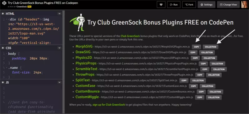
GreenSock Premium Plugins and Utilities
While TweenMax offers much, Club GreenSock membership unlocks premium plugins and utilities. A Shockingly Green membership grants access to download these resources. However, CodePen demos allow free experimentation with premium plugins within the CodePen environment.
Drag & Drop with Draggable and ThrowPropsPlugin
Draggable simplifies drag-and-drop animations, offering cross-browser compatibility, touchscreen support, and performance. ThrowPropsPlugin adds smooth, physics-based gliding.
Basic implementation:
TweenMax.to(document.getElementById('myDiv'), 5, {
  bezier:[
    {left:100, top:250},
    {left:300, top:0},
    {left:500, top:400}
  ],
  ease:Power1.easeInOut
});
Constrain movement with bounds and enable gliding with throwProps:
const points = [ /* ... your points */ ];
TweenMax.to(document.getElementById('myDiv'), 5, { bezier: points, ease:Power1.easeInOut });
Lock dragging direction using type: 'x' (horizontal) or type: 'y' (vertical). type: 'rotation' enables rotational dragging.
Live-Drawing SVG Strokes with DrawSVGPlugin
DrawSVGPlugin creates the effect of an SVG drawing itself. It handles simple shapes lacking getTotalLength() and adapts to responsive scaling, surpassing CSS limitations.
Basic usage:
Draggable.create('#yourID');
Ensure your SVG has a defined stroke (either in the SVG or CSS). Stagger multiple strokes using GSAP's stagger methods.
Shape Shifting with MorphSVGPlugin
MorphSVGPlugin morphs one SVG shape into another, even with differing point counts.
Simple usage:
Draggable.create('#yourID', { bounds: '.container', throwProps: true });
You can provide path data directly or use MorphSVGPlugin.convertToPath() for simple shapes.
Fun Text Effects with SplitText
SplitText splits text into lines, words, or characters for targeted animation.
Basic usage:
TweenLite.fromTo("#path", 1, { drawSVG:"0 5%" }, { drawSVG:"95% 100%" });
Animate split.lines, split.words, or split.chars individually. Use split.revert() to remove added markup after animation.
Conclusion
GreenSock's plugins empower you to create sophisticated web animations efficiently. Explore the documentation and community forums to master its capabilities and elevate your web design. Remember to replace the placeholder CodePen links with actual links to your created demos.
The above is the detailed content of Fancy Web Animations Made Easy with GreenSock Plugins. For more information, please follow other related articles on the PHP Chinese website!

Hot AI Tools

Undress AI Tool
Undress images for free

Undresser.AI Undress
AI-powered app for creating realistic nude photos

AI Clothes Remover
Online AI tool for removing clothes from photos.

Clothoff.io
AI clothes remover

Video Face Swap
Swap faces in any video effortlessly with our completely free AI face swap tool!

Hot Article
Hot Tools

Notepad++7.3.1
Easy-to-use and free code editor

SublimeText3 Chinese version
Chinese version, very easy to use

Zend Studio 13.0.1
Powerful PHP integrated development environment

Dreamweaver CS6
Visual web development tools

SublimeText3 Mac version
God-level code editing software (SublimeText3)


 CSS tutorial for creating loading spinners and animations
Jul 07, 2025 am 12:07 AM
CSS tutorial for creating loading spinners and animations
Jul 07, 2025 am 12:07 AM
There are three ways to create a CSS loading rotator: 1. Use the basic rotator of borders to achieve simple animation through HTML and CSS; 2. Use a custom rotator of multiple points to achieve the jump effect through different delay times; 3. Add a rotator in the button and switch classes through JavaScript to display the loading status. Each approach emphasizes the importance of design details such as color, size, accessibility and performance optimization to enhance the user experience.
 Addressing CSS Browser Compatibility issues and prefixes
Jul 07, 2025 am 01:44 AM
Addressing CSS Browser Compatibility issues and prefixes
Jul 07, 2025 am 01:44 AM
To deal with CSS browser compatibility and prefix issues, you need to understand the differences in browser support and use vendor prefixes reasonably. 1. Understand common problems such as Flexbox and Grid support, position:sticky invalid, and animation performance is different; 2. Check CanIuse confirmation feature support status; 3. Correctly use -webkit-, -moz-, -ms-, -o- and other manufacturer prefixes; 4. It is recommended to use Autoprefixer to automatically add prefixes; 5. Install PostCSS and configure browserslist to specify the target browser; 6. Automatically handle compatibility during construction; 7. Modernizr detection features can be used for old projects; 8. No need to pursue consistency of all browsers,
 Creating custom shapes with css clip-path
Jul 09, 2025 am 01:29 AM
Creating custom shapes with css clip-path
Jul 09, 2025 am 01:29 AM
Use the clip-path attribute of CSS to crop elements into custom shapes, such as triangles, circular notches, polygons, etc., without relying on pictures or SVGs. Its advantages include: 1. Supports a variety of basic shapes such as circle, ellipse, polygon, etc.; 2. Responsive adjustment and adaptable to mobile terminals; 3. Easy to animation, and can be combined with hover or JavaScript to achieve dynamic effects; 4. It does not affect the layout flow, and only crops the display area. Common usages are such as circular clip-path:circle (50pxatcenter) and triangle clip-path:polygon (50%0%, 100 0%, 0 0%). Notice
 What is the difference between display: inline, display: block, and display: inline-block?
Jul 11, 2025 am 03:25 AM
What is the difference between display: inline, display: block, and display: inline-block?
Jul 11, 2025 am 03:25 AM
Themaindifferencesbetweendisplay:inline,block,andinline-blockinHTML/CSSarelayoutbehavior,spaceusage,andstylingcontrol.1.Inlineelementsflowwithtext,don’tstartonnewlines,ignorewidth/height,andonlyapplyhorizontalpadding/margins—idealforinlinetextstyling
 Styling visited links differently with CSS
Jul 11, 2025 am 03:26 AM
Styling visited links differently with CSS
Jul 11, 2025 am 03:26 AM
Setting the style of links you have visited can improve the user experience, especially in content-intensive websites to help users navigate better. 1. Use CSS's: visited pseudo-class to define the style of the visited link, such as color changes; 2. Note that the browser only allows modification of some attributes due to privacy restrictions; 3. The color selection should be coordinated with the overall style to avoid abruptness; 4. The mobile terminal may not display this effect, and it is recommended to combine it with other visual prompts such as icon auxiliary logos.
 How to create responsive images using CSS?
Jul 15, 2025 am 01:10 AM
How to create responsive images using CSS?
Jul 15, 2025 am 01:10 AM
To create responsive images using CSS, it can be mainly achieved through the following methods: 1. Use max-width:100% and height:auto to allow the image to adapt to the container width while maintaining the proportion; 2. Use HTML's srcset and sizes attributes to intelligently load the image sources adapted to different screens; 3. Use object-fit and object-position to control image cropping and focus display. Together, these methods ensure that the images are presented clearly and beautifully on different devices.
 What are common CSS browser inconsistencies?
Jul 26, 2025 am 07:04 AM
What are common CSS browser inconsistencies?
Jul 26, 2025 am 07:04 AM
Different browsers have differences in CSS parsing, resulting in inconsistent display effects, mainly including the default style difference, box model calculation method, Flexbox and Grid layout support level, and inconsistent behavior of certain CSS attributes. 1. The default style processing is inconsistent. The solution is to use CSSReset or Normalize.css to unify the initial style; 2. The box model calculation method of the old version of IE is different. It is recommended to use box-sizing:border-box in a unified manner; 3. Flexbox and Grid perform differently in edge cases or in old versions. More tests and use Autoprefixer; 4. Some CSS attribute behaviors are inconsistent. CanIuse must be consulted and downgraded.
 Demystifying CSS Units: px, em, rem, vw, vh comparisons
Jul 08, 2025 am 02:16 AM
Demystifying CSS Units: px, em, rem, vw, vh comparisons
Jul 08, 2025 am 02:16 AM
The choice of CSS units depends on design requirements and responsive requirements. 1.px is used for fixed size, suitable for precise control but lack of elasticity; 2.em is a relative unit, which is easily caused by the influence of the parent element, while rem is more stable based on the root element and is suitable for global scaling; 3.vw/vh is based on the viewport size, suitable for responsive design, but attention should be paid to the performance under extreme screens; 4. When choosing, it should be determined based on whether responsive adjustments, element hierarchy relationships and viewport dependence. Reasonable use can improve layout flexibility and maintenance.
