


Mastering CSS: A Guide to Browser-Based Developer Tools for Debugging and Optimization
This excerpt from Tiffany's CSS Master, 2nd Edition, explores essential tools for troubleshooting and optimizing your CSS. Learn how to diagnose rendering problems, enhance performance, and maintain code quality. Effective use of developer tools is key to a high-performing front-end.
Key Takeaways:
- Chrome, Safari, Firefox, and Edge developer tools are crucial for CSS debugging and optimization. They enable element inspection, problem identification, and performance enhancement.
- These tools pinpoint cascade/inheritance issues, invalid properties/values, and responsive layout bugs. Mobile emulation allows for cross-device testing.
- Beyond basic debugging, these tools optimize CSS by identifying redundant code, facilitating real-time style experimentation, and analyzing performance bottlenecks.
Browser-Based Developer Tools: A Deep Dive
Most desktop browsers feature an element inspector. Access it by right-clicking and selecting "Inspect Element" or by pressing Ctrl (Windows/Linux) or Cmd (macOS) while clicking the element. (Alternatively, use the keyboard shortcuts Ctrl Shift I or Cmd Option I).


Access via menus:
- Microsoft Edge: Tools > Developer Tools
- Firefox: Tools > Web Developer
- Chrome: View > Developer
- Safari: Develop > Show Web Inspector (Enable in Safari Preferences > Advanced)
After opening, select the appropriate panel (DOM Explorer/Inspector/Elements). The HTML panel displays the DOM (Document Object Model), a browser representation that may differ from the source code. "View Source" shows the original markup.
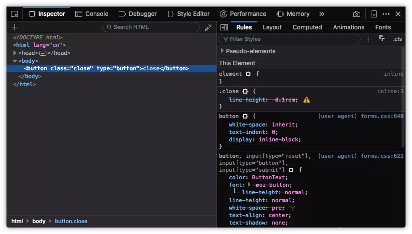
Utilizing the Styles Panel
The Styles panel helps diagnose styling discrepancies. Inline styles (from the style attribute) are listed first, followed by author stylesheets (grouped by media query/filename), and finally, user agent styles (browser defaults). Checkboxes toggle rules on/off, and properties/values can be modified in real-time.
Identifying Cascade and Inheritance Problems
Overridden properties are indicated by a strikethrough. This highlights conflicts due to cascading rules, conflicting rules, or more specific selectors.

Spotting Invalid Properties and Values
Invalid or unsupported properties/values are also strikethrough, often with a warning icon (browser-specific variations exist).


Debugging Responsive Layouts
All major browsers offer responsive design modes for simulating mobile devices:
-
Chrome: Device toolbar (emulates Android/iOS devices, network throttling, offline simulation).

-
Firefox: Responsive Design Mode (portrait/landscape, touch events, screenshots, network throttling).
-
Microsoft Edge: Emulation tab (Windows mobile devices, geolocation, no network throttling).
-
Safari: Responsive Design Mode (iOS device emulation).


The book continues with advanced debugging techniques, performance tools, and FAQs. For a comprehensive guide, refer to Tiffany's CSS Master, 2nd Edition.
The above is the detailed content of CSS Debugging and Optimization: Browser-based Developer Tools. For more information, please follow other related articles on the PHP Chinese website!

Hot AI Tools

Undress AI Tool
Undress images for free

Undresser.AI Undress
AI-powered app for creating realistic nude photos

AI Clothes Remover
Online AI tool for removing clothes from photos.

Clothoff.io
AI clothes remover

Video Face Swap
Swap faces in any video effortlessly with our completely free AI face swap tool!

Hot Article
Hot Tools

Notepad++7.3.1
Easy-to-use and free code editor

SublimeText3 Chinese version
Chinese version, very easy to use

Zend Studio 13.0.1
Powerful PHP integrated development environment

Dreamweaver CS6
Visual web development tools

SublimeText3 Mac version
God-level code editing software (SublimeText3)
Hot Topics


 What is Autoprefixer and how does it work?
Jul 02, 2025 am 01:15 AM
What is Autoprefixer and how does it work?
Jul 02, 2025 am 01:15 AM
Autoprefixer is a tool that automatically adds vendor prefixes to CSS attributes based on the target browser scope. 1. It solves the problem of manually maintaining prefixes with errors; 2. Work through the PostCSS plug-in form, parse CSS, analyze attributes that need to be prefixed, and generate code according to configuration; 3. The usage steps include installing plug-ins, setting browserslist, and enabling them in the build process; 4. Notes include not manually adding prefixes, keeping configuration updates, prefixes not all attributes, and it is recommended to use them with the preprocessor.
 CSS tutorial for creating a sticky header or footer
Jul 02, 2025 am 01:04 AM
CSS tutorial for creating a sticky header or footer
Jul 02, 2025 am 01:04 AM
TocreatestickyheadersandfooterswithCSS,useposition:stickyforheaderswithtopvalueandz-index,ensuringparentcontainersdon’trestrictit.1.Forstickyheaders:setposition:sticky,top:0,z-index,andbackgroundcolor.2.Forstickyfooters,betteruseposition:fixedwithbot
 CSS tutorial for creating loading spinners and animations
Jul 07, 2025 am 12:07 AM
CSS tutorial for creating loading spinners and animations
Jul 07, 2025 am 12:07 AM
There are three ways to create a CSS loading rotator: 1. Use the basic rotator of borders to achieve simple animation through HTML and CSS; 2. Use a custom rotator of multiple points to achieve the jump effect through different delay times; 3. Add a rotator in the button and switch classes through JavaScript to display the loading status. Each approach emphasizes the importance of design details such as color, size, accessibility and performance optimization to enhance the user experience.
 CSS tutorial focusing on mobile-first design
Jul 02, 2025 am 12:52 AM
CSS tutorial focusing on mobile-first design
Jul 02, 2025 am 12:52 AM
Mobile-firstCSSdesignrequiressettingtheviewportmetatag,usingrelativeunits,stylingfromsmallscreensup,optimizingtypographyandtouchtargets.First,addtocontrolscaling.Second,use%,em,orreminsteadofpixelsforflexiblelayouts.Third,writebasestylesformobile,the
 How to create an intrinsically responsive grid layout?
Jul 02, 2025 am 01:19 AM
How to create an intrinsically responsive grid layout?
Jul 02, 2025 am 01:19 AM
To create an intrinsic responsive grid layout, the core method is to use CSSGrid's repeat(auto-fit,minmax()) mode; 1. Set grid-template-columns:repeat(auto-fit,minmax(200px,1fr)) to let the browser automatically adjust the number of columns and limit the minimum and maximum widths of each column; 2. Use gap to control grid spacing; 3. The container should be set to relative units such as width:100%, and use box-sizing:border-box to avoid width calculation errors and center them with margin:auto; 4. Optionally set the row height and content alignment to improve visual consistency, such as row
 How to center an entire grid within the viewport?
Jul 02, 2025 am 12:53 AM
How to center an entire grid within the viewport?
Jul 02, 2025 am 12:53 AM
To make the entire grid layout centered in the viewport, it can be achieved by the following methods: 1. Use margin:0auto to achieve horizontal centering, and the container needs to be set to set the fixed width, which is suitable for fixed layout; 2. Use Flexbox to set the justify-content and align-items properties in the outer container, and combine min-height:100vh to achieve vertical and horizontal centering, which is suitable for full-screen display scenarios; 3. Use CSSGrid's place-items property to quickly center on the parent container, which is simple and has good support from modern browsers, and at the same time, it is necessary to ensure that the parent container has sufficient height. Each method has applicable scenarios and restrictions, just choose the appropriate solution according to actual needs.
 What is feature detection in CSS using @supports?
Jul 02, 2025 am 01:14 AM
What is feature detection in CSS using @supports?
Jul 02, 2025 am 01:14 AM
FeaturedetectioninCSSusing@supportschecksifabrowsersupportsaspecificfeaturebeforeapplyingrelatedstyles.1.ItusesconditionalCSSblocksbasedonproperty-valuepairs,suchas@supports(display:grid).2.Thismethodensuresfuturecompatibilityandavoidsrelianceonunrel
 Addressing CSS Browser Compatibility issues and prefixes
Jul 07, 2025 am 01:44 AM
Addressing CSS Browser Compatibility issues and prefixes
Jul 07, 2025 am 01:44 AM
To deal with CSS browser compatibility and prefix issues, you need to understand the differences in browser support and use vendor prefixes reasonably. 1. Understand common problems such as Flexbox and Grid support, position:sticky invalid, and animation performance is different; 2. Check CanIuse confirmation feature support status; 3. Correctly use -webkit-, -moz-, -ms-, -o- and other manufacturer prefixes; 4. It is recommended to use Autoprefixer to automatically add prefixes; 5. Install PostCSS and configure browserslist to specify the target browser; 6. Automatically handle compatibility during construction; 7. Modernizr detection features can be used for old projects; 8. No need to pursue consistency of all browsers,
