


I couldn't wait to have some "free" time so I could add styling to my project. Something about a little bit of interactivity adds life to the page.
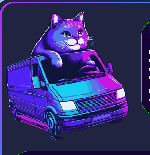
You want a floating cat? No problem. I made an image of a cat using AI and extracted the background in Illustator "by hand" to get a nice cut-out effect for my .png image. Bam. Cat.
Lets make him move a little bit so it looks like he's floating. One of my favorite CSS animations is orbit. It is really useful and you can do a lot with it.
Cat
In the view, I bring the image of my cat in and assign it the class "cat"
<%= image_tag "favicon.png", alt:"vendor booth", width:"40%", height:"40%", class:"cat" %>
Now, in my css file, I build my style for "cat". In cat, we call our animation, orbit, as shown below.
.cat {
  animation: orbit 3s infinite linear;
}

@keyframes orbit {
  from {
    transform: rotate(0deg) translateX(15px) rotate(0deg);
  }
  to {
    transform: rotate(360deg) translateX(15px) rotate(-360deg);
  }
}
You see here that we are "rotating the cat starting at an angle of 0 degrees", at 15px away from the x-origin, starting at 0 degrees.
The cat goes a full circle to 360 degrees, at 15px away, all the way around. The second rotation of -360 is canceling out the first rotation, to keep the cat upright. It's easier if you just see the animation. XD.
We are just moving him a tiny amount, as we don't want him flying all over the page. Just enough to be exciting.
A little bit to the left,
A little bit to the right.

Magic!
Cube
I had previously learned how to create a cube with css. While that's fine and dandy, I got the wild hair idea today about re-using the cube in a dynamic way. I wanted to populate the cube faces with data in real time. Like say, the next few upcoming events. As like a fun discovering thing on the landing page. Why not. This is exciting.
So as anything, I build out the skeleton in the view. Our cube needs a home after all.
I've got some radio buttons so the user can interact with the cube.
Each radio button will show a different cube face.
I add the information I want to display on each face in a loop:
  <div>


<hr>

<p>Handling the css is a bit of a dance. Especially with viewports and what not. This is not the answer for mobile but it will work and be functional on a bigger screen, LOL. I'm just gonna leave this here for you. Open to suggestions for handling a small screen size. <br>
</p>
<hr>


<p><img src="/static/imghw/default1.png" data-src="https://img.php.cn/upload/article/000/000/000/173429456116557.jpg" class="lazy" alt="Floating Cats and Cubes"><br>
<br><br>
</p>

<pre class="brush:php;toolbar:false">
/*===========
rotating cube
==============*/

.cube-container {
  width: 30vw;
  height: 40vh;
  text-align: center;
  perspective: 100em;
}

.cube {
  width: 100%;
  height: 100%;
  position: relative;
  transform-style: preserve-3d;
  transition-duration: 2s;
  border: 5px solid transparent;
  margin-top:100px;
  display: block;
}

.cube-side {
  position: absolute;
  width: 300px;
  height: 300px;
  background-color: rgb(64, 0, 148);
  border: 1px solid white;
  background-position: center;
  background-size: cover;
  border: 4px solid lime;
}

.cube-side:nth-child(1){
  transform: rotateY(0deg) translateZ(10em);
}

.cube-side:nth-child(2){
  transform: rotateY(90deg) translateZ(10em);
}

.cube-side:nth-child(3){
  transform: rotateY(180deg) translateZ(10em);
}

.cube-side:nth-child(4){
  transform: rotateY(-90deg) translateZ(10em);
}

.cube-side:nth-child(5){
  transform: rotateX(90deg) translateZ(9.75em);
  border-top: 8px solid lime;
  border-bottom: 8px solid lime;
}

.cube-side:nth-child(6){
  transform: rotateX(-90deg) translateZ(9.3em);
  border-top: 8px solid lime;
  border-bottom: 8px solid lime;
}


/* cube radio buttons */

.radio-button {
  transform: translateX(-50px);
}

.radio-button:checked ~ .cube{
  transition-duration: 3s;
  transition-timing-function: cubic-bezier(0.19. 1, 0.22, 1);
}

.radio-button:nth-child(1):checked ~ .cube {
  transform: rotateX(-15deg) rotateY(20deg);
}

.radio-button:nth-child(2):checked ~ .cube {
  transform: rotateX(-15deg) rotateY(180deg);
}

.radio-button:nth-child(3):checked ~ .cube {
  transform: rotateX(-15deg) rotateY(90deg);
}

.radio-button:nth-child(4):checked ~ .cube {
  transform: rotateX(-15deg) rotateY(-90deg);
}

.radio-button:nth-child(5):checked ~ .cube {
  transform: rotateX(-105deg) rotateY(0deg);
}

.radio-button:nth-child(6):checked ~ .cube {
  transform: rotateX(75deg) rotateY(0deg);
}
Each button and side is being handled individually. I'd love to see a more elegant solution if it exists.
I'm just really excited it worked.
Thanks for looking!
The above is the detailed content of Floating Cats and Cubes. For more information, please follow other related articles on the PHP Chinese website!

Hot AI Tools

Undress AI Tool
Undress images for free

Undresser.AI Undress
AI-powered app for creating realistic nude photos

AI Clothes Remover
Online AI tool for removing clothes from photos.

Clothoff.io
AI clothes remover

Video Face Swap
Swap faces in any video effortlessly with our completely free AI face swap tool!

Hot Article
Hot Tools

Notepad++7.3.1
Easy-to-use and free code editor

SublimeText3 Chinese version
Chinese version, very easy to use

Zend Studio 13.0.1
Powerful PHP integrated development environment

Dreamweaver CS6
Visual web development tools

SublimeText3 Mac version
God-level code editing software (SublimeText3)
Hot Topics


 CSS tutorial for creating loading spinners and animations
Jul 07, 2025 am 12:07 AM
CSS tutorial for creating loading spinners and animations
Jul 07, 2025 am 12:07 AM
There are three ways to create a CSS loading rotator: 1. Use the basic rotator of borders to achieve simple animation through HTML and CSS; 2. Use a custom rotator of multiple points to achieve the jump effect through different delay times; 3. Add a rotator in the button and switch classes through JavaScript to display the loading status. Each approach emphasizes the importance of design details such as color, size, accessibility and performance optimization to enhance the user experience.
 Addressing CSS Browser Compatibility issues and prefixes
Jul 07, 2025 am 01:44 AM
Addressing CSS Browser Compatibility issues and prefixes
Jul 07, 2025 am 01:44 AM
To deal with CSS browser compatibility and prefix issues, you need to understand the differences in browser support and use vendor prefixes reasonably. 1. Understand common problems such as Flexbox and Grid support, position:sticky invalid, and animation performance is different; 2. Check CanIuse confirmation feature support status; 3. Correctly use -webkit-, -moz-, -ms-, -o- and other manufacturer prefixes; 4. It is recommended to use Autoprefixer to automatically add prefixes; 5. Install PostCSS and configure browserslist to specify the target browser; 6. Automatically handle compatibility during construction; 7. Modernizr detection features can be used for old projects; 8. No need to pursue consistency of all browsers,
 What is the difference between display: inline, display: block, and display: inline-block?
Jul 11, 2025 am 03:25 AM
What is the difference between display: inline, display: block, and display: inline-block?
Jul 11, 2025 am 03:25 AM
Themaindifferencesbetweendisplay:inline,block,andinline-blockinHTML/CSSarelayoutbehavior,spaceusage,andstylingcontrol.1.Inlineelementsflowwithtext,don’tstartonnewlines,ignorewidth/height,andonlyapplyhorizontalpadding/margins—idealforinlinetextstyling
 Styling visited links differently with CSS
Jul 11, 2025 am 03:26 AM
Styling visited links differently with CSS
Jul 11, 2025 am 03:26 AM
Setting the style of links you have visited can improve the user experience, especially in content-intensive websites to help users navigate better. 1. Use CSS's: visited pseudo-class to define the style of the visited link, such as color changes; 2. Note that the browser only allows modification of some attributes due to privacy restrictions; 3. The color selection should be coordinated with the overall style to avoid abruptness; 4. The mobile terminal may not display this effect, and it is recommended to combine it with other visual prompts such as icon auxiliary logos.
 Creating custom shapes with css clip-path
Jul 09, 2025 am 01:29 AM
Creating custom shapes with css clip-path
Jul 09, 2025 am 01:29 AM
Use the clip-path attribute of CSS to crop elements into custom shapes, such as triangles, circular notches, polygons, etc., without relying on pictures or SVGs. Its advantages include: 1. Supports a variety of basic shapes such as circle, ellipse, polygon, etc.; 2. Responsive adjustment and adaptable to mobile terminals; 3. Easy to animation, and can be combined with hover or JavaScript to achieve dynamic effects; 4. It does not affect the layout flow, and only crops the display area. Common usages are such as circular clip-path:circle (50pxatcenter) and triangle clip-path:polygon (50%0%, 100 0%, 0 0%). Notice
 What is the CSS Painting API?
Jul 04, 2025 am 02:16 AM
What is the CSS Painting API?
Jul 04, 2025 am 02:16 AM
TheCSSPaintingAPIenablesdynamicimagegenerationinCSSusingJavaScript.1.DeveloperscreateaPaintWorkletclasswithapaint()method.2.TheyregisteritviaregisterPaint().3.ThecustompaintfunctionisthenusedinCSSpropertieslikebackground-image.Thisallowsfordynamicvis
 How to create responsive images using CSS?
Jul 15, 2025 am 01:10 AM
How to create responsive images using CSS?
Jul 15, 2025 am 01:10 AM
To create responsive images using CSS, it can be mainly achieved through the following methods: 1. Use max-width:100% and height:auto to allow the image to adapt to the container width while maintaining the proportion; 2. Use HTML's srcset and sizes attributes to intelligently load the image sources adapted to different screens; 3. Use object-fit and object-position to control image cropping and focus display. Together, these methods ensure that the images are presented clearly and beautifully on different devices.
 What are common CSS browser inconsistencies?
Jul 26, 2025 am 07:04 AM
What are common CSS browser inconsistencies?
Jul 26, 2025 am 07:04 AM
Different browsers have differences in CSS parsing, resulting in inconsistent display effects, mainly including the default style difference, box model calculation method, Flexbox and Grid layout support level, and inconsistent behavior of certain CSS attributes. 1. The default style processing is inconsistent. The solution is to use CSSReset or Normalize.css to unify the initial style; 2. The box model calculation method of the old version of IE is different. It is recommended to use box-sizing:border-box in a unified manner; 3. Flexbox and Grid perform differently in edge cases or in old versions. More tests and use Autoprefixer; 4. Some CSS attribute behaviors are inconsistent. CanIuse must be consulted and downgraded.
