
 Web Front-end
CSS Tutorial
How We Created a Futuristic Newsletter Sign-Up Form with Premium UI/UX
Web Front-end
CSS Tutorial
How We Created a Futuristic Newsletter Sign-Up Form with Premium UI/UX

Creating an engaging, visually stunning, and functional newsletter sign-up form is no small feat. For this project, we set out to break away from the typical designs, aiming for something truly innovative: a futuristic, time-machine-inspired sign-up form. Here’s how we brought it to life.
Vision and Concept
The goal was simple: to make a newsletter sign-up form that:
- Captures attention immediately.
- Feels fun, interactive, and premium.
- Demonstrates the power of creative UI/UX design.
We wanted users to feel like they were stepping into a time machine when subscribing. With glowing neon effects, animated transitions, and a fully responsive layout, the design needed to stand out while remaining functional.
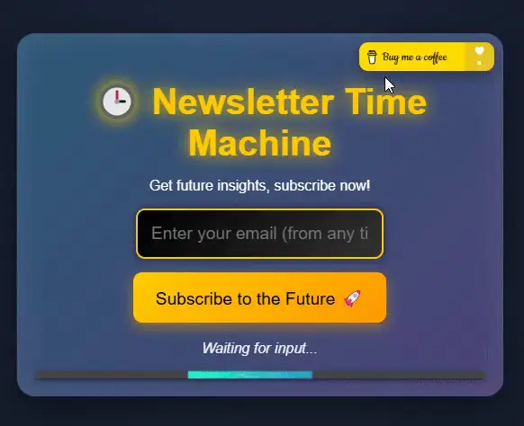
Step 1: The Core Structure
We started by structuring the form in HTML. This included:
Header Section:
- A title and subtitle to set the theme (time travel!).
Form Body:
- An email input field.
- A “Subscribe” button that triggers interactive animations.
Footer Section:
- A status message for feedback.
- A loading bar for visual progress after submission.
To make it more engaging, we added a “Buy Me a Coffee” button at the top-right corner, subtly encouraging users to support the project.
<div>


<p>Step 2: Styling for a Futuristic Look</p>

<p>The design needed to feel high-tech, so we focused on:</p>

<ul>
<li>Neon Colors: Bright, glowing colors for a sci-fi vibe.</li>
<li>Smooth Transitions: Subtle animations to make the UI feel alive.</li>
<li>Responsive Design: Ensuring the form looked great on all devices.</li>
</ul>

<p>Key styles included:</p>

<p>A glowing neon effect using text-shadow.<br>
Background animations with @keyframes to create a dynamic atmosphere.<br>
Button hover effects for an interactive feel.</p>

<p>CSS Code<br>
</p>

<pre class="brush:php;toolbar:false">body {
  font-family: 'Orbitron', sans-serif;
  background: radial-gradient(circle, #1b2735, #090a0f);
  color: #fff;
  margin: 0;
  padding: 0;
  overflow: hidden;
  animation: backgroundGlow 10s infinite alternate;
}

@keyframes backgroundGlow {
  0% {
    background: radial-gradient(circle, #1b2735, #090a0f);
  }
  100% {
    background: radial-gradient(circle, #202d42, #0d0f1a);
  }
}

.newsletter-container {
  position: relative;
  width: 80%;
  max-width: 500px;
  margin: 100px auto;
  background: linear-gradient(135deg, #2b5876, #4e4376);
  border-radius: 20px;
  padding: 20px;
  box-shadow: 0 15px 50px rgba(0, 0, 0, 0.5), inset 0 0 30px rgba(255, 255, 255, 0.1);
}

.coffee-button {
  position: absolute;
  top: 10px;
  right: 10px;
  display: inline-block;
  transition: transform 0.3s ease, box-shadow 0.3s ease;
}

.coffee-button img {
  width: 150px;
  border-radius: 10px;
  box-shadow: 0 5px 15px rgba(0, 0, 0, 0.3);
}

.coffee-button:hover img {
  transform: scale(1.1);
  box-shadow: 0 10px 30px rgba(255, 223, 0, 0.5);
}
Step 3: Adding Interactivity
We wanted the form to feel alive and responsive, so we used JavaScript to:
- Validate the email field.
- Display dynamic messages (error, success, loading).
- Animate a loading bar for visual feedback.
JavaScript Code
const subscribeBtn = document.getElementById('subscribe-btn');
const emailInput = document.getElementById('email');
const statusMessage = document.querySelector('.status-message');

subscribeBtn.addEventListener('click', () => {
  const email = emailInput.value.trim();

  if (!email) {
    statusMessage.textContent = '?? Please enter a valid email address!';
    statusMessage.style.color = '#ff4d4d';
    return;
  }

  statusMessage.textContent = '? Calculating time coordinates...';
  statusMessage.style.color = '#ffc107';

  setTimeout(() => {
    statusMessage.textContent = '? Coordinates verified! Welcome to the future.';
    statusMessage.style.color = '#00ff99';
    emailInput.value = '';
  }, 3000);
});
Step 4: Testing and Deployment
To ensure a smooth experience:
- We tested on different browsers and devices for responsiveness.
- We optimized the code for performance (minimizing CSS and JS).
Finally, we published the project on CodePen to showcase it to the community.
Key Takeaways
- Innovative Design Sells: A unique theme like time travel can elevate a simple form into something extraordinary.
- Interactivity is Key: Engaging animations and dynamic feedback keep users invested.
- Premium Feel: Glowing neon effects and smooth transitions give the form a high-end look.
Check It Out!
Explore the live demo here: Futuristic Newsletter Sign-Up Form on https://codepen.io/HanGPIIIErr/pen/oNKKXqg
For more creative designs and fun projects, visit https://gladiatorsbattle.com/ and dive into the world of gladiator-themed mini-games and premium designs. ?

The above is the detailed content of How We Created a Futuristic Newsletter Sign-Up Form with Premium UI/UX. For more information, please follow other related articles on the PHP Chinese website!

Hot AI Tools

Undress AI Tool
Undress images for free

Undresser.AI Undress
AI-powered app for creating realistic nude photos

AI Clothes Remover
Online AI tool for removing clothes from photos.

Clothoff.io
AI clothes remover

Video Face Swap
Swap faces in any video effortlessly with our completely free AI face swap tool!

Hot Article
Hot Tools

Notepad++7.3.1
Easy-to-use and free code editor

SublimeText3 Chinese version
Chinese version, very easy to use

Zend Studio 13.0.1
Powerful PHP integrated development environment

Dreamweaver CS6
Visual web development tools

SublimeText3 Mac version
God-level code editing software (SublimeText3)
Hot Topics


 CSS tutorial for creating loading spinners and animations
Jul 07, 2025 am 12:07 AM
CSS tutorial for creating loading spinners and animations
Jul 07, 2025 am 12:07 AM
There are three ways to create a CSS loading rotator: 1. Use the basic rotator of borders to achieve simple animation through HTML and CSS; 2. Use a custom rotator of multiple points to achieve the jump effect through different delay times; 3. Add a rotator in the button and switch classes through JavaScript to display the loading status. Each approach emphasizes the importance of design details such as color, size, accessibility and performance optimization to enhance the user experience.
 Addressing CSS Browser Compatibility issues and prefixes
Jul 07, 2025 am 01:44 AM
Addressing CSS Browser Compatibility issues and prefixes
Jul 07, 2025 am 01:44 AM
To deal with CSS browser compatibility and prefix issues, you need to understand the differences in browser support and use vendor prefixes reasonably. 1. Understand common problems such as Flexbox and Grid support, position:sticky invalid, and animation performance is different; 2. Check CanIuse confirmation feature support status; 3. Correctly use -webkit-, -moz-, -ms-, -o- and other manufacturer prefixes; 4. It is recommended to use Autoprefixer to automatically add prefixes; 5. Install PostCSS and configure browserslist to specify the target browser; 6. Automatically handle compatibility during construction; 7. Modernizr detection features can be used for old projects; 8. No need to pursue consistency of all browsers,
 What is the difference between display: inline, display: block, and display: inline-block?
Jul 11, 2025 am 03:25 AM
What is the difference between display: inline, display: block, and display: inline-block?
Jul 11, 2025 am 03:25 AM
Themaindifferencesbetweendisplay:inline,block,andinline-blockinHTML/CSSarelayoutbehavior,spaceusage,andstylingcontrol.1.Inlineelementsflowwithtext,don’tstartonnewlines,ignorewidth/height,andonlyapplyhorizontalpadding/margins—idealforinlinetextstyling
 Styling visited links differently with CSS
Jul 11, 2025 am 03:26 AM
Styling visited links differently with CSS
Jul 11, 2025 am 03:26 AM
Setting the style of links you have visited can improve the user experience, especially in content-intensive websites to help users navigate better. 1. Use CSS's: visited pseudo-class to define the style of the visited link, such as color changes; 2. Note that the browser only allows modification of some attributes due to privacy restrictions; 3. The color selection should be coordinated with the overall style to avoid abruptness; 4. The mobile terminal may not display this effect, and it is recommended to combine it with other visual prompts such as icon auxiliary logos.
 Creating custom shapes with css clip-path
Jul 09, 2025 am 01:29 AM
Creating custom shapes with css clip-path
Jul 09, 2025 am 01:29 AM
Use the clip-path attribute of CSS to crop elements into custom shapes, such as triangles, circular notches, polygons, etc., without relying on pictures or SVGs. Its advantages include: 1. Supports a variety of basic shapes such as circle, ellipse, polygon, etc.; 2. Responsive adjustment and adaptable to mobile terminals; 3. Easy to animation, and can be combined with hover or JavaScript to achieve dynamic effects; 4. It does not affect the layout flow, and only crops the display area. Common usages are such as circular clip-path:circle (50pxatcenter) and triangle clip-path:polygon (50%0%, 100 0%, 0 0%). Notice
 What is the CSS Painting API?
Jul 04, 2025 am 02:16 AM
What is the CSS Painting API?
Jul 04, 2025 am 02:16 AM
TheCSSPaintingAPIenablesdynamicimagegenerationinCSSusingJavaScript.1.DeveloperscreateaPaintWorkletclasswithapaint()method.2.TheyregisteritviaregisterPaint().3.ThecustompaintfunctionisthenusedinCSSpropertieslikebackground-image.Thisallowsfordynamicvis
 How to create responsive images using CSS?
Jul 15, 2025 am 01:10 AM
How to create responsive images using CSS?
Jul 15, 2025 am 01:10 AM
To create responsive images using CSS, it can be mainly achieved through the following methods: 1. Use max-width:100% and height:auto to allow the image to adapt to the container width while maintaining the proportion; 2. Use HTML's srcset and sizes attributes to intelligently load the image sources adapted to different screens; 3. Use object-fit and object-position to control image cropping and focus display. Together, these methods ensure that the images are presented clearly and beautifully on different devices.
 What are common CSS browser inconsistencies?
Jul 26, 2025 am 07:04 AM
What are common CSS browser inconsistencies?
Jul 26, 2025 am 07:04 AM
Different browsers have differences in CSS parsing, resulting in inconsistent display effects, mainly including the default style difference, box model calculation method, Flexbox and Grid layout support level, and inconsistent behavior of certain CSS attributes. 1. The default style processing is inconsistent. The solution is to use CSSReset or Normalize.css to unify the initial style; 2. The box model calculation method of the old version of IE is different. It is recommended to use box-sizing:border-box in a unified manner; 3. Flexbox and Grid perform differently in edge cases or in old versions. More tests and use Autoprefixer; 4. Some CSS attribute behaviors are inconsistent. CanIuse must be consulted and downgraded.
