


Image Swap in Pure CSS
Let's create Image Swap tutorial in Pure CSS without using JavaScript.
- Let's create few elements in html using input radios, labels. At the end, also let's add **
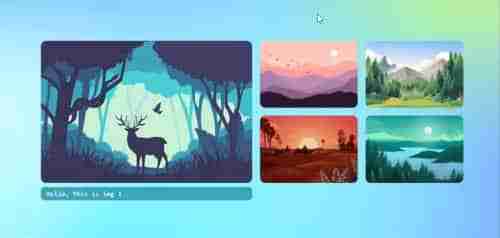
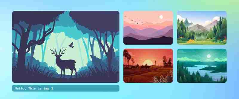
<div>


<p>Let's create <strong>CSS</strong><br>
</p>

<pre class="brush:php;toolbar:false"> * {
    margin: 0;
    padding: 0;
}

html {
    height: 100%;
    scroll-behavior: smooth;
}

body {
    display: flex;
    flex-direction: column;
    height: 100%;
    font-family: monospace;
    place-content: center;
    background-size: 100% 100%;
    background-position: 0px 0px;
    background-image: radial-gradient(18% 28% at 24% 50%, #CEFAFFFF 7%,
 #073AFF00 100%), radial-gradient(18% 28% at 18% 71%, #FFFFFF59 6%,
#073AFF00 100%), radial-gradient(70% 53% at 36% 76%, #73F2FFFF 0%,
#073AFF00 100%), radial-gradient(42% 53% at 15% 94%, #FFFFFFFF 7%,
 #073AFF00 100%), radial-gradient(42% 53% at 34% 72%, #FFFFFFFF 7%,
 #073AFF00 100%), radial-gradient(18% 28% at 35% 87%, #FFFFFFFF 7%,
 #073AFF00 100%), radial-gradient(31% 43% at 7% 98%, #FFFFFFFF 24%,
 #073AFF00 100%), radial-gradient(21% 37% at 72% 23%, #D3FF6D9C 24%,
 #073AFF00 100%), radial-gradient(35% 56% at 91% 74%, #8A4FFFF5 9%,
 #073AFF00 100%), radial-gradient(74% 86% at 67% 38%, #84d9ff 24%,
 #073AFF00 100%), linear-gradient(125deg, #4EB5FFFF 1%, #4C00FCFF 100%);
}

.wrapper {
    width: 860px;
    height: 283px;
    position: relative;
    margin: 0 auto;
}

.wrapper label {
    width: 200px;
    height: 134px;
    cursor: pointer;
    position: absolute;
    transition: 0.25s;
    border-radius: 10px;
}

.wrapper label img{
    max-width: 100%;
    height: 100%;
    border-radius: 10px;
}

.wrapper input[type="radio"] {
    padding: 5px 5px 5px 10px;
    height: 134px;
    width: 200px;
    cursor: pointer;
    position: absolute;
    z-index: -1;
    opacity: 0;
}

.wrapper input[type="radio"]+label span {
    opacity: 0;
    background: var(--bg);
    display: inline-block;
    border-radius: 7px;
    padding: 5px 0 5px 10px;
    margin-top: 5px;
    width: calc(100% - 10px);
    color: white;
}

.wrapper input[type="radio"]:checked+label span {
    opacity: 1;
    animation-delay: 1s;
    animation: fade 1s;
}

/* static positions */
.wrapper input[type="radio"]#s1,
.wrapper input[type="radio"]#s1+label {
    left: 0;
    top: 0;
}

.wrapper input[type="radio"]#s2,
.wrapper input[type="radio"]#s2+label {
    left: 440px;
    top: 0;
}

.wrapper input[type="radio"]#s3,
.wrapper input[type="radio"]#s3+label {
    left: 655px;
    top: 0;
}

.wrapper input[type="radio"]#s4,
.wrapper input[type="radio"]#s4+label {
    left: 440px;
    top: 150px;
}

.wrapper input[type="radio"]#s5,
.wrapper input[type="radio"]#s5+label {
    left: 655px;
    top: 150px;
}

/* onclick shows large image and caption*/
.wrapper input[type="radio"]:checked,
.wrapper input[type="radio"]:checked+label {
    left: 0 !important;
    top: 0 !important;
    width: 425px;
    height: 100%;
}

/* placing first item position when clickced on other thumbnails */
.wrapper input[type="radio"]#s2:checked~#s1+label {
    left: 440px;
}

.wrapper input[type="radio"]#s3:checked~#s1+label {
    left: 660px;
}

.wrapper input[type="radio"]#s4:checked~#s1+label {
    left: 440px;
    top: 150px;
}

.wrapper input[type="radio"]#s5:checked~#s1+label {
    left: 660px;
    top: 150px;
}

@keyframes fade {
    from {
        opacity: 0;
    }

    to {
        opacity: 1;
    }
}

/* changing background color when clicked on thumbnails */
.bg {
    position: fixed;
    left: 0;
    top: 0;
    width: 100vw;
    height: 100vh;
    z-index: -1;
}

.wrapper input[type="radio"]#s2:checked~.bg {
    background-image: radial-gradient(circle, rgba(238, 174, 202, 1) 0%, rgba(148, 187, 233, 1) 100%);
}

.wrapper input[type="radio"]#s3:checked~.bg {
    background-image: radial-gradient(circle, rgb(197, 218, 196) 0%, rgb(88, 167, 204) 100%);
}

.wrapper input[type="radio"]#s4:checked~.bg {
    background-image: radial-gradient(circle, rgb(238, 226, 174) 0%, rgb(177, 139, 131) 100%);
}

.wrapper input[type="radio"]#s5:checked~.bg {
    background-image: radial-gradient(circle, rgb(174, 238, 225) 0%, rgb(36, 163, 136) 100%);
}
Now, we have done the swap animations with static positions. Check the output in below gif animation if it plays else go to the end of this article and view the codepen link for demo.

Now let's try with dynamic width and height using CSS custom variables. Using custom css variables is very useful because just by changing at only 2 places, all the sizes(large and thumbnails) including gaps will get automatically fixed. Let's create variables in :root
 :root {
     --w: 800px;
     --h: 270px;
     --m: 15px;
     --thumbw: calc(var(--w)/4 - 15px);
     --thumbh: calc(50% - var(--m));
     --top: calc(var(--h)/2 + var(--m)/2 + 0px);
 }
Now ignore all the previous CSS and replace with below CSS. You can find below the previous CSS are commented and replaced with custom variables.
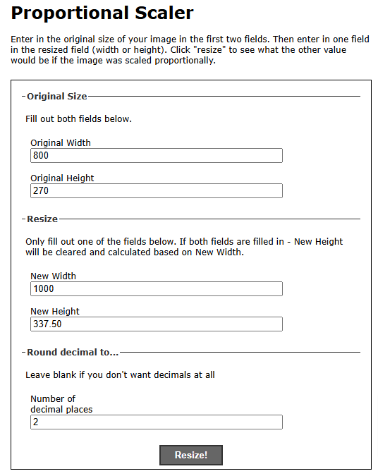
:root {
    --w: 800px;
    --h: 270px;
    --m: 15px;
    --thumbw: calc(var(--w)/4 - 15px);
    --thumbh: calc(50% - var(--m));
    --top: calc(var(--h)/2 + var(--m)/2 + 0px);
}

 * {
     margin: 0;
     padding: 0;
 }

 html {
     height: 100%;
     scroll-behavior: smooth;
 }

body {
    display: flex;
    flex-direction: column;
    height: 100%;
    font-family: monospace;
    place-content: center;
    background-size: 100% 100%;
    background-position: 0px 0px;
    background-image: radial-gradient(18% 28% at 24% 50%, #CEFAFFFF 7%,
 #073AFF00 100%), radial-gradient(18% 28% at 18% 71%, #FFFFFF59 6%,
#073AFF00 100%), radial-gradient(70% 53% at 36% 76%, #73F2FFFF 0%,
#073AFF00 100%), radial-gradient(42% 53% at 15% 94%, #FFFFFFFF 7%,
 #073AFF00 100%), radial-gradient(42% 53% at 34% 72%, #FFFFFFFF 7%,
 #073AFF00 100%), radial-gradient(18% 28% at 35% 87%, #FFFFFFFF 7%,
 #073AFF00 100%), radial-gradient(31% 43% at 7% 98%, #FFFFFFFF 24%,
 #073AFF00 100%), radial-gradient(21% 37% at 72% 23%, #D3FF6D9C 24%,
 #073AFF00 100%), radial-gradient(35% 56% at 91% 74%, #8A4FFFF5 9%,
 #073AFF00 100%), radial-gradient(74% 86% at 67% 38%, #84d9ff 24%,
 #073AFF00 100%), linear-gradient(125deg, #4EB5FFFF 1%, #4C00FCFF 100%);
}

 .wrapper {
     /* width: 860px; */
     /* height: 283px; */
     width: var(--w);
     height: var(--h);
     position: relative;
     margin: 0 auto;
 }

 .wrapper label {
     /* width: 200px; */
     width: var(--thumbw);
     height: calc(50% - var(--m) / 2);
     cursor: pointer;
     position: absolute;
     transition: 0.25s;
     border-radius: 10px;
 }

 .wrapper label img,
 .wrapper label div {
     max-width: 100%;
     height: 100%;
     border-radius: 10px;
 }

 .wrapper input[type="radio"] {
     padding: 5px 5px 5px 10px;
      /* width: 200px; */
     /* height: 134px; */
     height: calc(50% - var(--m) / 2);
     width: var(--thumbw);
     cursor: pointer;
     position: absolute;
     z-index: -1;
     opacity: 0;
 }

 .wrapper input[type="radio"]+label span {
     opacity: 0;
     background: var(--bg);
     display: inline-block;
     border-radius: 7px;
     padding: 5px 0 5px 10px;
     margin-top: 5px;
     width: calc(100% - 10px);
     color: white;
 }

 .wrapper input[type="radio"]:checked+label span {
     opacity: 1;
     animation-delay: 1s;
     animation: fade 1s;
 }

 .wrapper input[type="radio"]#s1,
 .wrapper input[type="radio"]#s1+label {
     left: 0;
     top: 0;
 }

 .wrapper input[type="radio"]#s2,
 .wrapper input[type="radio"]#s2+label {
     /* left: 440px; */
     left: calc((var(--w)/2) + var(--m));
     top: 0;
 }

 .wrapper input[type="radio"]#s3,
 .wrapper input[type="radio"]#s3+label {
     /* left: 655px; */
     left: calc(var(--w)/2 + var(--thumbw) + var(--m) + 15px);
     top: 0;
 }

 .wrapper input[type="radio"]#s4,
 .wrapper input[type="radio"]#s4+label {
     /* left: 440px; */
      /* top: 150px; */
     left: calc((var(--w)/2) + var(--m));
     top: var(--top);
 }

 .wrapper input[type="radio"]#s5,
 .wrapper input[type="radio"]#s5+label {
     /* left: 655px; */
      /* top: 150px; */
     left: calc(var(--w)/2 + var(--thumbw) + var(--m) + 15px);
     top: var(--top);
 }

 .wrapper input[type="radio"]:checked,
 .wrapper input[type="radio"]:checked+label {
     left: 0 !important;
     top: 0 !important;
     /* width: 425px; */
     width: calc(var(--w)/2);
     height: 100%;
 }

 .bg {
     position: fixed;
     left: 0;
     top: 0;
     width: 100vw;
     height: 100vh;
     z-index: -1;
 }

 .wrapper input[type="radio"]#s2:checked~#s1+label {
     /* left: 440px; */
     left: calc((var(--w)/2) + var(--m));
 }

 .wrapper input[type="radio"]#s3:checked~#s1+label {
     /* left: 660px; */
     left: calc(var(--w)/2 + var(--thumbw) + var(--m) + 15px);
 }

 .wrapper input[type="radio"]#s4:checked~#s1+label {
     /* left: 440px; */
      /* top: 150px; */
     left: calc((var(--w)/2) + var(--m));
     top: var(--top);
 }

 .wrapper input[type="radio"]#s5:checked~#s1+label {
     /* left: 660px; */
      /* top: 150px; */
     left: calc(var(--w)/2 + var(--thumbw) + var(--m)*2);
     top: var(--top);
 }


 @keyframes fade {
     from {
         opacity: 0;
     }

     to {
         opacity: 1;
     }
 }

 .wrapper input[type="radio"]#s2:checked~.bg {
     background-image: radial-gradient(circle, rgba(238, 174, 202, 1) 0%, rgba(148, 187, 233, 1) 100%);
 }

 .wrapper input[type="radio"]#s3:checked~.bg {
     background-image: radial-gradient(circle, rgb(197, 218, 196) 0%, rgb(88, 167, 204) 100%);
 }

 .wrapper input[type="radio"]#s4:checked~.bg {
     background-image: radial-gradient(circle, rgb(238, 226, 174) 0%, rgb(177, 139, 131) 100%);
 }

 .wrapper input[type="radio"]#s5:checked~.bg {
     background-image: radial-gradient(circle, rgb(174, 238, 225) 0%, rgb(36, 163, 136) 100%);
 }
Now in the :root {--w: 800px; --h: 270px;}. Just change the width and height proportionately. Go to url https://scriptygoddess.com/resources/proportioncalc.htm and type :root width and height shown in below image
Now type new width or height to get proportionate value. I added my new width 1000 and clicked on resize and I got 337.5 as height and I assigned in :root {--w: 1000px; --h: 337.5px;}. That's all you have to do. You can see the change in all images - width, height, gaps increases proportionately.
You can edit the value of width and height in :root in below codepen link and run. Have fun!
Codepen DemoThank you for watching...
The above is the detailed content of Image Swap in Pure CSS. For more information, please follow other related articles on the PHP Chinese website!


Hot AI Tools

Undress AI Tool
Undress images for free

Undresser.AI Undress
AI-powered app for creating realistic nude photos

AI Clothes Remover
Online AI tool for removing clothes from photos.

Clothoff.io
AI clothes remover

Video Face Swap
Swap faces in any video effortlessly with our completely free AI face swap tool!

Hot Article
Hot Tools

Notepad++7.3.1
Easy-to-use and free code editor

SublimeText3 Chinese version
Chinese version, very easy to use

Zend Studio 13.0.1
Powerful PHP integrated development environment

Dreamweaver CS6
Visual web development tools

SublimeText3 Mac version
God-level code editing software (SublimeText3)


 CSS tutorial for creating loading spinners and animations
Jul 07, 2025 am 12:07 AM
CSS tutorial for creating loading spinners and animations
Jul 07, 2025 am 12:07 AM
There are three ways to create a CSS loading rotator: 1. Use the basic rotator of borders to achieve simple animation through HTML and CSS; 2. Use a custom rotator of multiple points to achieve the jump effect through different delay times; 3. Add a rotator in the button and switch classes through JavaScript to display the loading status. Each approach emphasizes the importance of design details such as color, size, accessibility and performance optimization to enhance the user experience.
 Addressing CSS Browser Compatibility issues and prefixes
Jul 07, 2025 am 01:44 AM
Addressing CSS Browser Compatibility issues and prefixes
Jul 07, 2025 am 01:44 AM
To deal with CSS browser compatibility and prefix issues, you need to understand the differences in browser support and use vendor prefixes reasonably. 1. Understand common problems such as Flexbox and Grid support, position:sticky invalid, and animation performance is different; 2. Check CanIuse confirmation feature support status; 3. Correctly use -webkit-, -moz-, -ms-, -o- and other manufacturer prefixes; 4. It is recommended to use Autoprefixer to automatically add prefixes; 5. Install PostCSS and configure browserslist to specify the target browser; 6. Automatically handle compatibility during construction; 7. Modernizr detection features can be used for old projects; 8. No need to pursue consistency of all browsers,
 Creating custom shapes with css clip-path
Jul 09, 2025 am 01:29 AM
Creating custom shapes with css clip-path
Jul 09, 2025 am 01:29 AM
Use the clip-path attribute of CSS to crop elements into custom shapes, such as triangles, circular notches, polygons, etc., without relying on pictures or SVGs. Its advantages include: 1. Supports a variety of basic shapes such as circle, ellipse, polygon, etc.; 2. Responsive adjustment and adaptable to mobile terminals; 3. Easy to animation, and can be combined with hover or JavaScript to achieve dynamic effects; 4. It does not affect the layout flow, and only crops the display area. Common usages are such as circular clip-path:circle (50pxatcenter) and triangle clip-path:polygon (50%0%, 100 0%, 0 0%). Notice
 What is the difference between display: inline, display: block, and display: inline-block?
Jul 11, 2025 am 03:25 AM
What is the difference between display: inline, display: block, and display: inline-block?
Jul 11, 2025 am 03:25 AM
Themaindifferencesbetweendisplay:inline,block,andinline-blockinHTML/CSSarelayoutbehavior,spaceusage,andstylingcontrol.1.Inlineelementsflowwithtext,don’tstartonnewlines,ignorewidth/height,andonlyapplyhorizontalpadding/margins—idealforinlinetextstyling
 Styling visited links differently with CSS
Jul 11, 2025 am 03:26 AM
Styling visited links differently with CSS
Jul 11, 2025 am 03:26 AM
Setting the style of links you have visited can improve the user experience, especially in content-intensive websites to help users navigate better. 1. Use CSS's: visited pseudo-class to define the style of the visited link, such as color changes; 2. Note that the browser only allows modification of some attributes due to privacy restrictions; 3. The color selection should be coordinated with the overall style to avoid abruptness; 4. The mobile terminal may not display this effect, and it is recommended to combine it with other visual prompts such as icon auxiliary logos.
 How to create responsive images using CSS?
Jul 15, 2025 am 01:10 AM
How to create responsive images using CSS?
Jul 15, 2025 am 01:10 AM
To create responsive images using CSS, it can be mainly achieved through the following methods: 1. Use max-width:100% and height:auto to allow the image to adapt to the container width while maintaining the proportion; 2. Use HTML's srcset and sizes attributes to intelligently load the image sources adapted to different screens; 3. Use object-fit and object-position to control image cropping and focus display. Together, these methods ensure that the images are presented clearly and beautifully on different devices.
 What are common CSS browser inconsistencies?
Jul 26, 2025 am 07:04 AM
What are common CSS browser inconsistencies?
Jul 26, 2025 am 07:04 AM
Different browsers have differences in CSS parsing, resulting in inconsistent display effects, mainly including the default style difference, box model calculation method, Flexbox and Grid layout support level, and inconsistent behavior of certain CSS attributes. 1. The default style processing is inconsistent. The solution is to use CSSReset or Normalize.css to unify the initial style; 2. The box model calculation method of the old version of IE is different. It is recommended to use box-sizing:border-box in a unified manner; 3. Flexbox and Grid perform differently in edge cases or in old versions. More tests and use Autoprefixer; 4. Some CSS attribute behaviors are inconsistent. CanIuse must be consulted and downgraded.
 Demystifying CSS Units: px, em, rem, vw, vh comparisons
Jul 08, 2025 am 02:16 AM
Demystifying CSS Units: px, em, rem, vw, vh comparisons
Jul 08, 2025 am 02:16 AM
The choice of CSS units depends on design requirements and responsive requirements. 1.px is used for fixed size, suitable for precise control but lack of elasticity; 2.em is a relative unit, which is easily caused by the influence of the parent element, while rem is more stable based on the root element and is suitable for global scaling; 3.vw/vh is based on the viewport size, suitable for responsive design, but attention should be paid to the performance under extreme screens; 4. When choosing, it should be determined based on whether responsive adjustments, element hierarchy relationships and viewport dependence. Reasonable use can improve layout flexibility and maintenance.
