


When we work with CSS, one of the fundamental concepts is to understand how styles are applied to a web page. The "cascade" is precisely the mechanism that defines how browsers decide which CSS rules to apply when there are multiple styles for the same element. Understanding the flow of styles and how cascading works not only improves our skills as developers, but also helps us write cleaner, more efficient and maintainable CSS code.
What is Waterfall in CSS?
Cascading is the process CSS uses to determine which styles to apply to elements on a page. This process follows certain rules and priorities based on three main factors:
Specificity: How specific the selector is.
Importance: Whether the !important property has been applied.
Declaration order: The place where the rule is located in the style sheet.
The waterfall evaluates these rules in order to decide which style should be applied. If two rules have the same level of specificity and neither uses !important, the browser will apply the rule that is closest to the end of the style sheet, following the order of the declaration.
How Style Flow Works
Style flow in CSS refers to the order in which style rules are applied depending on their specificity and location. Let's break down the most important points:
Browser styles: All browsers apply certain styles by default (such as the margin on the body element or the unordered list ul ). These styles are applied first and can be overridden with our custom CSS rules.
External styles: Those that we define in external style sheets, usually linked with the link tag in the HTML. These styles have higher priority than browser styles.
Inline styles: These are styles applied directly in the HTML with the style attribute. They have higher specificity and usually override external style sheet rules.
Rules !important: Using !important gives a rule the highest priority, overriding any other applied styles, regardless of specificity.
Basic Waterfall Example
Let's imagine an element with several rules applied from different places:
HTML

Suppose we have the following rules in our CSS
CSS

In this case, the text will appear blue, since cascade is the last defined declaration, in addition to having the same specificity as the previous declaration.
But you can come across this scenario, that although the specificity and the cascade are the same, you will be able to see a significant change.
CSS

In this case, the text will appear green, since the rule color: green !important; has the highest priority thanks to the use of !important, this ignores both specificity and cascade.
Declaration Order Example
As I mentioned before, if we have two rules with the same specificity but declared in different places, the one lower in the style sheet will apply:
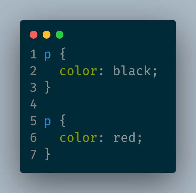
The paragraph will be red, since that rule is declared after the rule that establishes the color black.
Good Practices for Managing the Cascade and Flow of Styles
Minimize the use of !important: Although useful in specific situations, overusing !important can make your CSS difficult to maintain and overwrite. Use it only in cases where it is really necessary.
Use classes instead of IDs: Classes have less specificity than IDs, allowing more flexibility to override styles without generating overly specific CSS.
Organize your CSS from general to specific: Start by defining global styles and then move on to more specific rules. This follows a logical flow and makes the code easier to understand.
Group and order your selectors consistently: Keep rules that affect the same elements together to make it easier to visualize the waterfall and make adjustments.
Document the rules !important: If you need to use !important, document the reason. This will help you remember the reason and reduce the risk of the code getting confusing.
Tools to Visualize Specificity and Cascade
There are online tools and browser extensions that allow you to visualize the specificity of your selectors and see the flow of styles applied to a particular element. For example:
Chrome DevTools: By inspecting an element, you can see which CSS rules are being applied and in what order.
Specificity Calculator: Tools like Specificity Calculator allow you to calculate the specificity of a selector.
CSS Stats: A resource that allows you to view statistics of your CSS, including the level of specificity of your selectors.
Summary
Cascading and flow of styles are basic principles in CSS, but understanding them well can make a big difference in how we organize and manage our styles. By knowing how cascading is applied, we can structure our CSS to be cleaner, more efficient, and easier to maintain.
Now that you understand cascading, you'll be able to have better control over your CSS styles and avoid unexpected overwrite issues!
The above is the detailed content of Understand Cascading and Flow of Styles in CSS. For more information, please follow other related articles on the PHP Chinese website!

Hot AI Tools

Undress AI Tool
Undress images for free

Undresser.AI Undress
AI-powered app for creating realistic nude photos

AI Clothes Remover
Online AI tool for removing clothes from photos.

Clothoff.io
AI clothes remover

Video Face Swap
Swap faces in any video effortlessly with our completely free AI face swap tool!

Hot Article
Hot Tools

Notepad++7.3.1
Easy-to-use and free code editor

SublimeText3 Chinese version
Chinese version, very easy to use

Zend Studio 13.0.1
Powerful PHP integrated development environment

Dreamweaver CS6
Visual web development tools

SublimeText3 Mac version
God-level code editing software (SublimeText3)


 CSS tutorial for creating loading spinners and animations
Jul 07, 2025 am 12:07 AM
CSS tutorial for creating loading spinners and animations
Jul 07, 2025 am 12:07 AM
There are three ways to create a CSS loading rotator: 1. Use the basic rotator of borders to achieve simple animation through HTML and CSS; 2. Use a custom rotator of multiple points to achieve the jump effect through different delay times; 3. Add a rotator in the button and switch classes through JavaScript to display the loading status. Each approach emphasizes the importance of design details such as color, size, accessibility and performance optimization to enhance the user experience.
 Addressing CSS Browser Compatibility issues and prefixes
Jul 07, 2025 am 01:44 AM
Addressing CSS Browser Compatibility issues and prefixes
Jul 07, 2025 am 01:44 AM
To deal with CSS browser compatibility and prefix issues, you need to understand the differences in browser support and use vendor prefixes reasonably. 1. Understand common problems such as Flexbox and Grid support, position:sticky invalid, and animation performance is different; 2. Check CanIuse confirmation feature support status; 3. Correctly use -webkit-, -moz-, -ms-, -o- and other manufacturer prefixes; 4. It is recommended to use Autoprefixer to automatically add prefixes; 5. Install PostCSS and configure browserslist to specify the target browser; 6. Automatically handle compatibility during construction; 7. Modernizr detection features can be used for old projects; 8. No need to pursue consistency of all browsers,
 What is the difference between display: inline, display: block, and display: inline-block?
Jul 11, 2025 am 03:25 AM
What is the difference between display: inline, display: block, and display: inline-block?
Jul 11, 2025 am 03:25 AM
Themaindifferencesbetweendisplay:inline,block,andinline-blockinHTML/CSSarelayoutbehavior,spaceusage,andstylingcontrol.1.Inlineelementsflowwithtext,don’tstartonnewlines,ignorewidth/height,andonlyapplyhorizontalpadding/margins—idealforinlinetextstyling
 Creating custom shapes with css clip-path
Jul 09, 2025 am 01:29 AM
Creating custom shapes with css clip-path
Jul 09, 2025 am 01:29 AM
Use the clip-path attribute of CSS to crop elements into custom shapes, such as triangles, circular notches, polygons, etc., without relying on pictures or SVGs. Its advantages include: 1. Supports a variety of basic shapes such as circle, ellipse, polygon, etc.; 2. Responsive adjustment and adaptable to mobile terminals; 3. Easy to animation, and can be combined with hover or JavaScript to achieve dynamic effects; 4. It does not affect the layout flow, and only crops the display area. Common usages are such as circular clip-path:circle (50pxatcenter) and triangle clip-path:polygon (50%0%, 100 0%, 0 0%). Notice
 Styling visited links differently with CSS
Jul 11, 2025 am 03:26 AM
Styling visited links differently with CSS
Jul 11, 2025 am 03:26 AM
Setting the style of links you have visited can improve the user experience, especially in content-intensive websites to help users navigate better. 1. Use CSS's: visited pseudo-class to define the style of the visited link, such as color changes; 2. Note that the browser only allows modification of some attributes due to privacy restrictions; 3. The color selection should be coordinated with the overall style to avoid abruptness; 4. The mobile terminal may not display this effect, and it is recommended to combine it with other visual prompts such as icon auxiliary logos.
 How to create responsive images using CSS?
Jul 15, 2025 am 01:10 AM
How to create responsive images using CSS?
Jul 15, 2025 am 01:10 AM
To create responsive images using CSS, it can be mainly achieved through the following methods: 1. Use max-width:100% and height:auto to allow the image to adapt to the container width while maintaining the proportion; 2. Use HTML's srcset and sizes attributes to intelligently load the image sources adapted to different screens; 3. Use object-fit and object-position to control image cropping and focus display. Together, these methods ensure that the images are presented clearly and beautifully on different devices.
 Demystifying CSS Units: px, em, rem, vw, vh comparisons
Jul 08, 2025 am 02:16 AM
Demystifying CSS Units: px, em, rem, vw, vh comparisons
Jul 08, 2025 am 02:16 AM
The choice of CSS units depends on design requirements and responsive requirements. 1.px is used for fixed size, suitable for precise control but lack of elasticity; 2.em is a relative unit, which is easily caused by the influence of the parent element, while rem is more stable based on the root element and is suitable for global scaling; 3.vw/vh is based on the viewport size, suitable for responsive design, but attention should be paid to the performance under extreme screens; 4. When choosing, it should be determined based on whether responsive adjustments, element hierarchy relationships and viewport dependence. Reasonable use can improve layout flexibility and maintenance.
 What are common CSS browser inconsistencies?
Jul 26, 2025 am 07:04 AM
What are common CSS browser inconsistencies?
Jul 26, 2025 am 07:04 AM
Different browsers have differences in CSS parsing, resulting in inconsistent display effects, mainly including the default style difference, box model calculation method, Flexbox and Grid layout support level, and inconsistent behavior of certain CSS attributes. 1. The default style processing is inconsistent. The solution is to use CSSReset or Normalize.css to unify the initial style; 2. The box model calculation method of the old version of IE is different. It is recommended to use box-sizing:border-box in a unified manner; 3. Flexbox and Grid perform differently in edge cases or in old versions. More tests and use Autoprefixer; 4. Some CSS attribute behaviors are inconsistent. CanIuse must be consulted and downgraded.
