

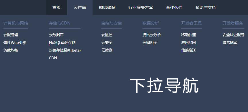
HTML5 responsive navigation menu effects

HTML5 responsive navigation menu effect is a very practical widescreen navigation menu UI layout effect.
All resources on this site are contributed by netizens or reprinted by major download sites. Please check the integrity of the software yourself! All resources on this site are for learning reference only. Please do not use them for commercial purposes. Otherwise, you will be responsible for all consequences! If there is any infringement, please contact us to delete it. Contact information: admin@php.cn
Related Article
 How to create a responsive navigation menu in HTML5?
11 Aug 2025
Use elements of semantic HTML5 to build a navigation structure. 2. Use CSSFlexbox to layout the desktop menu and hide the mobile buttons. 3. Show the hamburger icon on the small screen through media queries and hide the menu. 4. Use JavaScript to switch the menu and icon status. 5. Automatically close the mobile menu after clicking the link. It must include the viewport meta tag, adopt the flex layout, and the menu sliding has a transition effect, ultimately realizing cross-device responsive navigation.
 How to make a responsive navigation menu with HTML5
18 Aug 2025
To create a responsive navigation menu, you must first use HTML5 semantics, then implement desktop layout through CSSFlexbox, and use media queries and JavaScript to display and interact with mobile hamburger menus, ultimately implement cross-device compatible smooth responsive navigation.
 Making a Sliding Side Navigation Menu for Responsive Designs
01 Mar 2025
This tutorial shows you how to build a responsive expandable side navigation menu using JavaScript and CSS. The final result is a sleek, modern menu. Here's a live demo: 1. HTML Structure: Start by adding the HTML for the side menu: × About
 How to create a responsive navigation bar with a dropdown menu?
06 Aug 2025
To create a responsive navigation bar, you must first build an HTML structure containing logo, menu toggle buttons and navigation links; 2. Use CSS to set basic styles and implement responsive layouts, trigger the drop-down menu through:hover on the desktop, hide the menu on the mobile side and switch with the hamburger button; 3. Use JavaScript to expand and close the mobile menu and pull-down items, and automatically close the menu after clicking the link to ensure a good user experience. Finally, a navigation bar with clear structure, beautiful style, and support multi-device interaction is obtained, ending with a complete sentence.
 How to create a responsive navigation menu with a toggle button?
04 Aug 2025
To create a responsive navigation menu, you must first build an HTML structure containing the hamburger icon button and navigation link; 2. Use CSS to set the navigation level under the large screen, hide it under the small screen, and display it through active classes only when clicked; 3. Add click events to the button through JavaScript to switch the active class of the menu to expand and collapse; 4. Optionally, the hamburger icon rotates to "X" animation effect through CSS and JavaScript linkage; finally obtain a cross-device-compatible, keyboard navigation and good accessibility responsive navigation menu. After completion and testing, you can adjust the style details according to the design.
 How to add a navigation menu with HTML5
11 Aug 2025
The method of creating navigation menus using HTML5 is: 1. Use elements to define navigation areas to improve semantics and accessibility; 2. Use unordered lists to wrap navigation links to ensure clear structure; 3. Set display:flex to achieve horizontal layout through CSS and remove the default style; 4. Add media queries to change the menu to vertical arrangement when the screen width is less than 600px; 5. Optionally add brand links or logos to the navigation and style them separately. This method is simple, responsive and easy to maintain, resulting in a beautiful and multi-device compatible navigation menu.
 Responsive navigation menu: realize mobile click expansion and desktop hover display
12 Aug 2025
This article details how to implement the click-expanding function of submenu on mobile devices for responsive navigation menus and the hover on desktop devices. By combining JavaScript dynamic switching classes and CSS media queries, we can provide an intuitive and smooth user experience for different screen sizes, ensuring that the navigation menu works efficiently on any device.
 How to create a responsive navigation menu with CSS?
18 Jul 2025
The core of the responsive navigation menu is clear structure, media query and simple interaction. 1. Use Flexbox to layout the infrastructure, HTML includes logo, link list and hamburger buttons; 2. Arrange elements through flex in CSS and set default styles; 3. Add media queries to hide links and display hamburger buttons when the screen is less than 768px; 4. Use JavaScript to control the menu to expand and close; 5. Optionally add transition animations to improve the experience, pay attention to details such as z-index and click areas to optimize the user experience.
 How to create a responsive navigation bar with a hamburger menu using HTML?
05 Jul 2025
The key to making a responsive navigation bar is to realize the collapse function of the menu on the small screen. The core steps include: 1. Building an HTML structure, including containers, logos, links and hidden hamburger buttons; 2. Using CSS media to query and control styles under different screen sizes, hiding the menu on the mobile terminal and displaying the hamburger buttons; 3. Using JS to realize the interactive logic of click expansion and collapse. Specifically: the navigation items are displayed in HTML.nav-links, and the .hamburger button is hidden by default; the menu is set in CSS to absolutely position and hide the menu, and the hamburger button is displayed; JS controls the menu expansion and collapse by switching the .active class to ensure smooth interaction.


Hot Tools

Black left navigation management panel ui special effects
Native js css3 is used to create a black and practical left-hand category navigation management panel with icon text vertical navigation menu ui layout. Suitable for: functional and backend management UI website templates.
jQuery left drop-down navigation menu background frame template
jQuery creates a vertical drop-down navigation bar on the left and an embedded iframe navigation menu background page template.
js-realize expandable hidden navigation menu button special effects
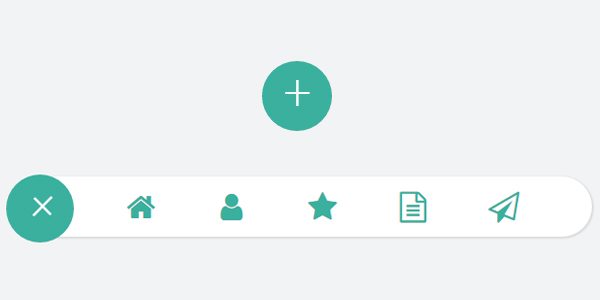
Simple and practical expandable hidden navigation menu button js special effects code download. The feature of this menu is that the menu can be expanded when the button is clicked. When expanded, it has flexible animation effects, which is quite cool. Menu items are small icons. Of course, you can also use icons combined with text. Since the hidden/expanded method is relatively space-saving, this menu can be applied to mobile devices.

Interactive liquid navigation tab bar
A super popular HTML+CSS interactive liquid navigation tab bar with a very beautiful and concise design