


 收藏
收藏


 天蓬老師
天蓬老師批改狀態(tài):合格
老師批語(yǔ):不錯(cuò), 用上錨點(diǎn)了, 有個(gè)建議, 在跳轉(zhuǎn)到目標(biāo)處之后應(yīng)該另一個(gè)按鈕, 再跳轉(zhuǎn)到頭部, <a hre="#">回到頂部</a>就可以

flex布局?flex意為彈性布局,布局元素大小在flex容器中自動(dòng)伸縮,以適應(yīng)容器的變化,特別適合響應(yīng)式布局
| 序號(hào) | 名稱 | 描述 |
|---|---|---|
| 1. | flex-direction | 主軸方向 |
| 2. | flex-wrap | 主軸上項(xiàng)目換行方式 |
| 3. | flex-flow | 主軸方向和主軸上的項(xiàng)目換行方式的復(fù)合屬性 |
| 4. | justify-content | 主軸上的項(xiàng)目對(duì)齊方式 |
| 5. | align-items | 交叉軸上的項(xiàng)目對(duì)齊方式(適用于單行容器) |
| 6. | align-content | 交叉軸上的項(xiàng)目對(duì)齊方式(適用于多行容器) |
flex-direction
<!DOCTYPE html><html lang="en"><head><meta charset="UTF-8"><meta name="viewport" content="width=device-width, initial-scale=1.0"><style>.flex-container {/* 將容器設(shè)置為flex容器 */display: flex;/* 設(shè)置主軸的方向,默認(rèn)從左到右排列 */flex-direction: row;/* 主軸方向從右到左 *//* flex-direction: row-reverse; *//* 主軸方向從上到下 *//* flex-direction: column; *//* 主軸方向從下到上 *//* flex-direction: column-reverse; */width: 300px;height: 150px;}.item {width: 100px;height: 100px;}</style><title>Document</title></head><body><div class="flex-container"><div class="item">flex1</div><div class="item">flex2</div><div class="item">flex3</div><div class="item">flex4</div></div></body></html>


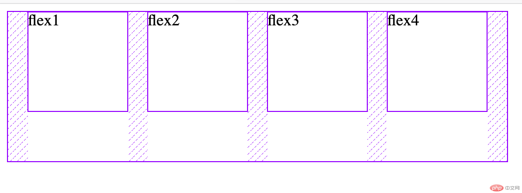
flex-wrap
<!DOCTYPE html><html lang="en"><head><meta charset="UTF-8"><meta name="viewport" content="width=device-width, initial-scale=1.0"><style>.flex-container {display: flex;/* 設(shè)置主軸方向項(xiàng)目換行方式,默認(rèn)不換行 */flex-wrap: nowrap;/* 換行 *//* flex-wrap: wrap; *//* 反向換行 *//* flex-wrap: wrap-reverse; */width: 300px;height: 300px;}.item {width: 100px;height: 100px;}</style><title>Document</title></head><body><div class="flex-container"><div class="item">flex1</div><div class="item">flex2</div><div class="item">flex3</div><div class="item">flex4</div></div></body></html>


flex-flow
<!DOCTYPE html><html lang="en"><head><meta charset="UTF-8"><meta name="viewport" content="width=device-width, initial-scale=1.0"><style>.flex-container {display: flex;/* flex-flow:為flex-direction和flex-wrap的復(fù)合屬性 */flex-flow: row wrap;width: 300px;height: 300px;}.item {width: 100px;height: 100px;}</style><title>Document</title></head><body><div class="flex-container"><div class="item">flex1</div><div class="item">flex2</div><div class="item">flex3</div><div class="item">flex4</div></div></body></html>

justify-content
<!DOCTYPE html><html lang="en"><head><meta charset="UTF-8"><meta name="viewport" content="width=device-width, initial-scale=1.0"><style>.flex-container {display: flex;width: 500px;height: 150px;/* 主軸上項(xiàng)目對(duì)齊方式,默認(rèn)左對(duì)齊 */justify-content: flex-start;/* 右對(duì)齊 *//* justify-content: flex-end; *//* 居中對(duì)齊 *//* justify-content: center; *//* 兩端對(duì)齊 *//* justify-content: space-between; *//* 分散對(duì)齊,項(xiàng)目間距是兩側(cè)兩倍 *//* justify-content: space-around; *//* 平均對(duì)齊 *//* justify-content: space-evenly; */}.item {width: 100px;height: 100px;}</style><title>Document</title></head><body><div class="flex-container"><div class="item">flex1</div><div class="item">flex2</div><div class="item">flex3</div><div class="item">flex4</div></div></body></html>


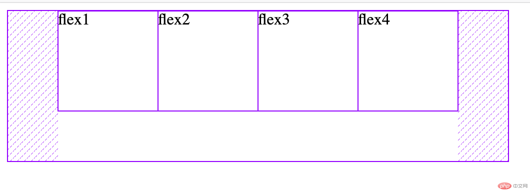


align-items
<!DOCTYPE html><html lang="en"><head><meta charset="UTF-8"><meta name="viewport" content="width=device-width, initial-scale=1.0"><style>.flex-container {display: flex;/* 交叉軸對(duì)齊方式,默認(rèn)為起始線對(duì)齊 */align-items: flex-start;/* 終止線對(duì)齊 *//* align-items: flex-end; *//* 居中對(duì)齊 *//* align-items: center; */width: 400px;height: 150px;}.item {width: 100px;height: 100px;}</style><title>Document</title></head><body><div class="flex-container"><div class="item">flex1</div><div class="item">flex2</div><div class="item">flex3</div><div class="item">flex4</div></div></body></html>


<!DOCTYPE html><html lang="en"><head><meta charset="UTF-8"><meta name="viewport" content="width=device-width, initial-scale=1.0"><style>.flex-container {display: flex;flex-flow: row wrap;/* 多行容器項(xiàng)目交叉軸對(duì)齊方式,默認(rèn)為stretch *//* align-content: stretch; *//* 起始線對(duì)齊 */align-content: flex-start;/* 終止線對(duì)齊 *//* align-content: flex-end; *//* 居中對(duì)齊 *//* align-content: center; *//* 兩端對(duì)齊 *//* align-content: space-between; *//* 分散對(duì)齊 *//* align-content: space-around; *//* 平均對(duì)齊 *//* align-content: space-evenly; */width: 300px;height: 300px;}.item {width: 100px;height: 100px;}</style><title>Document</title></head><body><div class="flex-container"><div class="item">flex1</div><div class="item">flex2</div><div class="item">flex3</div><div class="item">flex4</div></div></body></html>
效果圖同主軸對(duì)齊方式
| 序號(hào) | 名稱 | 描述 |
|---|---|---|
| 1. | order | 項(xiàng)目排序 |
| 2. | align-self | 交叉軸獨(dú)立對(duì)齊方式 |
| 3. | ||
| 3. | ||
| 3. | ||
| 3. |
order
<!DOCTYPE html><html lang="en"><head><meta charset="UTF-8"><meta name="viewport" content="width=device-width, initial-scale=1.0"><style>.flex-container {display: flex;width: 400px;/* 項(xiàng)目排序,默認(rèn)為0,支持負(fù)數(shù)數(shù)值越小排在前面*//* order: 0; */}.item {width: 100px;height: 100px;}.item:first-of-type {order: 4;}.item:nth-of-type(2) {order: 1;}.item:nth-of-type(3) {/* 支持負(fù)數(shù)排序 */order: -1;}.item:last-of-type {order: 6;}</style><title>Document</title></head><body><div class="flex-container"><div class="item">flex1</div><div class="item">flex2</div><div class="item">flex3</div><div class="item">flex4</div></div></body></html>

天蓬老師
微信掃碼
關(guān)注PHP中文網(wǎng)服務(wù)號(hào)
 技術(shù)交流群
QQ掃碼
加入技術(shù)交流群


Copyright 2014-2025 http://ipnx.cn/ All Rights Reserved | php.cn | 湘ICP備2023035733號(hào)