


This article explores techniques for mastering the spacing between columns in responsive grid layouts, using a responsive image gallery as a practical example.
For further insights into responsive layouts, view our screencast: Creating Multiple Column Layouts in Flexbox.
Key Takeaways:
- Custom responsive layouts are achievable by precisely controlling inter-column spacing, as demonstrated with the responsive image gallery.
- The
display: inline-blockmethod creates responsive image galleries; setting the parent's font size to zero removes default inline-block spacing. - Flexbox efficiently solves common layout issues, creating equal-height columns across all screen sizes, simplifying inter-column spacing control in responsive image grids.
- Media queries and CSS Grid layouts enable responsive image grids, applying different CSS rules based on device characteristics (screen size).
Building a Responsive Layout:
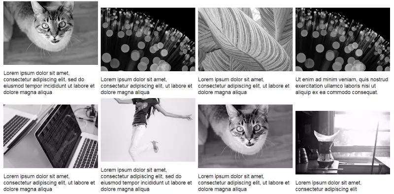
On larger screens, the gallery resembles this:

On smaller screens:

The simple markup:
<div>
  <a href="http://ipnx.cn/link/14d2bc475177e1dde633b4ca1972d53c">
    <img src="/static/imghw/default1.png"  data-src="https://img.php.cn/"  class="lazy" alt="Using Modern CSS to Build a Responsive Image Grid " />
  </a>
  <!-- ...more images... -->
</div>
Several layout methods achieve this. Before exploring two, let's reiterate the requirements:
- Two-column layout on medium and smaller screens.
- 8px inter-column spacing.
Using inline-block:
The display: inline-block method builds the gallery. Consider this CSS:
div {
  font-size: 0;
}

a {
  font-size: 16px;
  display: inline-block;
  margin-bottom: 8px;
  width: calc(50% - 4px);
  margin-right: 8px;
}

a:nth-of-type(2n) {
  margin-right: 0;
}

@media screen and (min-width: 50em) {
  a {
    width: calc(25% - 6px);
  }

  a:nth-of-type(2n) {
    margin-right: 8px;
  }

  a:nth-of-type(4n) {
    margin-right: 0;
  }
}
Explanation:
Default inline-block spacing is overridden by setting the parent's font size to zero. Child element font sizes may need resetting (not here).
Small screens have a two-column layout with 8px spacing. Column width calculation:
- Total inter-column space per row: 1 * 8px = 8px (8px, not 16px, because the right margin is removed from every second column).
- Column width:
calc(50% - 4px)(4px = 8px / 2).

Large screens have a four-column layout with 8px spacing. Column width calculation:
- Total inter-column space per row: 3 * 8px = 24px (24px, not 32px, because the right margin is removed from every fourth column).
- Column width:
calc(25% - 6px)(6px = 24px / 4).

See the CodePen demo for the inline-block method.
Using Flexbox:
The inline-block solution has drawbacks. Adding captions demonstrates one:
Updated markup:
<div>
  <a href="http://ipnx.cn/link/14d2bc475177e1dde633b4ca1972d53c">
    <img src="/static/imghw/default1.png"  data-src="https://img.php.cn/"  class="lazy" alt="Using Modern CSS to Build a Responsive Image Grid " />
  </a>
  <!-- ...more images... -->
</div>
Large screen gallery with captions:
Unequal heights are resolved with Flexbox. Update the parent element's CSS:
div {
  font-size: 0;
}

a {
  font-size: 16px;
  display: inline-block;
  margin-bottom: 8px;
  width: calc(50% - 4px);
  margin-right: 8px;
}

a:nth-of-type(2n) {
  margin-right: 0;
}

@media screen and (min-width: 50em) {
  a {
    width: calc(25% - 6px);
  }

  a:nth-of-type(2n) {
    margin-right: 8px;
  }

  a:nth-of-type(4n) {
    margin-right: 0;
  }
}
The result is equal-height columns across all screens. Large screen example:

See the CodePen demo using Flexbox with improved captions.
Flexbox's justify-content property doesn't directly create this layout. space-between and space-around result in awkward distribution on the last row. CSS:
<div>
  <a href="http://ipnx.cn/link/14d2bc475177e1dde633b4ca1972d53c">
    <img src="/static/imghw/default1.png"  data-src="https://img.php.cn/"  class="lazy" alt="Using Modern CSS to Build a Responsive Image Grid " />
    <figcaption>Some text here</figcaption>
  </a>
  <!-- ...more images... -->
</div>
No margin-right is needed; justify-content handles item distribution.
See the CodePen demo using the justify-content property.
Conclusion:
This post details techniques for controlling inter-column spacing in responsive image grids. While inline-block suffices, Flexbox is easier and more convenient, especially with calc().
Learn more about Flexbox layouts in our screencast: Creating Multiple Column Layouts in Flexbox.
(FAQs section omitted for brevity, as it's a repetition of common responsive design questions.)
The above is the detailed content of Using Modern CSS to Build a Responsive Image Grid. For more information, please follow other related articles on the PHP Chinese website!

Hot AI Tools

Undress AI Tool
Undress images for free

Undresser.AI Undress
AI-powered app for creating realistic nude photos

AI Clothes Remover
Online AI tool for removing clothes from photos.

Clothoff.io
AI clothes remover

Video Face Swap
Swap faces in any video effortlessly with our completely free AI face swap tool!

Hot Article
Hot Tools

Notepad++7.3.1
Easy-to-use and free code editor

SublimeText3 Chinese version
Chinese version, very easy to use

Zend Studio 13.0.1
Powerful PHP integrated development environment

Dreamweaver CS6
Visual web development tools

SublimeText3 Mac version
God-level code editing software (SublimeText3)
Hot Topics


 CSS tutorial for creating loading spinners and animations
Jul 07, 2025 am 12:07 AM
CSS tutorial for creating loading spinners and animations
Jul 07, 2025 am 12:07 AM
There are three ways to create a CSS loading rotator: 1. Use the basic rotator of borders to achieve simple animation through HTML and CSS; 2. Use a custom rotator of multiple points to achieve the jump effect through different delay times; 3. Add a rotator in the button and switch classes through JavaScript to display the loading status. Each approach emphasizes the importance of design details such as color, size, accessibility and performance optimization to enhance the user experience.
 Addressing CSS Browser Compatibility issues and prefixes
Jul 07, 2025 am 01:44 AM
Addressing CSS Browser Compatibility issues and prefixes
Jul 07, 2025 am 01:44 AM
To deal with CSS browser compatibility and prefix issues, you need to understand the differences in browser support and use vendor prefixes reasonably. 1. Understand common problems such as Flexbox and Grid support, position:sticky invalid, and animation performance is different; 2. Check CanIuse confirmation feature support status; 3. Correctly use -webkit-, -moz-, -ms-, -o- and other manufacturer prefixes; 4. It is recommended to use Autoprefixer to automatically add prefixes; 5. Install PostCSS and configure browserslist to specify the target browser; 6. Automatically handle compatibility during construction; 7. Modernizr detection features can be used for old projects; 8. No need to pursue consistency of all browsers,
 Styling visited links differently with CSS
Jul 11, 2025 am 03:26 AM
Styling visited links differently with CSS
Jul 11, 2025 am 03:26 AM
Setting the style of links you have visited can improve the user experience, especially in content-intensive websites to help users navigate better. 1. Use CSS's: visited pseudo-class to define the style of the visited link, such as color changes; 2. Note that the browser only allows modification of some attributes due to privacy restrictions; 3. The color selection should be coordinated with the overall style to avoid abruptness; 4. The mobile terminal may not display this effect, and it is recommended to combine it with other visual prompts such as icon auxiliary logos.
 Creating custom shapes with css clip-path
Jul 09, 2025 am 01:29 AM
Creating custom shapes with css clip-path
Jul 09, 2025 am 01:29 AM
Use the clip-path attribute of CSS to crop elements into custom shapes, such as triangles, circular notches, polygons, etc., without relying on pictures or SVGs. Its advantages include: 1. Supports a variety of basic shapes such as circle, ellipse, polygon, etc.; 2. Responsive adjustment and adaptable to mobile terminals; 3. Easy to animation, and can be combined with hover or JavaScript to achieve dynamic effects; 4. It does not affect the layout flow, and only crops the display area. Common usages are such as circular clip-path:circle (50pxatcenter) and triangle clip-path:polygon (50%0%, 100 0%, 0 0%). Notice
 What is the difference between display: inline, display: block, and display: inline-block?
Jul 11, 2025 am 03:25 AM
What is the difference between display: inline, display: block, and display: inline-block?
Jul 11, 2025 am 03:25 AM
Themaindifferencesbetweendisplay:inline,block,andinline-blockinHTML/CSSarelayoutbehavior,spaceusage,andstylingcontrol.1.Inlineelementsflowwithtext,don’tstartonnewlines,ignorewidth/height,andonlyapplyhorizontalpadding/margins—idealforinlinetextstyling
 How to create responsive images using CSS?
Jul 15, 2025 am 01:10 AM
How to create responsive images using CSS?
Jul 15, 2025 am 01:10 AM
To create responsive images using CSS, it can be mainly achieved through the following methods: 1. Use max-width:100% and height:auto to allow the image to adapt to the container width while maintaining the proportion; 2. Use HTML's srcset and sizes attributes to intelligently load the image sources adapted to different screens; 3. Use object-fit and object-position to control image cropping and focus display. Together, these methods ensure that the images are presented clearly and beautifully on different devices.
 What is CSS and what does it stand for?
Jul 03, 2025 am 01:48 AM
What is CSS and what does it stand for?
Jul 03, 2025 am 01:48 AM
CSS,orCascadingStyleSheets,isthepartofwebdevelopmentthatcontrolsawebpage’svisualappearance,includingcolors,fonts,spacing,andlayout.Theterm“cascading”referstohowstylesareprioritized;forexample,inlinestylesoverrideexternalstyles,andspecificselectorslik
 What is the CSS Painting API?
Jul 04, 2025 am 02:16 AM
What is the CSS Painting API?
Jul 04, 2025 am 02:16 AM
TheCSSPaintingAPIenablesdynamicimagegenerationinCSSusingJavaScript.1.DeveloperscreateaPaintWorkletclasswithapaint()method.2.TheyregisteritviaregisterPaint().3.ThecustompaintfunctionisthenusedinCSSpropertieslikebackground-image.Thisallowsfordynamicvis
