


Checking the Wikipedia page for the Flag of Togo, it describes it as:
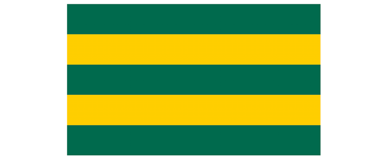
- Five horizontal stripes alternating between green and yellow
- A squared red field on the top left corner
- A five-pointed white star on the red field
- It has a 3:5 proportion (5 width units for each 3 height units)

As for the colors, we will use:
- #006a4e for the green
- #ffce00 for the yellow
- #d21034 for the red
- #fff for the white
HTML
We will code this flag using a single HTML element:
<div role="img" aria-label="Flag of Togo">


<p>For accessibility reasons, we added a couple of attributes:<br>
role="img" to indicate the element represents an image.<br>
aria-label="Flag of Togo" so assistive technologies can announce the image as Togo's flag.</p>

<p>Maybe it would be better to have a second visually-hidden element with the flag's "alternative text" linked with an aria-labelledby, but we'll keep it as a single element for simplicity.</p>
<h2>


  CSS
</h2>

<p>Let's start by setting the flag properties that will be needed:<br>
</p>

<pre class="brush:php;toolbar:false">.flag.togo {
  aspect-ratio: 5 / 3;
  position: relative;
}
With aspect-ratio we set the flag's proportion (width goes first in this case). And we set a relative position because we will draw the star using an absolute-positioned pseudo-element and we want to keep it within the flag container.
For the background, we need five horizontal strips: green, yellow, green, yellow, and green. This is a repetitive pattern of greens and yellows that can be easily coded using a repeating linear gradient:
.flag.togo {
  aspect-ratio: 5 / 3;
  position: relative;
  background: repeating-linear-gradient(#006a4e 0 20%, #ffce00 0 40%);
}
Now that we have the bars, we need the red square at the top left. We could use a pseudo-element, but instead, we will add another gradient to the background:
.flag.togo {
  aspect-ratio: 5 / 3;
  position: relative;
  background:
    linear-gradient(#d21034 0 0) 0 0 / 36% 60% no-repeat,
    repeating-linear-gradient(#006a4e 0 20%, #ffce00 0 40%);
}
This new gradient will be completely red (#d21034 0 0), positioned at the top left of the flag (0 0), with a width of 36% and a height of 60% of the flag (36% 60%) so it keeps the 3:5 proportion that will make it a square (36 = 60 * 3 / 5). And we need to make sure that it doesn't repeat (no-repeat), otherwise, it will occupy the whole container and everything will be red.

With this, we have the base for the flag, and we need to draw the star. We could do it with conic gradients, but that would be a small pain in the neck. Instead, we will use a pseudo-element and then crop it into the star shape using clip-path:
.flag.togo::before {
  content: "";
  width: 20%;
  aspect-ratio: 1;
  position: absolute;
  /* half of the size of the red square */
  left: 18%;
  top: 30%;
  /* translated half its size to top and left to center it */
  transform: translate(-50%, -50%);
  background: #fff;
  clip-path: polygon(50% 2%, 62% 39%, 100% 39%, 69% 61%, 81% 98%,
                     50% 75%, 19% 98%, 31% 61%, 0% 39%, 38% 39%);
}
Note: These are approximate points for the star. We could use trigonometry to make it perfect. But this will work as a good enough approximation.
With that, we are done! The whole CSS code for the flag of Togo would be:
.flag.togo {
  aspect-ratio: 5 / 3;
  position: relative;
  background:
    linear-gradient(#d21034 0 0) 0 0 / 36% 60% no-repeat,
    repeating-linear-gradient(#006a4e 0 20%, #ffce00 0 40%);

  &::before {
    content: "";
    width: 20%;
    aspect-ratio: 1;
    position: absolute;
    left: 18%;
    top: 30%;
    background: #fff;
    clip-path: polygon(50% 2%, 62% 39%, 100% 39%, 69% 61%, 81% 98%,
                       50% 75%, 19% 98%, 31% 61%, 0% 39%, 38% 39%);
  }
}

Some Thoughts
If we add a display: inline-block to the flag's styles, we will be able to have it in line with the text. In that case, we will need to set a height or a width so the aspect-ratio property can do its magic and automatically set the other value.
By drawing this flag, we have practiced:
- Positioning: relative and absolute
- Gradients: linear and repeating linear
- Aspect ratios: to set the flag and star's sizes
- Clip-paths: to shape the star
- Pseudo-elements: to create the star itself
I hope you enjoyed this short tutorial. I plan to release a new one shortly with other flags, explaining how the different gradients work –not only the linear ones. Keep an eye out for it!
The above is the detailed content of Drawing Togo&#s Flag with?CSS. For more information, please follow other related articles on the PHP Chinese website!

Hot AI Tools

Undress AI Tool
Undress images for free

Undresser.AI Undress
AI-powered app for creating realistic nude photos

AI Clothes Remover
Online AI tool for removing clothes from photos.

Clothoff.io
AI clothes remover

Video Face Swap
Swap faces in any video effortlessly with our completely free AI face swap tool!

Hot Article
Hot Tools

Notepad++7.3.1
Easy-to-use and free code editor

SublimeText3 Chinese version
Chinese version, very easy to use

Zend Studio 13.0.1
Powerful PHP integrated development environment

Dreamweaver CS6
Visual web development tools

SublimeText3 Mac version
God-level code editing software (SublimeText3)
Hot Topics


 CSS tutorial for creating loading spinners and animations
Jul 07, 2025 am 12:07 AM
CSS tutorial for creating loading spinners and animations
Jul 07, 2025 am 12:07 AM
There are three ways to create a CSS loading rotator: 1. Use the basic rotator of borders to achieve simple animation through HTML and CSS; 2. Use a custom rotator of multiple points to achieve the jump effect through different delay times; 3. Add a rotator in the button and switch classes through JavaScript to display the loading status. Each approach emphasizes the importance of design details such as color, size, accessibility and performance optimization to enhance the user experience.
 Addressing CSS Browser Compatibility issues and prefixes
Jul 07, 2025 am 01:44 AM
Addressing CSS Browser Compatibility issues and prefixes
Jul 07, 2025 am 01:44 AM
To deal with CSS browser compatibility and prefix issues, you need to understand the differences in browser support and use vendor prefixes reasonably. 1. Understand common problems such as Flexbox and Grid support, position:sticky invalid, and animation performance is different; 2. Check CanIuse confirmation feature support status; 3. Correctly use -webkit-, -moz-, -ms-, -o- and other manufacturer prefixes; 4. It is recommended to use Autoprefixer to automatically add prefixes; 5. Install PostCSS and configure browserslist to specify the target browser; 6. Automatically handle compatibility during construction; 7. Modernizr detection features can be used for old projects; 8. No need to pursue consistency of all browsers,
 Styling visited links differently with CSS
Jul 11, 2025 am 03:26 AM
Styling visited links differently with CSS
Jul 11, 2025 am 03:26 AM
Setting the style of links you have visited can improve the user experience, especially in content-intensive websites to help users navigate better. 1. Use CSS's: visited pseudo-class to define the style of the visited link, such as color changes; 2. Note that the browser only allows modification of some attributes due to privacy restrictions; 3. The color selection should be coordinated with the overall style to avoid abruptness; 4. The mobile terminal may not display this effect, and it is recommended to combine it with other visual prompts such as icon auxiliary logos.
 Creating custom shapes with css clip-path
Jul 09, 2025 am 01:29 AM
Creating custom shapes with css clip-path
Jul 09, 2025 am 01:29 AM
Use the clip-path attribute of CSS to crop elements into custom shapes, such as triangles, circular notches, polygons, etc., without relying on pictures or SVGs. Its advantages include: 1. Supports a variety of basic shapes such as circle, ellipse, polygon, etc.; 2. Responsive adjustment and adaptable to mobile terminals; 3. Easy to animation, and can be combined with hover or JavaScript to achieve dynamic effects; 4. It does not affect the layout flow, and only crops the display area. Common usages are such as circular clip-path:circle (50pxatcenter) and triangle clip-path:polygon (50%0%, 100 0%, 0 0%). Notice
 What is the difference between display: inline, display: block, and display: inline-block?
Jul 11, 2025 am 03:25 AM
What is the difference between display: inline, display: block, and display: inline-block?
Jul 11, 2025 am 03:25 AM
Themaindifferencesbetweendisplay:inline,block,andinline-blockinHTML/CSSarelayoutbehavior,spaceusage,andstylingcontrol.1.Inlineelementsflowwithtext,don’tstartonnewlines,ignorewidth/height,andonlyapplyhorizontalpadding/margins—idealforinlinetextstyling
 How to create responsive images using CSS?
Jul 15, 2025 am 01:10 AM
How to create responsive images using CSS?
Jul 15, 2025 am 01:10 AM
To create responsive images using CSS, it can be mainly achieved through the following methods: 1. Use max-width:100% and height:auto to allow the image to adapt to the container width while maintaining the proportion; 2. Use HTML's srcset and sizes attributes to intelligently load the image sources adapted to different screens; 3. Use object-fit and object-position to control image cropping and focus display. Together, these methods ensure that the images are presented clearly and beautifully on different devices.
 What is CSS and what does it stand for?
Jul 03, 2025 am 01:48 AM
What is CSS and what does it stand for?
Jul 03, 2025 am 01:48 AM
CSS,orCascadingStyleSheets,isthepartofwebdevelopmentthatcontrolsawebpage’svisualappearance,includingcolors,fonts,spacing,andlayout.Theterm“cascading”referstohowstylesareprioritized;forexample,inlinestylesoverrideexternalstyles,andspecificselectorslik
 What is the CSS Painting API?
Jul 04, 2025 am 02:16 AM
What is the CSS Painting API?
Jul 04, 2025 am 02:16 AM
TheCSSPaintingAPIenablesdynamicimagegenerationinCSSusingJavaScript.1.DeveloperscreateaPaintWorkletclasswithapaint()method.2.TheyregisteritviaregisterPaint().3.ThecustompaintfunctionisthenusedinCSSpropertieslikebackground-image.Thisallowsfordynamicvis
