CSS3 transition transition-timing-function property
3. transition-timing-function:
Syntax:
transition-timing-function: ease | linear | ease-in | ease-out | ease-in-out | cubic -bezier(<number>, <number>, <number>, <number>) [, ease | linear | ease-in | ease-out | ease-in-out | cubic-bezier(<number> ;, <number>, <number>, <number>)]*
Value:
transition-timing- The value of function allows you to change the conversion rate of attribute values ????according to the advancement of time. The transition-timing-function has 6 possible values:
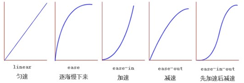
1. ease: (gradually slows down) default value. The ease function is equivalent to Bezier curve (0.25, 0.1, 0.25, 1.0).
2. linear: (uniform speed), the linear function is equivalent to Bezier curve (0.0, 0.0, 1.0, 1.0).
3. ease-in: (acceleration), ease-in function is equivalent to Bezier curve (0.42, 0, 1.0, 1.0).
4. ease-out: (deceleration), ease- The out function is equivalent to the Bezier curve (0, 0, 0.58, 1.0).
5. ease-in-out: (accelerate and then decelerate), the ease-in-out function is equivalent to the Bezier curve (0.42, 0, 0.58, 1.0)
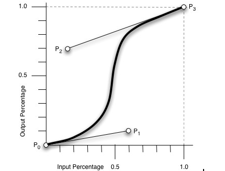
6. cubic-bezier: (This value allows you to customize a time curve), a specific cubic-bezier curve. The four values ??(x1, y1, x2, y2) are specific to points P1 and P2 on the curve. All values ??must be within the [0, 1] range, otherwise they will be invalid.
It is cubic-bezier to calculate the attribute value in the "conversion" process through Bezier curve, as shown in the following curve, by changing the coordinates of P1 (x1, y1) and P2 (x2, y2) The Output Percentage of the entire process can be changed. The initial default value is default.

Schematic diagram of several other properties:

Code example:
<!DOCTYPE html>
<html>
<head>
<meta charset=" utf-8">
<meta name="author" content="http://ipnx.cn/" />
<title>php中文網(wǎng)</title>
<style>
#thediv{
  width:100px;
  height:100px;
  background:blue;

  transition-property:width,height;
  -moz-transition-property:width,height;
  -webkit-transition-property:width,height;
  -o-transition-property:width,height;

  transition-duration:2s,6s;
  -moz-transition-duration:2s,6s;
  -webkit-transition-duration:2s,6s;
  -o-transition-duration:2s,6s;

  transition-timing-function:ease-in,linear;
  -moz-transition-timing-function:ease-in,linear;
  -webkit-transition-timing-function:ease-in,linear;
  -o-transition-timing-function:ease-in,linear;
}
#thediv:hover{
  width:500px;
  height:200px;
}
</style>
</head>
<body>
<div id="thediv"></div>
</body>
</html>


